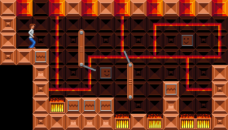
Wow really nice! I love the background. I can't help but feel like the guy's clothes aren't shaded in the same style though. His legs especially are looking pillow shaded. I think. I feel like his legs below the knee would be darker than the thigh, so probably the highlight at the top shouldn't carry all the way down the leg like that.
Viewing post in Pixel Platformer Animated Mockup
Thank you. I don't mind that the highlight on the leg is barely going the right direction. I like the outline it defines. The legs were the 1st thing I designed. I wanted to give Rod some highly visible stylized flashy 70's style. Also, if hold my bent finger under an incandescent, I get a similar spread of light.
I've got the 2nd level into Godot. I didn't find a use for robots, so I got rid of Rod's gun.

Oops, I missed a tile at the entrance. I have a list of little things to clean up.
I've got 4 rooms working in Godot. Watching my GF play, they seem difficult. However, I can breeze through the rooms in seconds. I understand that's what happens in speed runners. They go from hard to easy with experience. It just feels strange that this precision platformer is so easy.
I've got 2 more levels of art almost done.

