ahoy Webcough
It's been a minute since I've played and I booted it up again today. In the spirit of fairness I treated the game as if it's my first playthrough instead of relying on old knowledge of Demo Days passed.
So,
The Good:
Your room design is great. When the dungeon crafts a nice pathway, it feels smooth as butter to play through. I'da thought it difficult to make good randomly generated dungeon where the main gameplay would resolve around speed/time trials, but it works. While some motifs repeated a bit, nothing felt repetitive despite having already played before. I don't think I've seen the same layout twice, except for the starting room. My favorites are still the water room, especially if it involves floating water. Your lever placements are very fun as well, I had one on the roof of a hallway which I thought was especially clever.
It's also clear a lot of thought went into first impressions/tutorials/whathaveyou, especially with the helpful overlay on starting a dungeon, telling you what's what. I think that's the #1 issue DD games face, since they expect players to understand complex mechanics from the get-go, and you've taken steps to make playing your game all the easier.
The Almost-There:
New sounds are good, except some sounds like the dash are MUCH louder than everything else. Walking around and jumping a bit is great and the dash was at least twice as loud as everything else.
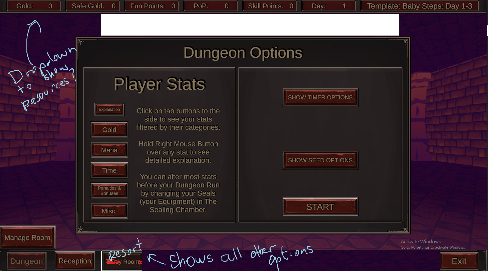
The first screen, while not daunting anymore after playing a handful of times, is surely a nightmare to anyone coming here for an Adult Game experience. The first screen (I think it was the Reception one) has 8 slides to go through, and most importantly, the first one isn't a "Welcome" slide. It immediately starts off talking about important game mechanics, without mentioning things that your game advertises (FPS platforming). I think a super simple, perhaps an expository "You are Mr.Bones and this is your Resort, you'll need to do a lot of jumping!" screen would work better than immediately talking about spending resources. This is made much scarier because of the immense amount of Tabs available. You've got 10 (+ Manage room makes 11) buttons on your first screen after pressing New Game. Surely somebody quit by now because they think this is a text-only management sim or something at this point, without ever making it to the great platforming. I think you can scrap all the tabs the player can't interact with immediately upon starting a new game, and put them all together under one tab, and try and IMMEDIATELY get a player to the platforming. Afterwards, slowly unlock (and reveal in the UI) tabs one by one. A new player shouldn't really have access to seals (or any modifiers) if he hasn't even completed his first baby steps run

I'm known for having weak UIs, so take this with a huge chunk of salt. Either way, I think your goal should be to minimize the overwhelming feeling a player might have on their first start. A minor thing would also be that Manage Rooms is perhaps useless? Clicking on a tab again should minimize the window anyway. I guess the only thing it does differently is that it allows you to inspect different rooms (backgrounds)
Moving on to gameplay, some Dungeon layouts felt like traps sometimes. The problem that happened to me was stumbling upon a large room, where reaching the end (or in my specific case, the top of a long winding ramp) offered very little rewards. I see that there's a door frame visual, which tells me a room could spawn there, but I spent a large chunk of time only to get 2 orange coin-things. It would go much smoother if this "hallway room" had a connected room following it, but instead it came up empty. Something I'm working on in my dungeon generator is trimming the end of a room if it's known that it has no follow up room. Perhaps that's something you could look into, since I can imagine a player focusing on speed would feel cheated since they spent a lot of time for very little reward.
Another thing to think about is how punishing falling off can be. The obvious one is the first heart mirror room, where if a player fucks up (which they might on their first heart room), they will fall down into the liquid (goo?), and will then slowly crawl through until they reach a vine to start back up. While it makes sense gameplay wise (you fucked up, you now have to slow down), I think it kills the pacing a bit due to how slow you move. Maybe the player can start off slow, but build up some speed until they move at 50% movement speed, instead of the 20%
Either way, it's a clear improvement from before, and while I did write a lot, there weren't really issues I experienced but more like issues I think people will experience.
Keep it up!

