I am back! I said I was gonna work on design stuff but totally veered left and instead started prettying up the css. Tried a bunch of different image dimensions to nail down the ones I'll be drawing backgrounds/overlaying transparent characters on. Made a good go at scaling my passages and my images, since it'll be played on browsers. I'm not so hot about the style of the scroll bar, but I'll leave that for if there's extra time.

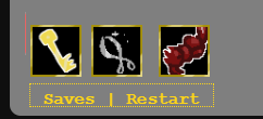
I didn't like Twine's default UI bar, so I just kept the saves and restarts functions and made a lil simple inventory to show what you've got! Added some quick lil icons as placeholders and they came out cute! But there was some issue positioning them since the footer follows the bottom text no matter what. And since you'll be constantly clicking on last word and uncovering more- it'd get annoying real quick.
So I added a lil image that'll be like a pocket icon later? And when you hover over it, the menu pops out! Ta-da!


Now I really need to buckle down on the font/color scheme so I could just duplicate the settings for my various locations =w=);;

