Indie game storeFree gamesFun gamesHorror games
Game developmentAssetsComics
SalesBundles
Jobs
TagsGame Engines

[DEVLOG] Cuphead IF: Regaining Eden demo

A topic by zaraegis created Feb 05, 2019 Views: 2,014 Replies: 20
Viewing posts 1 to 13
Submitted (1 edit) (+1)

Hello, hello!! I'm Zara, and this is my first game jam and my first go at designing any game at all- I wanted to try out an interactive fiction using Twine and a lil Cuphead au I'd been playing around with.

Story Summary:

You are Pirouletta, retired ballerina, crack-shot and the best damn roulette croupier the Devil's Casino employs.
Well... employed.
Pir had been fired a week ago.
After getting through her backlog of trashy novellas to read, cleaning her apartment top to bottom and moping around for a couple days, she's decided she's had enough and has come to either beg, bargain or threaten The Devil for her job back.
After joining up with fellow ex-worker Mr. Wheezy, Pir finds that Hell is empty, her old manager is missing and the Devil is nowhere to be found. They've gotta set aside past grudges and secrets to figure out if their old bosses are the ones causing trouble...or IN trouble.

Some concept art:
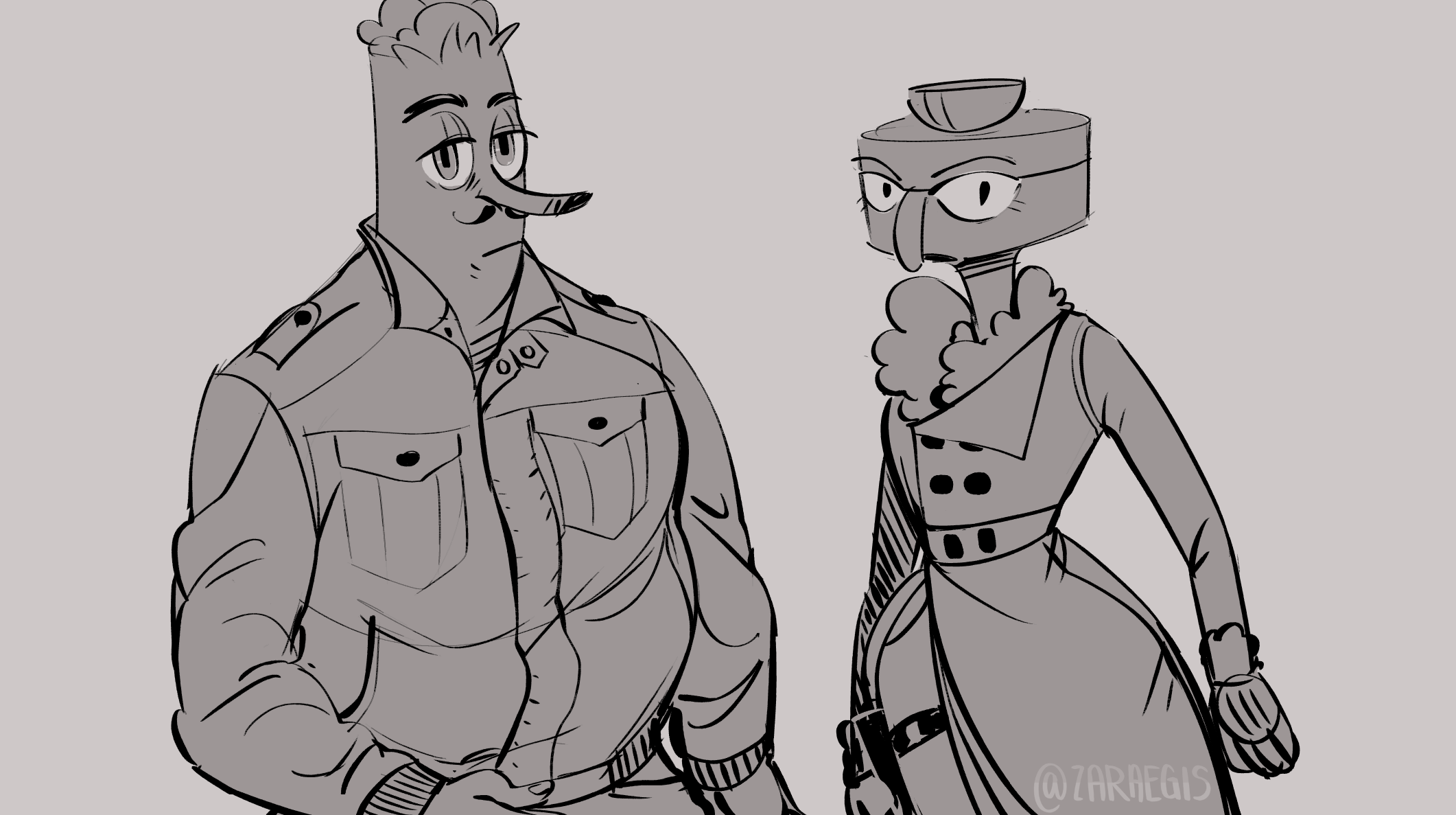
Main characters


Gonna be using Twine to program the game and Krita/Medibang Paint Pro to draw the backgrounds/characters/animations!

I've got the story halfway done, as I'm programming some simple macros/learning CSS as I go and hoping to get all the demo story finished by this week to start on the graphics and designs. 

Submitted

At first I was at a loss with what to start with. Story or designing the assets and coding a prettier background?? But once I laid out a general outline of places/hints/clues I wanted them to hit, I started writing out the narration! So I guess I had my starting point.

One of the biggest worries was how to narrate this entire thing. Most games I see like this have a second person style that gives the reader a sense of inclusion. "You pointed at an object" "You clicked here." But I wanted a bit more- unchangeable story? A sort of bottleneck plotline where there's different choices at certain concrete nodes.  And I wanted to give Pir a strong voice separate from the player. So we'll see how that goes 'v')>

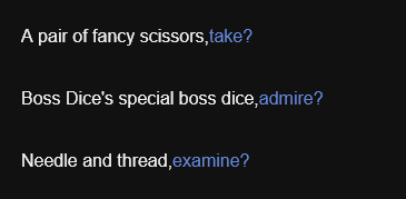
I really do love having the linkreplacer macro move through dialogue in one page though! I feel it sets a good pace for observations and tone.  I need to research how to get a button replaced by regular text though. Like having an action button that says "pick up scissors" that when clicked- changes to a text that says "Scissors grabbed!" or the like.

Love how strong your linework is! Looks like a great start so far, looking forward to the finished game :>

Submitted

Thank you!! The thought of getting to illustrate it keeps me powering through coding :>

Submitted

I had to go through all my passages and do some changes bc I'd learned how to do a more streamlined linkreplacement! And I finally did a bunch of looping passages with a series of if/else macros to put in some hilarious flavor text.


Submitted

OMFG, YAY, I'M NOT THE ONLY ONE DOING A TWINEFIC.


Your art's great and I'm looking forward to playing the finished thing! do you have any else/if macro tutorials that you reccomend?

Submitted

I'm doing sugarcube, and basically living in the documentation website :D here 

If there's also anything you're unsure of, searching the twine forums is also a great help!

Submitted (1 edit)

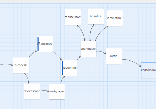
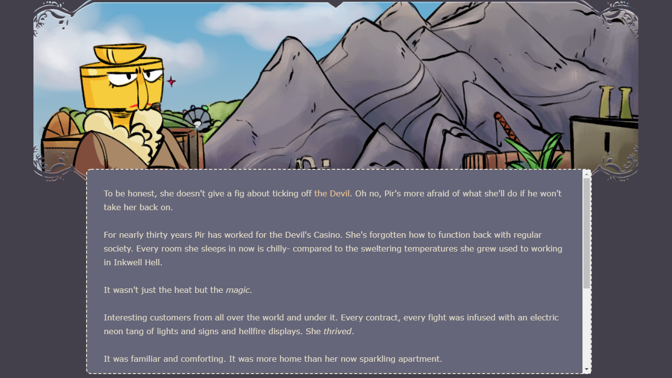
Day Six update: finally finished all the story narration and linking together everything! here's what the final thing ended up looking like.


And the word count total:

Goals for the next couple of days:

  • FINALLY DRAW A COVER ART
  • Nail down a color scheme (sepia/b&w/color)
  • Draw the location backgrounds
  • Draw a couple of emotive halfbodies of the two main charas: Pir and Wheezy
  • Draw an overlay concept and see about how to start coding that into Sugarcube Twine
  • Get all my variables in order and see about how to make an inventory and a custom save menu

I'll need to play around with some placeholder pictures to see about getting the best dimensions for all this stuff, so that's gonna be fun! And also going through the whole list and making a note of where I needed small illustrations for passages. After a couple days of not even touching my tablet, it's time to come back to it full throttle I guess, haha.

Submitted

Woah, look at that map!

Submitted

I am both afraid and excited to see what the full game map will look like when I finish the entire thing tbh

Submitted

I am back! I said I was gonna work on design stuff but totally veered left and instead started prettying up the css.  Tried a bunch of different image dimensions to nail down the ones I'll be drawing backgrounds/overlaying transparent characters on. Made a good go at scaling my passages and my images, since it'll be played on browsers.  I'm not so hot about the style of the scroll bar, but I'll leave that for if there's extra time.


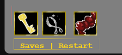
I didn't like Twine's default UI bar, so I just kept the saves and restarts functions and made a lil simple inventory to show what you've got! Added some quick lil icons as placeholders and they came out cute! But there was some issue positioning them since the footer follows the bottom text no matter what. And since you'll be constantly clicking on last word and uncovering more- it'd get annoying real quick.

So I added a lil image that'll be like a pocket icon later? And when you hover over it, the menu pops out! Ta-da!


Now I really need to buckle down on the font/color scheme so I could just duplicate the settings for my various locations =w=);;

Submitted

I bet it will look super slick when done!

Submitted

thank you!! Here's to hopin' ahaha!

Submitted

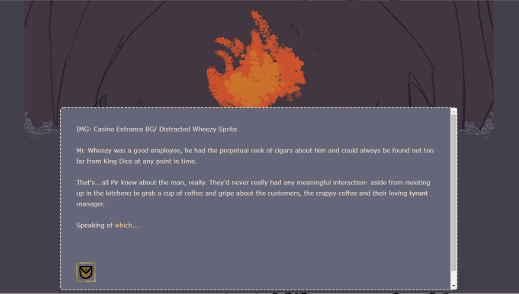
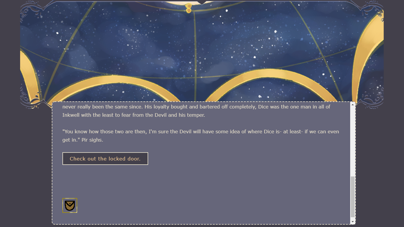
I think I've most of the css figured out! Here's what it'll look like in fullscreen on itch.io! It also works embedded so that's one worry out of the way, dimensions wise. If I have a lil bit of time after everything, I think I wanna see about changing the scrollbar to something that fits the theme more. When I looked it up there was a lot of javascript and I'd need a bit of time to parse through that aha!


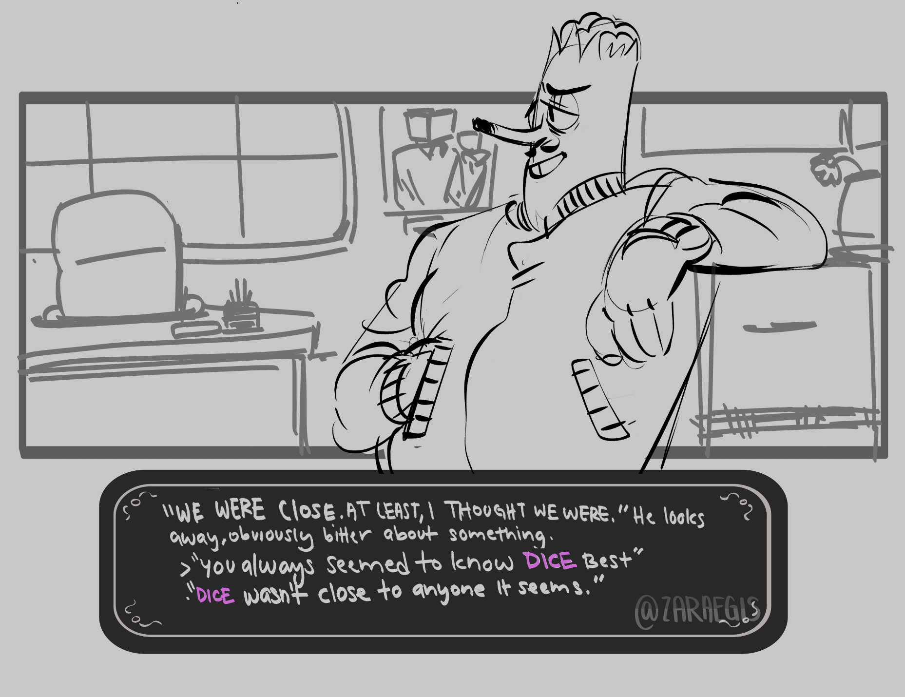
I couldn't find a way to safely background sprites on top of the background so I guess I'll just add em all manually with the background png.  I was thinking either shoulders up or waist up- but after drawing shoulders up anything else would be a bit too small and odd looking, I feel.

I figured out the best sizes for the backgrounds and the inline pictures- now it's time to go back into my passages and make note of how many locations need bgs and how many different emoting sprites I need to make. I like to keep things in batches, because going back to drawing after I feel I 'finished' all drawings is so strange feeling ://

Submitted

how many drawings do you like to keep in batches? also emoting sprites is a really good idea!

Submitted

all of them really! I tend to get into the groove of doing a certain thing: like sprites or backgrounds and to do em all in order. Even if just the rough so I can keep a modicum of consistency in my work lmao

Submitted (2 edits)

I feel like I didn't do much today and yesterday, but I was basically debugging my passages, going through all of them and fixing obvious spelling/coding errors. While I was going through everything I also whipped up a spreadsheet to check exactly how many backgrounds and how many sprites I'll need and on what passage to use em in!

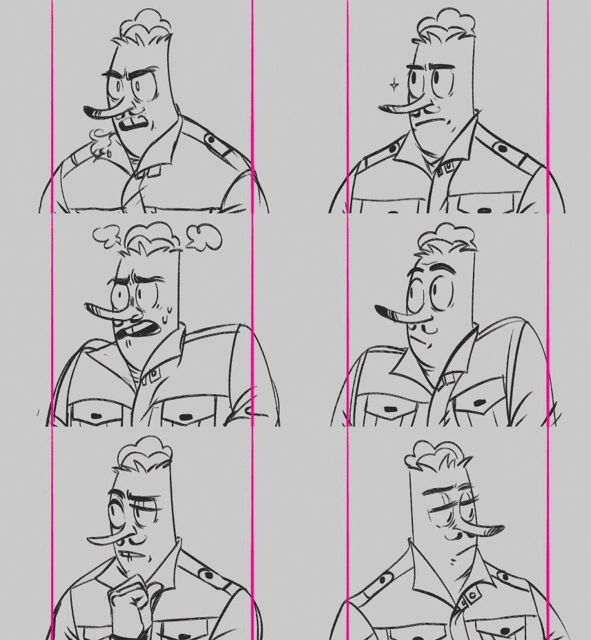
And I got the roughs done for the sprites! I want to get started on the backgrounds to begin exporting and adding it to the game already!

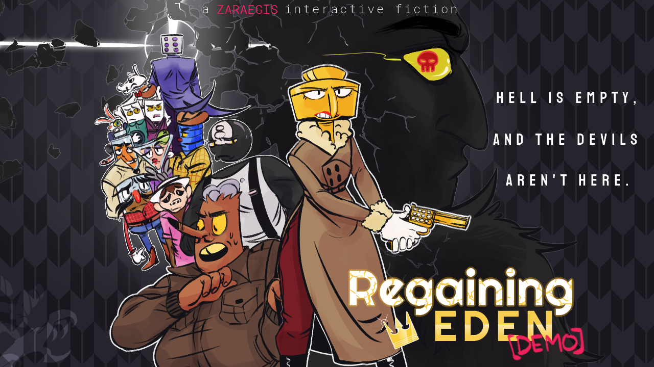
And then i can start on the tiny real quick inline pictures and gifs, since those are a bit more quick to whip up. Oh! And I settled on a title screen/ cover art thumbnail(that last one), so that's gonna be on the docket to line in the morning :}


Submitted

Oh maaan, the spreadsheets is a great idea.

Submitted

I've gotten the page set up the way I like it, and am now just working on the backgrounds needed and the illustrations that'll be inline! But I've got my logo, coverart and descriptions hammered out!


And very happy to have finangled this lil animation as a background piece:


Submitted (2 edits)

My two beta testers were lifesavers and got all the major hiccups ironed out before the deadline!! It's up now and live  HERE

  • I got sound effects on there and working!
  • I have been yelled at by two close friends who got the bad ending! Success! 
  • 51 sprites+background as the headers and 42 in-text illustrations total!
  • A better understanding of Twine and CSS- when the game breaking macros came out during beta testing, I actually felt like I knew where to look and fix it fairly quickly!
  • This has been tremendously fun, and I can't wait to begin work on the full game!!

Bruh.