Indie game storeFree gamesFun gamesHorror games
Game developmentAssetsComics
SalesBundles
Jobs
TagsGame Engines
(1 edit)

Thank you very much for the feedback, especially about the pitchfork bug!
It will help me improve the level design for the post jam update.

  • The UI seems to be fine for most people, would you mind sending a screenshot of what you've seen? It could also be a browser issue.
  • The score is actually below the timer in white. The timer has a black rectangular background, but the score is just below it. (Admittedly, I should have made it a little more contrasting.)
  • The trigger does seem to break after consecutive runs and I'm still unsure what causes it. However, it's simply triggered after reaching a specific point in the track.
  • The coins, I agree, need to be more balanced.  The initial design was to make the majority of the score dependent on the time, then the coins would determine the "tipping point" factor. Typically this is used to try and beat a previous score by trying different paths in the track. I was unable to get a decent balance between paths however...

I also made this with a possible multiplayer update in mind, so hopefully I can get this balanced enough :)

(3 edits)

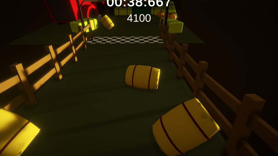
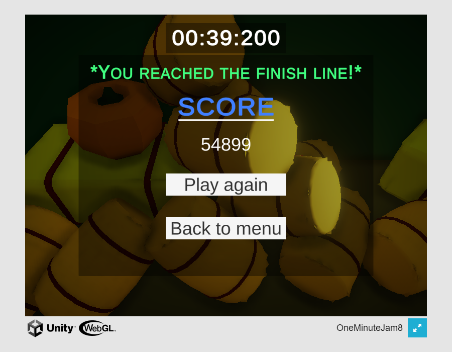
This is what it looks like for me in browser full screen (1920 x 1080).  


While playing again to get you a screen shot, I see that the location is fine when windowed


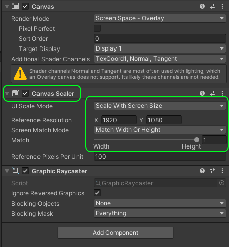
The reason for this is likely the screen resolution.  It looks like your game was made for 800 x 600 resolution (or some other scale with same ratio, 1.33).  So on a wider screen (1920 x 1080 is 1.77 ratio), some items fall off screen vertically due to pixel height and anchor positions.  I actually had a very similar issue on my game where the UI placement was a mess at different screen resolution ratios).  To fix this in Unity, on your UI canvas, add a UI scaler component.    Set the resolution your game is built at 800 x 600 and set the match to 1 (so that it will match height, which is what you want for a game that is landscape orientation).  Finally, it's a good practice to anchor your UI items from the closest edge.  In this case the timer located at the top of the screen should be anchored to the top-center.  In this way the rect dimensions will then define how far the timer text object is from this anchor position. 


Related to the discussion on score:

The first image above was taken just before crossing the finish line, with a current score of 4100.  Than half a second later screenshot 2 shows a score of 54,899.  This is why I felt the 'score' may have been off screen.  It is hard to connect the 4100 to 54,899 result.  I guess you could break the score down to something like this:

Total score:  XXXX

  • based on time:   YYYY
  • bonus, based on coins ZZZZ

Since the coins are kind of a 'bonus'.  Either way, we agree the coin value should be more balanced as their current contribution to score feels inconsequential.


I'm new to this stuff too.  Please don't take the above post as anything other than someone sharing something they also struggled with and trying to share the resolution they found.  Best of luck to you.


edits to fix typos.