Indie game storeFree gamesFun gamesHorror games
Game developmentAssetsComics
SalesBundles
Jobs
TagsGame Engines
(+1)

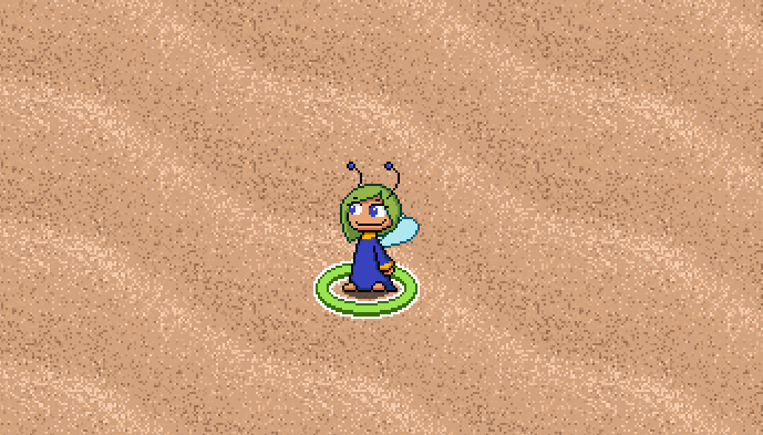
Yeah, I understand what's going on with the hitbox, it's just that for me it's the opposite. I think the blue fairy looks better aligned (though I think you should keep the shadow positioned relative to the sprite not the hitbox). Interacting with stuff indeed felt a bit off for the same reason to me.

I think for the sand, something resembling a dune-y texture would work better. Something with a wavy shape and two tones, like this perhaps? How Fish Makes Textures [Semi Realistic Planks 2/12/2012] - Resource Pack  Discussion - Resource Packs - Mapping and Modding: Java Edition - Minecraft  Forum - Minecraft Forum

> Yeah, I understand what's going on with the hitbox, it's just that for me it's the opposite. I think the blue fairy looks better aligned (though I think you should keep the shadow positioned relative to the sprite not the hitbox). Interacting with stuff indeed felt a bit off for the same reason to me.
Ok, maybe it falls into personal preference, but I will keep an eye on this in the future.

>I think for the sand, something resembling a dune-y texture would work better. Something with a wavy shape and two tones, like this perhaps?
I tried something like that. The issue was that it made the fairies look human sized. Right now the sand does have some waves to it though but they are on the larger side of things. Maybe the effect could be improved a bit.