Sorry to hear about the softlock! Can you tell me anything else you did before that happened? Was it right after entering it the first time? We had a softlock there in a previous version, but I thought it was fixed now.
Glad to hear you liked it!
I always love seeing retro rally games, but I feel it also suffers from the common overly sensitive turn controls issue. It’s very easy to oversteer and hard to counter it without then overshooting in the other direction - some of this is the fun in these games, but too much and it just feels like you can’t have any real agency on your movement. Also, whenever you spin out and end up going backwards or so, it takes a couple seconds of holding forward until the car actually starts moving forward - this really feels like the wheels have lost all traction for a good bit there.
I have tried both doorways but I really have no clue what’s going on at any time. I didn’t need to combine any items or do anything besides opening the red key bars door to escape the first level, and on the second level I cannot find a weapon so I can’t say there’s much combat to be done. Also, for some reason my dialogue got bugged after a while and I could only pick the third option or last if less.
The levels all just feel like an open field; the lack of a physical objective and terrain that is nondestructible makes any semblance of layout currently irrelevant; destructible buildings seem to only give you an advantage and enemies a disadvantage, and so it doesn’t feel like there’s any design to them. The… third? desert with water. level felt a bit more interesting with the water slowing you down and there being hovercrafts. What I think you should do is add in non-destructible terrain and physical objectives in the mission that you have to attack/defend/escort? or simply progress through the level to a goal, so that there is a reason to care about the terrain & certain spots can be better/worse to play around in. Destructible terrain would then act as a way to modify the battlefield as you play, but you would still be constrained to a degree on how you play in the level.
The visuals are very nice, but the gameplay feels quite dull for now. None of the environment feels relevant, and there’s not really any mechanics to counterplay elaborate enemies or anything like that, I can mostly just sit in place and shoot, and sitting in place elsewhere in a level doesn’t make a difference. I’m looking forward to the game being updated, though.
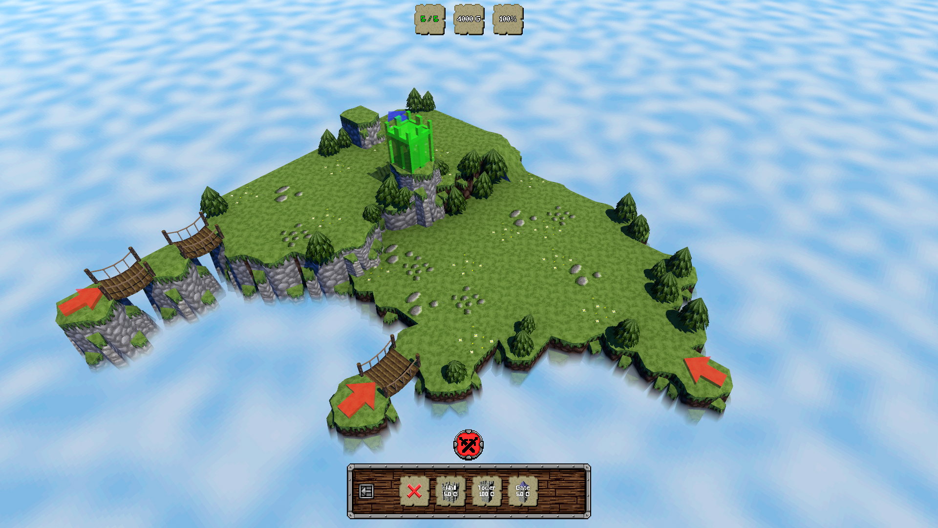
Neat little game but I feel it doesn’t do anything to go past the usual issue most/all tower defense games tend to have, which is that there is one correct way to win and it tends to be making a funnel. I guess that’s the genre though.
I would like to see this expanded with a level editor and please let me rotate the camera, just because I think it looks neat.
It would also solve typical issues like this: 
Thanks for playing!
On controller, you can use RT/R2 or whatever you rebind it to to use manual aim. This will always start you aiming in the direction the character is looking towards, instead of locking into enemies. You will still rotate though, it won’t aim relative to camera. Perhaps I’ll try it out, I admit it’s done this way out of familiarity with old tank control games.
TLDR since we discussed in voicechat: The level is a massive step up since the last demo and I only dislike the overly long corridor on the top left, the amount of paths and structure around it feels appropriate. Going to the right first feels slightly easier. I wish I had some better way to not inadvertently try to fire an out of ammo gun. Update mouse sensitivity without restarting!!! Keep it up
I mean no offense but I’m not sure I understood half of what you said, so I’ll try to answer the question instead.
I understand that the game wants to have a layer of mystery over its mechanics that you simply intuit as you work your way through these first puzzles, but it needs to do something so that it actually clicks in. Doing the same thing five times and then hitting a brick wall is not exactly what I’d envision. By dedicated introduction I mean having a narrative/map progression clearly unlock or progress after you do a few of them. I see a lot of things around this first area but I cannot figure or do much with most of them, and the things I could solve led to nothing. I need something to grab onto so I can derive some meaning from my actions.
I hope this clears it up a bit.
Starting the game booted up a frameless window that was going off of my screen, but evidently could not be dragged in. After going to the settings i could fix it, but after playing the nightclub then going back to the menu this happened. 
The game functions, I suppose. I wish I didn’t have TEXT TEXT TEXT all over the screen.
The tutorial is very badly paced. You’re thrown into a meat grinder style room (empty box, immediately surrounded) with enemies while controls still haven’t been explained to you, then on the next rooms nothing happens and you actually need to sit around for the very slow text before you can complete the tutorial. Afterwards, the game wasn’t displaying my mouse on the menu so I could not play the rest of the game.
After restarting I played a little, but it was hard to make it far without any cigs. Here’s some feedback;
It’s an ok base though so I’ll see it next time around maybe
It looks neat but I have no clue what’s going on. I did the first few “puzzles” by just drawing a circle every time. I have no understanding of “rules” after doing five or so of them nor a reason to keep doing them, meanwhile the next puzzles already don’t seem to be solvable in the same way but I feel no drive to do them. A more dedicated introduction could improve this greatly.
Not a bad concept but sorta just boring. The first time I had a melee guy so it was a bit interesting to try and maneuver around enemies to get nearby only when I could hit them, but after that run ended shortly I started another one with a cleric who would hit for sure, at infinite range, with a long long cooldown. Quit after a couple rooms. It would be more charming if the text was readable and the game used its own assets, and gave me something to do other than turn, or if levels were not an empty box.