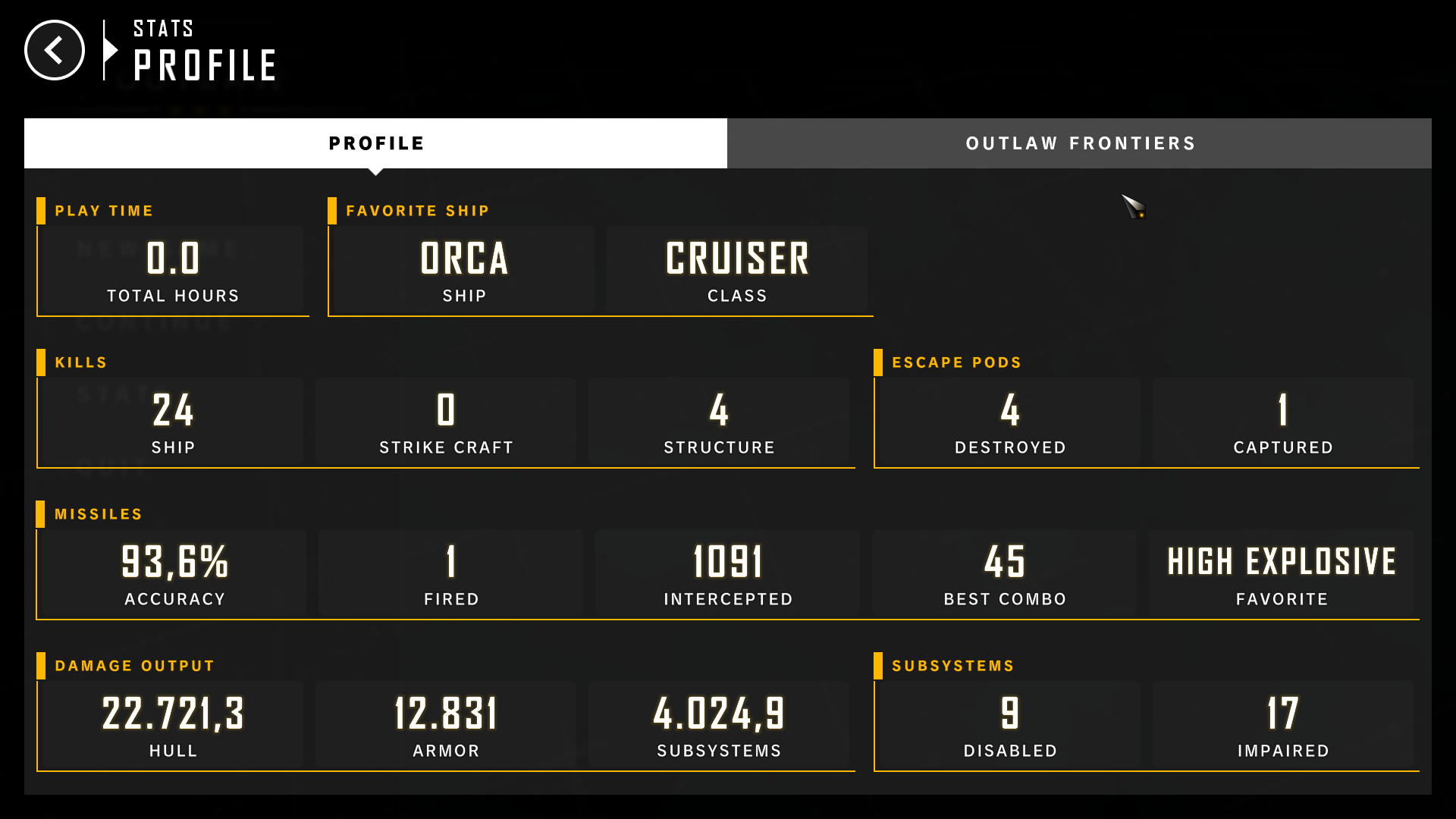
Some assorted feedback. I think the game is generally good, but I think many things could be made snappier and clearer just slightly and the game would improve drastically from it.
- The level select screen blinks the UI when changing the selected level, I found that to be a bit annoying to the eyes.
- In the modules menu, clicking on a slot opens the UI on the right, which makes sense as the slot (frame of reference) is still being displayed on the left. For the turrets UI, this doesn't make a lot of sense; my intuition tells me to press the top left button to go back for one, but also the 3d view of the turret isn't really the same as the slots. Personally, I'd open the gun selection UI over the current UI on the left side, and zoom in on the spot where the turret goes smoothly. Instead of having arrows to switch slots, I'd keep a mini version of the top down view so you can choose which one to switch to, or at the very least I'd smooth the camera transition here too so you can keep track of where you're actually placing the turret (just the slot name being a number really isn't enough to keep track).
- The scrollbar in "missile massacre" is really slow.
- I'm not sure if the missile ammo upgrade values are temp or if I just can't appreciate how 25k is a good price for what seems really minimal.
- I'm not sure why some options on the pause menu have a set of % buttons but map scroll has a slider. Either way it did not seem to affect zooming sensitivity ingame which is far too low.
- The "Menu" button in the pause menu should probably say "exit to menu" or at least be colored red, since it aborts the current mission. Also to my surprise, Reset reset the map and not the settings.
- It seems the stat values for turrets count up really fast when switching from one to another or so; I think just straight up changing the value to the proper one would be better for the sake of comparison (same stats = no visual movement).
- Middle mouse click is generally a terrible input that should not be used; I did not find a way to rebind it. I've had to play with arrow keys for now, but I think you should make it so having the mouse at the screen edge moves the map too, as well as wasd.
- I think more emphasis should be put on the mode switching tutorial, I didn't notice I wasn't in the right mode and played normally anyway.
- The first comms with the Auspicious in the second level left my camera totally out of focus. The second brought it back in place, but I have no clue what went on in the meantime. The effects in that first bit were also quite annoying. Try pixelating just the UI maybe?
- The missile massacre animation is really cool, but I think my camera was completely thrown off afterwards (I think if you're in planning mode).
- Railguns seem to shoot out into outer space every single time, I'm not sure what's going on. I think it would be good if you could see the aiming angle ranges/distance ranges of the guns while holding a key.
- I think camera should snap back to the previous zoom level when switching to target mode than back to planning.
- I don't like that I can only see hp bars while in target mode. Also, clicking on the on-screen target switch prompts is really annoying when I'm just trying to lead some missiles on the enemy.
- All five missions were fun, but I feel like I need something a bit more complex and involved, they all seemed fairly straightforward. The outlaw frontiers mode was that in some regard, but I also have no clue what I'm doing on that one.


