Crosshairs are pretty much the most important source of information in ATP. They have changed a lot during the development, as can be seen from the history video I posted earlier. They must meet two, often conflicting requirements: be clearly visible, but not get in the way. Earlier version (seen below) didn’t quite succeed with the latter one.
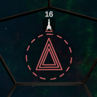
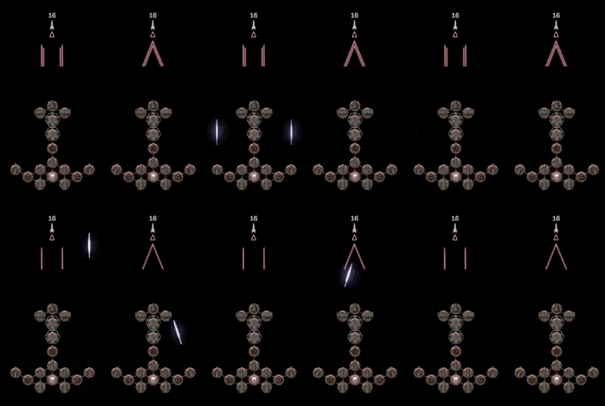
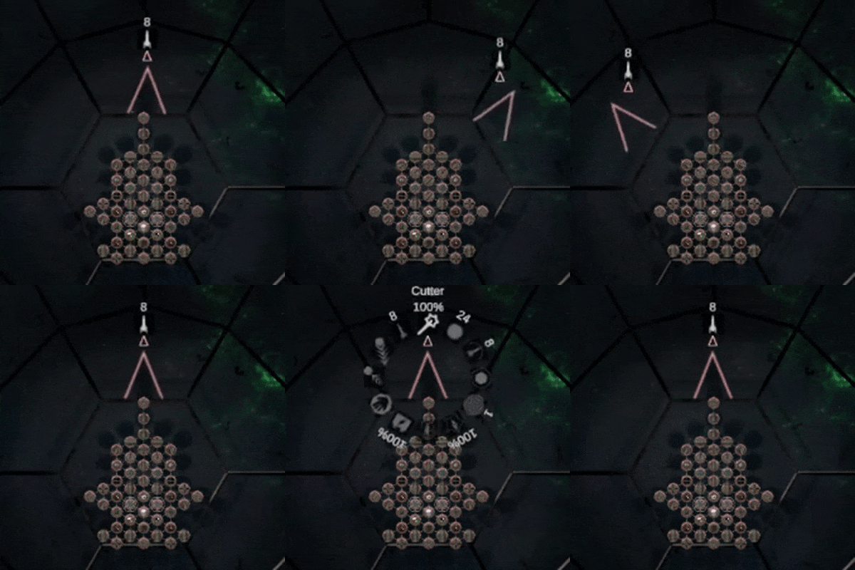
I had already reduced the crosshair opacity. To take things further, I got rid of the useless outer circle, which (I think) had some kind of purpose that I’ve since forgotten. Additionally, closed aiming triangles and rectangles were simplified, and two lines to indicate simultaneous shooting is enough instead of previously used three.
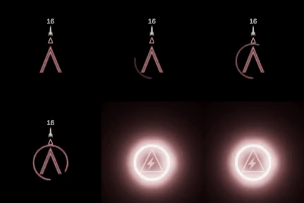
The circular energy bar opacity now increases with the energy consumption. In order to keep players aware of the usage, the circle starts blinking when the consumption exceeds 66%.
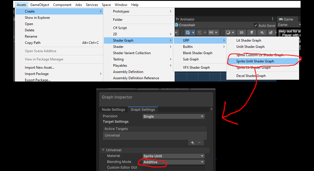
Adding the bloom effect was easy, as crosshairs are world-space UI-components. Nowadays additive GUI shaders can be made by creating a “Sprite Unlit Shader Graph” asset, and setting blending mode to “Additive”; I should probably replace my custom additive GUI-shader with this. It seems that the overlay camera’s bloom is also applied to the base camera, so game view and crosshairs must share the same post-processing effects. I may be missing something, but I didn’t find any way to change this via layers or anything.
This is how the new crosshair looks in use.
Beside this, I renamed and re-balanced some modules. As it often happens in simulations, every fixed feature seems to break two others. So (once again) it took longer than I expected.

