On Sale: GamesAssetsToolsTabletopComics
Indie game storeFree gamesFun gamesHorror games
Game developmentAssetsComics
SalesBundles
Jobs
TagsGame Engines

Mobile Last

85
Posts
2
Topics
15
Followers
17
Following
A member registered Jul 31, 2020 · View creator page →

Creator of

Recent community posts

If old thruster flames bore a resemblance to clouds, the old meteors could pass for meatballs. They were crafted hastily several years ago to replace the placeholder spheres. Models themselves are OK, but enhancing their texturing has lingered on my to-do list since then.

Substance (at least the 2021 version) lacks built-in rock/stone material, but I found concrete to be a solid foundation to build on. I incorporated robust bump mapping to lend it a rougher texture, adjusted its hue to a bright white, and fine-tuned the diffuse multiplier in Unity to achieve the desired brightness.

ATP employs a top-down perspective, and owing to its 2D physics, meteors are restricted to rotating around the top-down axis to maintain proper collider alignment. I leveraged this limitation to my advantage, and optimized the texturing by giving most of the UV-space to faces oriented towards the camera.
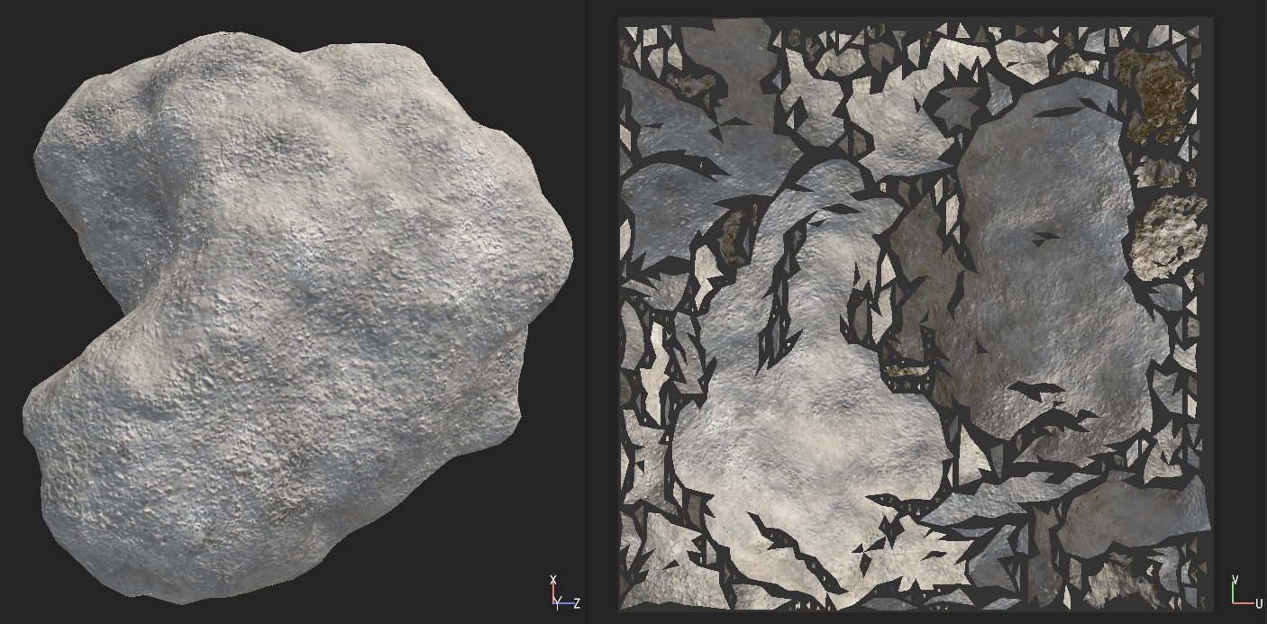

With a little imagination, they now bear a distant resemblance to meteors. And with the same effort, I added a few new meteor models to add variance.


It appears that Unity's collision model may have undergone some changes, as I encountered inaccuracies that went unnoticed previously. Using the continuous collision model resolved these issues, and given the absence of performance degradation, it will now be set as the default option.

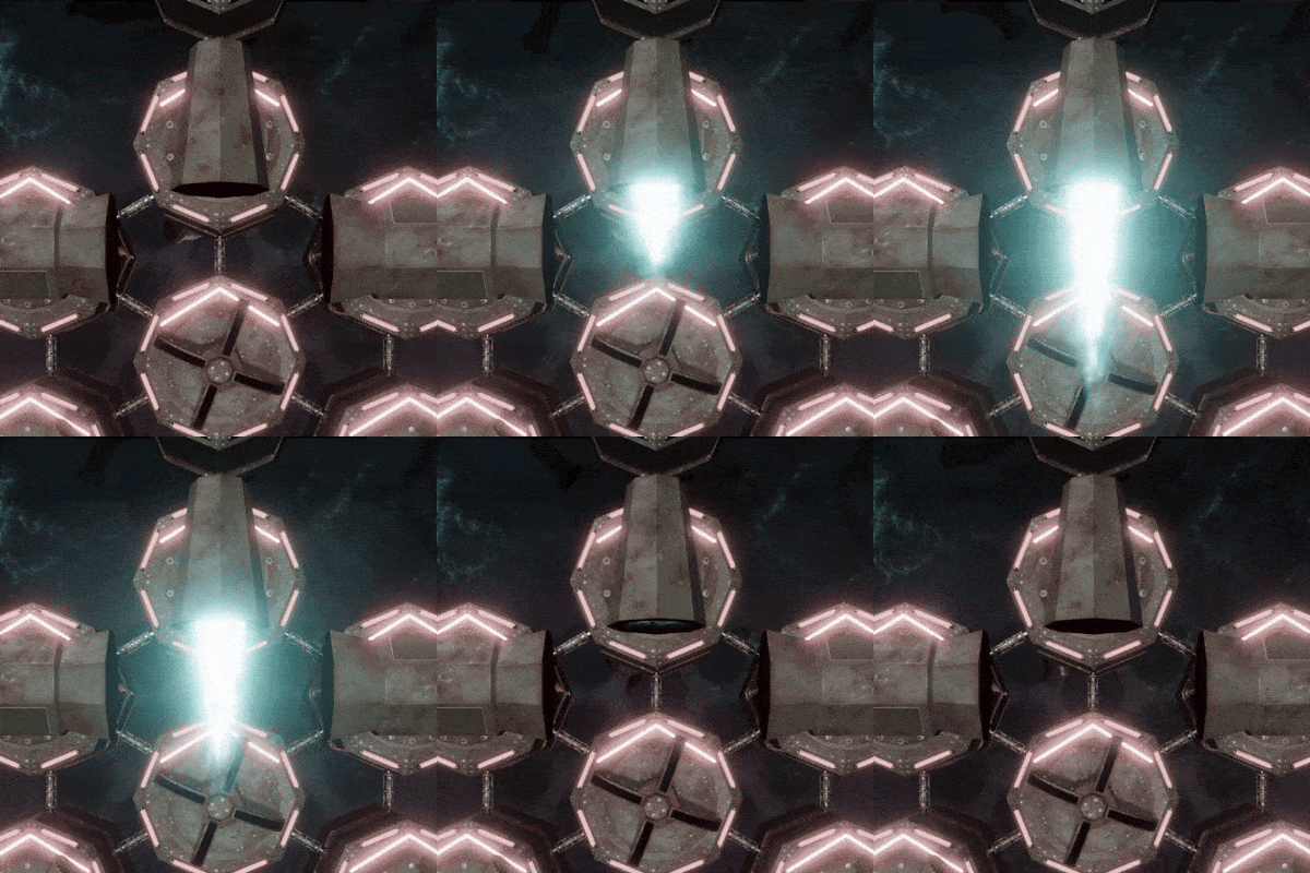
As mentioned earlier, expect numerous visual enhancements now that all graphical tools are running smoothly. Let's begin with one aspect that has particularly bothered me: the puffy clouds that were supposed to be thruster flames.

I created a basic half-sphere to serve as the model for the flame, allowing thrust power to be indicated simply by scaling it. The flame's appearance is achieved through a shader. Initially uncertain of the desired outcome, I experimented with smooth noises, Fresnel nodes, and other elements until I achieved a satisfactory result, especially when viewed from a distance.


And there you have it. While it may not be a contender for any beauty contests, at least the thrust direction is now clearer.

A closeup:


From a distance:


I’ve dreaded the transition of the project to a new device, fearing it would be a frustrating ordeal since I don’t store binaries to a version control. However, my computer's incessant noise finally spurred me to upgrade it. Much to my surprise, the process was completed in a mere 15 minutes or so.

The Unity upgrade from 2022.3.2f1 to 2022.3.21f1, on the other hand, didn’t go as smoothly. VFX graph effects exhibited numerous glitches, accompanied by "empty subgraph block" and "empty subgraph operator" errors, likely stemming from serialization issues. Fortunately I’m not that much into fancy effects, since I had to fix all of them manually. Despite this hiccup, overall functionality remained relatively smooth, although there may still be lingering undetected issues.

Now that I can effortlessly run Unity, Visual Studio, Blender, Substance Painter, and manage dozens of browser tabs simultaneously, expect some visual changes that I'll detail in upcoming posts.

How time flies...

As you might guess, I have distanced myself a little from ATP recently and delved into various other interests. These include all kinds of procedural stuff, water effects, volumetric lights and terrains, JPS-pathfinding, inverse kinematics, genetic algorithms, and more. I've also initiated a couple of new projects that I look forward to sharing more details about in the near future.

I'm finding myself a bit short on fresh ideas for ATP as well. My primary objective for this year is to polish the game as ready as it can be; while I'm open to any suggestions during this phase, my focus will predominantly be on refining existing elements. So I’m not quite done yet, but my posts will probably be more sporadic in the future.

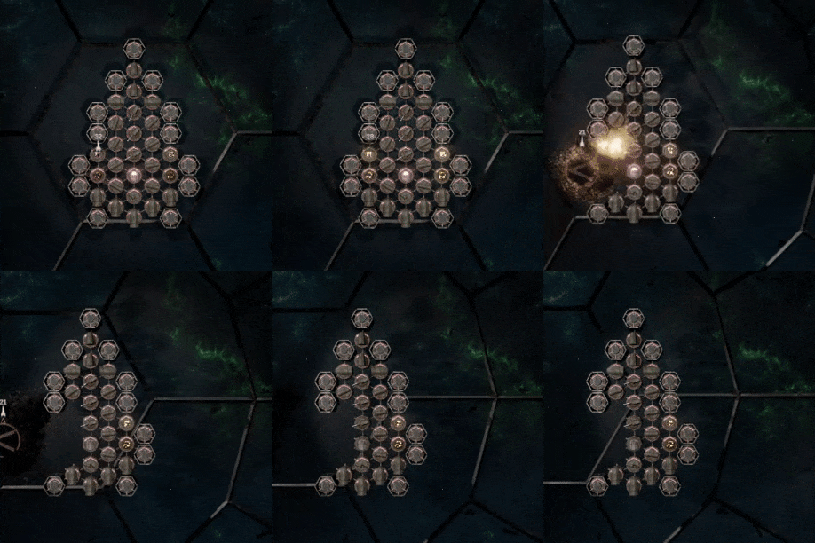
But most importantly, I added a shockwave effect to enhance the ship's destruction:


During the last, unfortunately busy weeks, I’ve been continuing where I last left: improving the trigonometry behind the behavior and refactoring the logic. In the process, I also thoroughly tested almost all AI behaviors. A tedious job, but a boring person that I am, I found it rather interesting.

Here’s a little summary:

  • I made improvements and optimizations to obstacles (meteors, team mates) and weapon dodging. At the same time, I fixed a bug related to collision layers, that caused the AI not to detect nor dodge incoming lasers properly. Funny, I hadn’t noticed that earlier.
  • Combatants have handedness which dictates the direction they prefer in even situations.
  • Fight-or-flight behavior in critical situations is more adjustable. Also, other characteristics are now less dependent on each other, which makes them easier to tweak in the future.
  • There is some inexplicable wizardry going on in tractor and pressor beam handling. I have no idea what I’ve been after with it, but since the AI is already quite competent with beams, I decided not to mess with it too much.

Only the two most difficult things are still to be done: movement and plasma orb handling. More about those later.

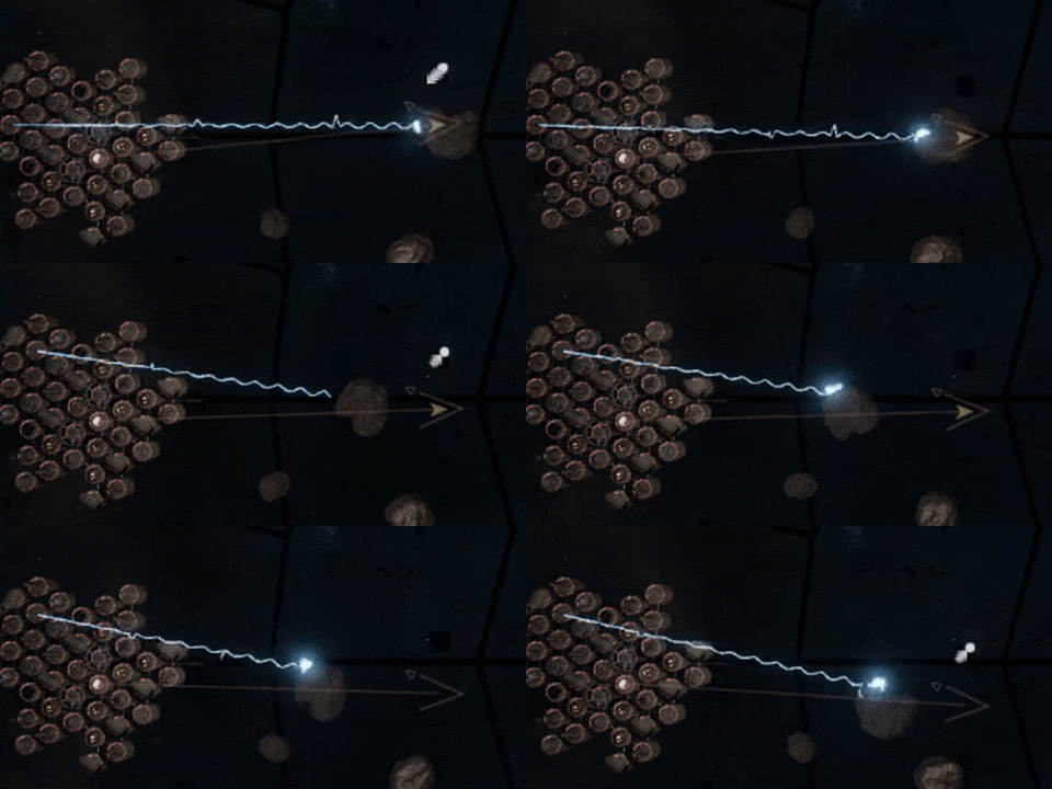
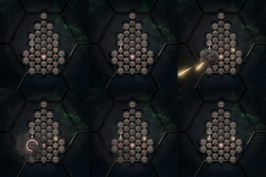
And in order to avoid another tell-don’t-show -post, here’s an image that introduces the new tractor and pressor beams. Direction of the beam should now be clearly visible.


Programming NPC AI is rewarding once you get into it; you never get tired of losing your own creation. On the downside, developing and testing requires lots of hard debugging as well as complicated play/cheat modes that take time to set up. Therefore I usually concentrate on AI for longer periods at once. Such as the last two weeks.

In addition to countless tweaks and fixes, there are several new features and improvements. AI players...

  • are more consistent when estimating enemies strengths and weaknesses.
  • are better at keeping safe distance to ships with more close-combat power.
  • can target vulnerable ships from a greater distance, not necessarily concentrate on the closest one anymore.
  • are able to detect if their cockpit is exposed to enemies. If so, they try to turn around to cover it.
  • dodge teammates better and can coordinate targets during the team play.
  • don’t waste their most precious weapons on harmless targets during tournaments (assuming they can move or enemies are within the reach of their cannons).
  • are aware when they’re surrounded by enemies, and will escape the situation accordingly. This will take some refining, since there’s a danger that they get too careful and waste all the time escaping.
  • perform silly things due to numerous bugs. So nothing new there.

All AI skills and characteristics are configurable. According to my plans, the next version introduces nine opponents in three different tiers, each having their own personal fighting style. I still need a set of portraits, new player selection GUI and all kinds of visual things that are not my strength. Slowly but steadily...

What an interesting Unity-week... Certainly not the first controversial decision they make, but since it doesn't directly affect ATP, I'll see how things progress and perhaps return to the subject later.

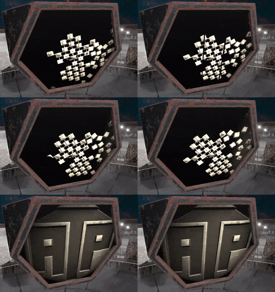
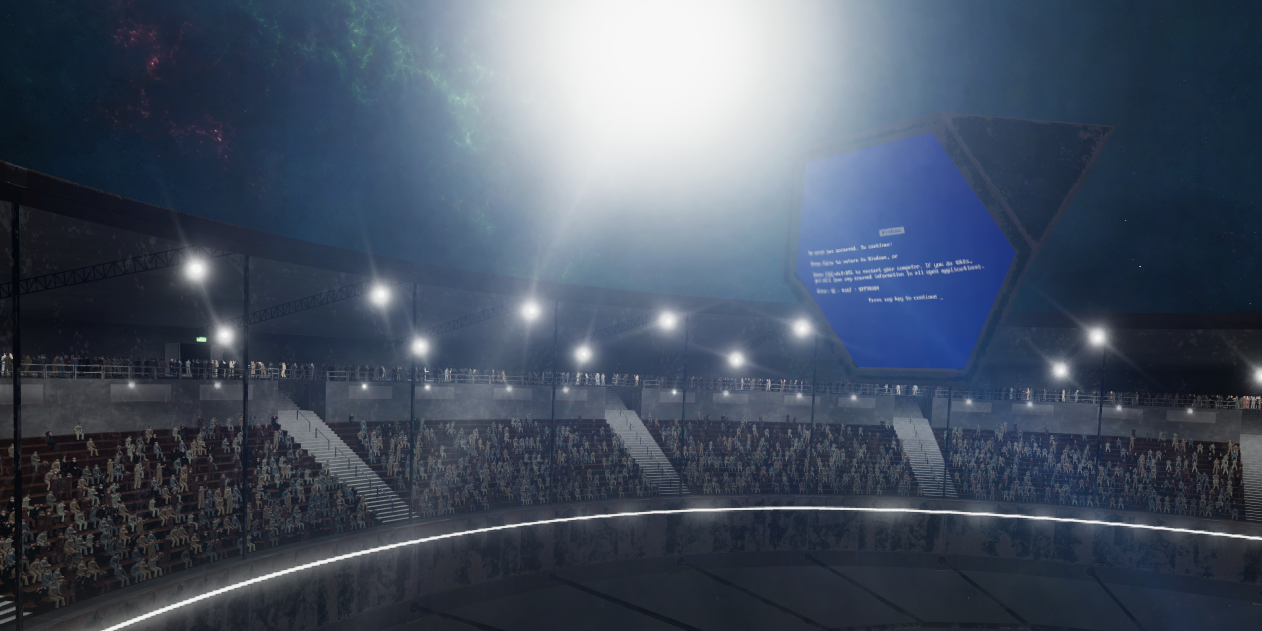
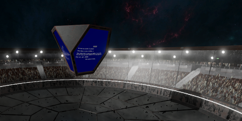
Meanwhile, it’s time to once again introduce something completely meaningless with absolutely no effect on the gameplay: Mauno, the flying mediacube, who so far has entertained the audience with error screens and static, is now capable of showing videos. Its favorite subject are clips about the old ATP versions.


I haven’t figured out what Mauno’s displays are supposed to be. They’re really neither film projectors or TV screens; perhaps some kind of weird film-TV screens or something. But it doesn’t matter: as I’m after the early 1900’s style, I added a vignette film grain to the videos by loosely following the ideas presented in this great article.

Videos are rendered to texture by using Unity’s VideoPlayer-component, which is surprisingly straightforward to use. There are some potential compatibility issues with certain platforms. Importing video clips by using VD8 encoding should maximize compatibility, but I have to do some testing on this, especially on Linux.

Beside numerous bugs, Avaruustaistelupeli is filled with weird game-overs that are logical under the hood, but the logic is hard to figure out. Lots of them can only be detected by carefully watching videos of the battles. I have already added some statistics to clarify things, but obviously it is not enough.

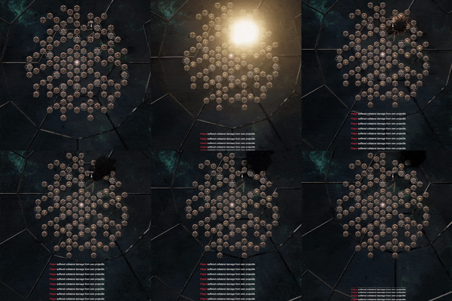
A very common mishap happens when players launch projectiles at high rate. Projectiles often collide and explode upon the ship that launched them, which causes heavy collateral damage to modules in their vicinity. Explosions near the cockpit may end the battle abruptly.


Players are now given an opportunity to make projectiles trigger only when they leave the ship’s bounding area. Untriggered ones won’t explode on collisions, only disappear. A dust cloud with a loud clang indicates the collision and lessens confusion on vanishing projectiles. The new mode should make the fighting more careless. As AI pilots are already rather careful with projectiles, this doesn’t affect their behavior.


Another similar case are mishaps with energy overflow, but I’m pretty clueless what to do with them. Experimenting with the subject has already taken too much time, so, in order to keep a steadier posting rate, I will probably do something else first.

As I expected, there has been little time for ATP this summer. Besides the normal boring vacation and day-job things, I took my precious time to prototype a new concept that I will tell more about in the future (once I figure out what I’m actually doing). It has nothing to do with ATP, but lots to do with Unity's SRP-features and other advanced, new, poorly documented stuff.

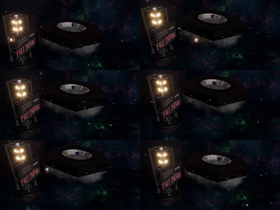
Although not practicing any serious development, I did try to make the game moodier and more lively, adding funny little details with no gameplay value whatsoever. For instance there are now dozens of 1910's t-model spaceships flying behind menus; spectators have to arrive somehow. As you can see, their ships are much more maneuverable than the ships used in battles. Arena also has lots more parking space than one would believe.


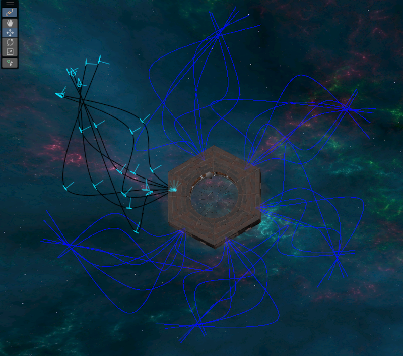
Animations are done by using Unity’s new splines-library. There is one entrance for each side of the arena, totaling six. To save time, I created several alternative splines for one entrance (within SplineContainer-object), and copied the bunch to five others. Ships select their route randomly, and they are animated by evaluating along the selected spline in the code. To introduce more diversity, I incorporated individual variations using Perlin noise and curve tangents.


I found the spline editor GUI to be somewhat awkward to use, and (unlike the spline node visualization implies) Unity seems to ignore the spline object’s world transform. As spline containers for each entrance differ by rotation, I had to do the transforming manually in this manner (feel free to comment if I’ve missed something):

var root = objectWhereTheSplineContainerResides.transform;
var position = root.TransformPoint(spline.EvaluatePosition(time));
var forward = root.TransformDirection(spline.EvaluateTangent(time));

But that’s enough cosmetics for now; there are some real features I need to implement too. AI is already somewhat able to operate shredders, but it still has plenty of tricks to learn. Some improvements to gameplay mechanics are also on my TODO list. So in the following posts, I’ll be returning to the more meaningful stuff.


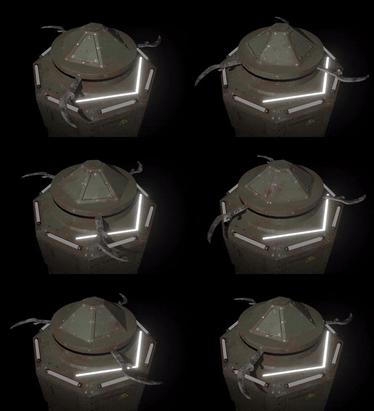
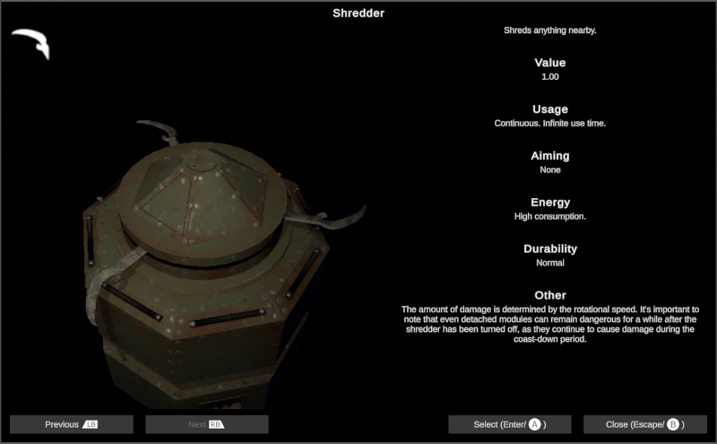
There, I added a brand new module type, the Shredder. It’s the first new module for over a year, so re-learning modeling and texturing process was quite a job. Softwares tends to change drastically in that time, but as my Substance license only covers the 2021 version, I was able to proceed with the old version; I like to consider myself lucky.

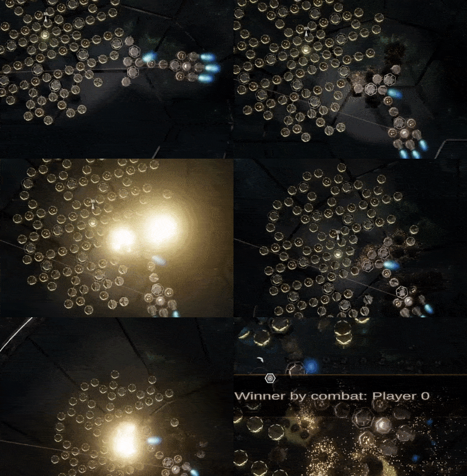
Shredders deal massive damage to all objects within their reach. They are efficient when ramming into enemy ships, and can also clear obstacles from the way. My goal is to make them emphasize movement: the ship's body can now be used as a weapon, and one must also be ready to escape the enemy blades. Other movement-related modifications and additions are also under way. Mines should also be more useful now, as they seem like a feasible way to battle against the shredders. Here’s a clip about shredders in action:


Functionality itself was pretty straightforward to implement, basically an overlap cast and damage to nearest enemy or neutral objects. With a little twist, of course: blades don’t stop immediately, but decelerate over time, which makes them potentially dangerous even when detached.

The only thing left is the hardest part: AI. As shredders require advanced movement handling, I will probably implement that as a part of the larger AI overhaul in the near future.

I updated Unity to the latest LTS version 2022.3, and was pleasantly surprised how few issues there were.

  • Console warnings started appearing here and there, but none of them seem to affect the functionality. These kinds of messages are common after major Unity updates; they are usually fixed in the following versions.
  • Some prefabs have changed in strange ways. For instance, a few disabled gameobjects became enabled and vice versa. Easy to fix, but sometimes hard to detect.
  • Colors seem clearer and deeper at some points, perhaps due to changes in post processing algorithms.
  • Force fields (that use custom shaders) became much brighter than before, and didn’t look correct anymore. I rewrote the whole shader, and now they look better than before. Other shaders haven’t changed.


The newest URP should support LOD crossfade, but I ended up having nothing but an error “Instancing: Property 'unity_LODFade' shares the same constant buffer offset with 'unity_RenderingLayer'. Ignoring.” Probably a compilation problem; maybe I should update Visual Studio as well.

My interest in LOD transitions is related to a new module type which I will tell more about in the near future. Time to re-learn Blender after a short break.


Summer has arrived, and rising temperatures tend to slow down my working rate. The original idea was to write a tutorialish post about shader tricks I’ve been playing with, but writing takes so long, I’ll publish it a little later. Something else instead.

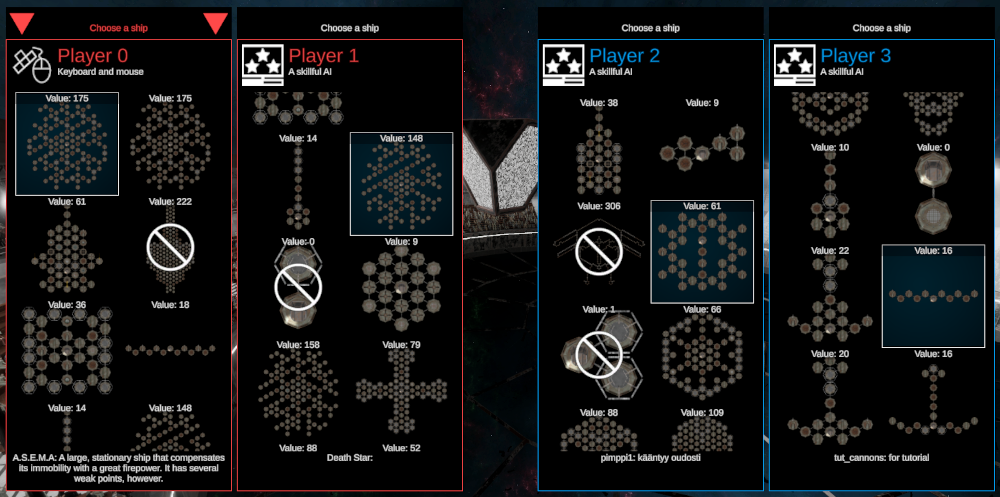
One particular thing has always bugged me during the test sessions: as there can be dozens of ships to choose from, it takes ages to find properly balanced ones for each player. As most ships on my computer are unusable test ships that I use in development, this may not be a problem for others. But still, I decided to take things from this


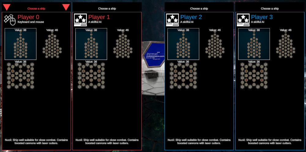
to this


In the next version, fleets can be used in all game modes, not only in tournaments. Fleets will be somewhat similar to folders, and there can be specific fleets for each game mode. This limits the number of available ships, speeding up the selection process. As the fleet-system was hastily done and not very cleverly designed, it took some refactoring to resolve the curious connections between game mode, fleet model, GUI and other places. But other than that, the change wasn’t as big as I feared.

My next short term goal is to update Unity into the latest LTS version (2022.3), and not to break everything in the process.

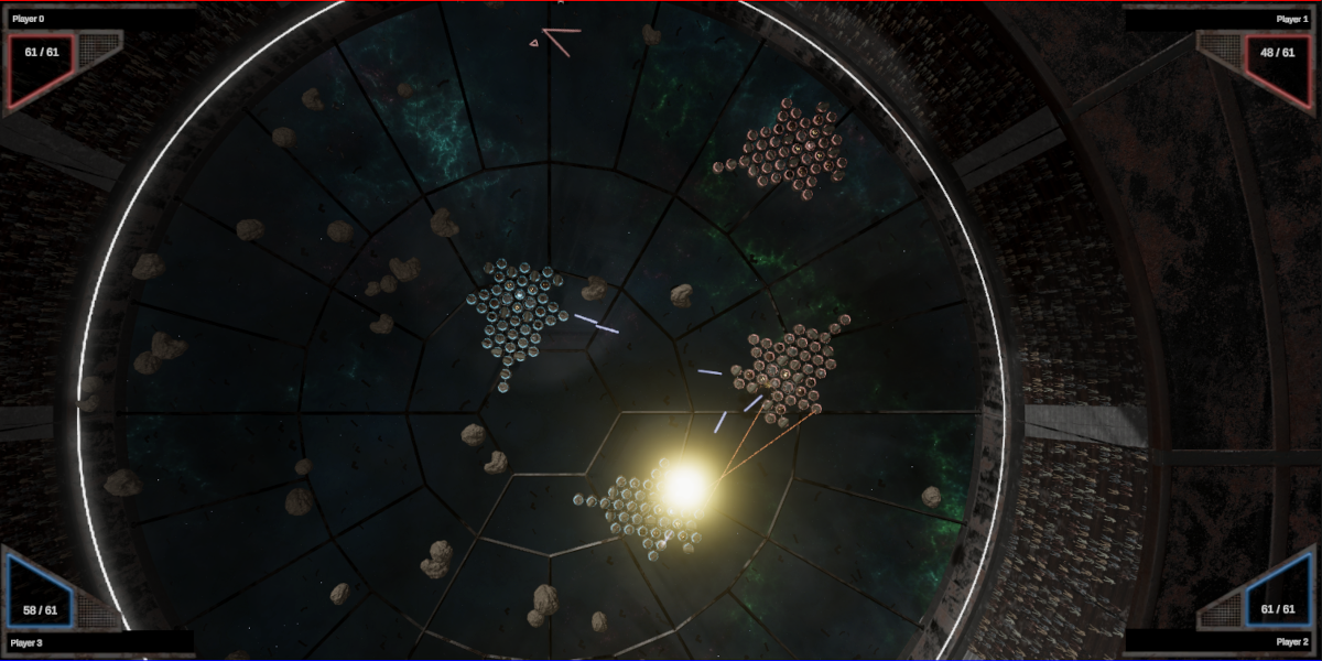
So far the AI combatants haven’t been capable of collaboration, which is why the cooperative mode is currently artificial and limited: only one AI player against one to three humans. This will change, as 0.5.3 will introduce a fully featured team mode (still limited to four players, though). In the future, human(s) can fight against multiple AI combatants, team up with them, even battle against others with AI wingmen.

As you can imagine, this causes major changes in AI, interface as well as other, yet uncharted places. Firstly, I had to teach the AI not to target or escape its teammates, be careful when they get in the way, not try to shoot through them, and handle their ships as obstacles that should be dodged. Although I would never trust my life with them, the AI pilots already work surprisingly well with those changes. Some sort of tactical awareness must still be added in order to make AI teams battle as a unit. And of course, there has to be lots of issues I haven’t bumped into yet.

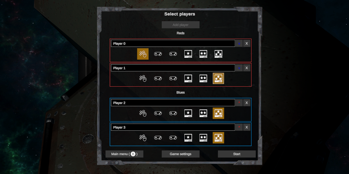
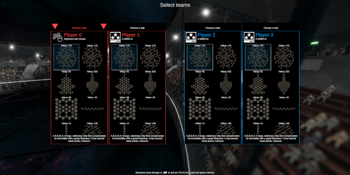
Additions to game creation and ship selection screens are needed. Menus will be completely redesigned at some point, but I made a rough implementation that should include all the mandatory functionalities (with lots of unexpected special cases).


Players must distinguish both their own ship and their teammates, which makes it hard to find good colors. For now, all team members share the team’s color, but I will try different red and blue variations for each individual in the future.


Lots of testing is required to make this work, so I have to organize multiplayer sessions at some point. I will post about those later.

One of the first posts in my dev diaries was about the difficulty of writing anything right after a release. Things haven’t changed. Last couple of weeks I’ve been mostly refactoring and making preparations as well as various small tweaks. So not much to show just yet, but here’s a few words, so you don’t think I’m getting lazy.

The most important improvements for 0.5.3 relate to moving and mishap handling. For instance, there will be new modules to ease the movement; perhaps a ramming weapon that would make collisions more rewarding so the movement could be utilized in battles. I’ve been also experimenting with a more forgiving energy mode, where overheating no longer destroys the energy sources. Instead, functions would just be unusable until energy sources have cooled down. How the cooldown period should work and how it should be visualized, is still to be decided. I will probably add difficulty settings for movement and energy handling. This would enable careless, easy matches as well as devilishly difficult ones.

But the feature I’m personally most excited, is the new team mode. It allows two teams (2-3 players per team, 4 in total) to match against each other. Humans and AI combatants can be freely assigned to both teams, so the current, limited cooperative mode will become needless. More about this in the next post, once I have time to design it more.

All right, I FINALLY got the version 0.5.2 finished and out! Releasing seems to get harder each time.

As usual, builds for Windows, OSX and Linux can be freely downloaded. Especially the OSX and Linux versions were hard to test extensively, so feedback is highly appreciated.

There has been a little pause in my development process, but I already have some kind of roadmap, so it’s time to clean up the TODO lists and kick off the 0.5.3 cycle. More about the future plans in the next post.

I’ve been experiencing some frustrating technical problems, which have slowed down the release process, testing and writing. Once I get the version 0.5.2 out (hopefully in a week or two), it’s time for a hardware upgrade.

But about the game.

One particular issue has been troubling me during the final testing: as the game has gotten more complex, the number of ways to screw things up has increased steadily. I actually gave mishaps a whole new statistics page for future expansions:


With all the hassle, it is often hard to tell if incidents are bugs or just unfortunate mishaps. This can become frustrating, and too much of the player’s concentration is now wasted on being careful. Even the best AI pilots aren’t immune to accidents. In fact, various collision fixes resulted in cases where AI opponents blew themselves up at the start. They should be more careful now.

Many of the incidents are somehow related to energy, and it looks like notifications about destroyed energy sources are not enough to clarify them. In the future, I will probably add a mode, where overheating no longer destroys the energy sources. Instead, all functions would just be disabled until energy sources have cooled down.

Another common mishap are cases where the colliding projectiles damage the ship that just launched them. These are double as harmful as normal hits, since projectiles cause damage simultaneously. Cannons can also blow up projectiles; these cases became more common after I fixed various collision bugs from the previous versions. Both projectile-projectile and cannon-projectile collisions are usually (but not always) due to aggressive spam-clicking.


Players can also get direct hits from their own projectiles. These cases are easier to detect, but one curious corner case has risen: the best AI pilots are pretty good with pressor beams, and constantly push projectiles back towards the launchers. So when you see mishap info about a direct hit, it might be because of this. Be careful when shooting missiles from a close range.


As a summary: it is hard to explain complex events in an arcade game’s feedback loop. In typical simulations, tempo is slower, making it possible to open up the causality; in arcade games, there’s no possibility to do so without interfering with the game flow. Text notifications are quite bad, as no one reads the messages during the battle. An icon flash etc. on the crosshair would probably be better. I will try to improve this in the upcoming versions. As always, feedback is welcome.

Thanks.

About those unpredicted simulation issues I mentioned earlier…

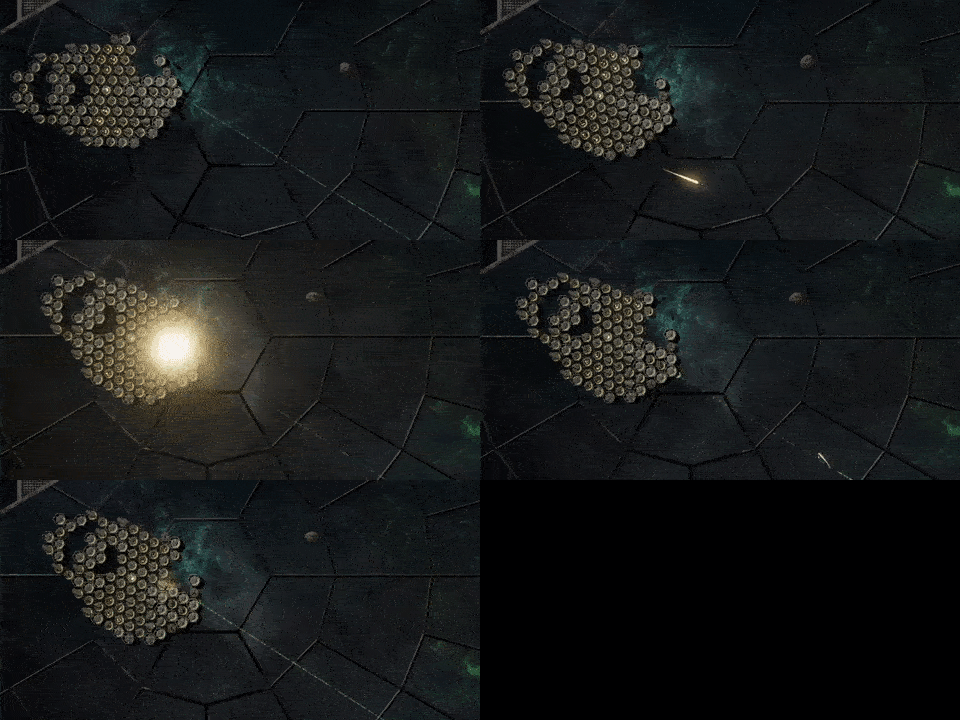
Many unexpected things can (and will) happen in physics simulations, many of them because of the mathematical inaccuracies. So far ATP has mostly used discrete collision detection, which is performant, but sometimes unable to handle small objects with great velocities. In the animation below, for instance, a pressor beam gives the missile a double push, causing it to speed through a module.


Limiting the velocity probably helps somewhat, but similar may happen also on CPU hiccups. For a more complete solution, three collision calculation modes are introduced:

  • Fast. Always uses the discrete model. This is similar to the one used so far.
  • Accurate. Always uses continuous calculations. The most accurate one, but may increase the CPU load on action-packed situations.
  • Analytic. Default setting that tracks the projectile velocity and adjusts the mode accordingly. If everything works, this should have the benefits of the other two.

Settings page is quite badly organized. I should probably re-group all the performance-related stuff, both graphical and physical. But as I have the version 0.5.2 pretty much wrapped up (and tested also on Linux), that’s a job for 0.5.3.

Unity Hub writes log files that may give some clues. See the bottom of page https://docs.unity3d.com/Manual/LogFiles.html.

That said, Hub seems rather unstable at times. I’ve had to un- and re-install it several times during the last couple of years. So that might help also (it shouldn’t affect Unity Editor installations).

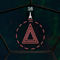
Crosshairs are pretty much the most important source of information in ATP. They have changed a lot during the development, as can be seen from the history video I posted earlier. They must meet two, often conflicting requirements: be clearly visible, but not get in the way. Earlier version (seen below) didn’t quite succeed with the latter one.

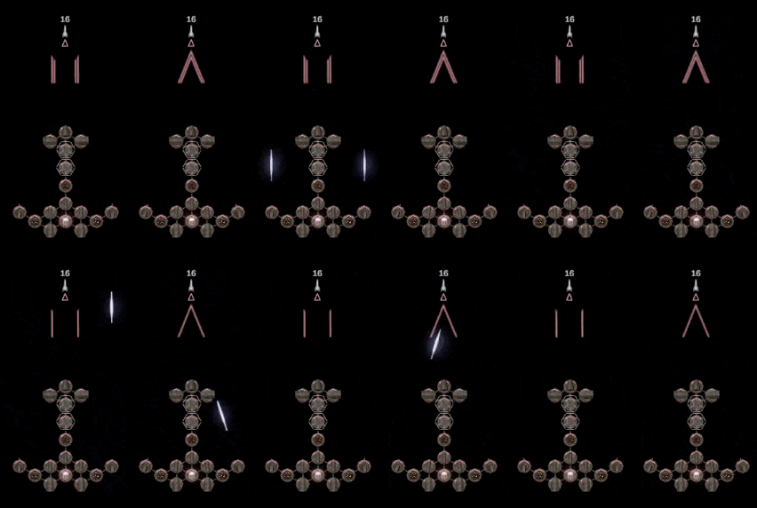
I had already reduced the crosshair opacity. To take things further, I got rid of the useless outer circle, which (I think) had some kind of purpose that I’ve since forgotten. Additionally, closed aiming triangles and rectangles were simplified, and two lines to indicate simultaneous shooting is enough instead of previously used three.


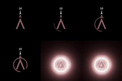
The circular energy bar opacity now increases with the energy consumption. In order to keep players aware of the usage, the circle starts blinking when the consumption exceeds 66%.
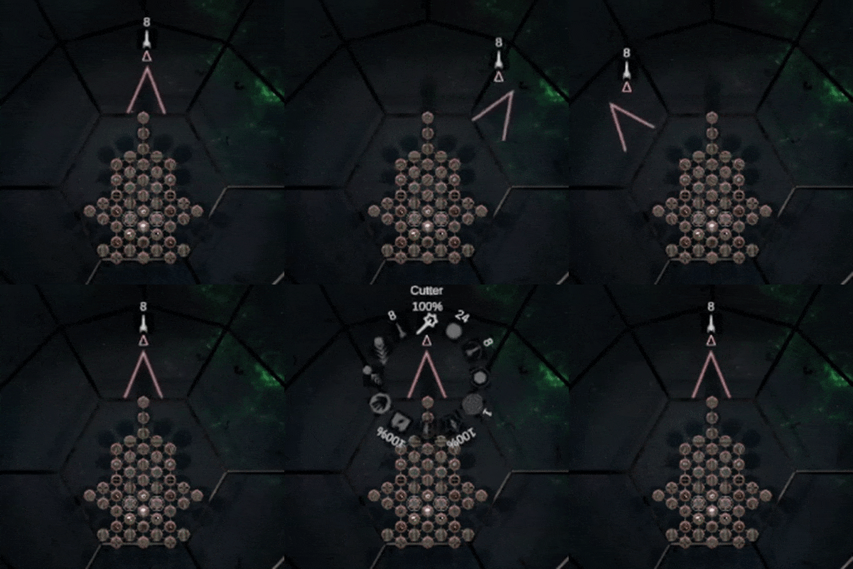

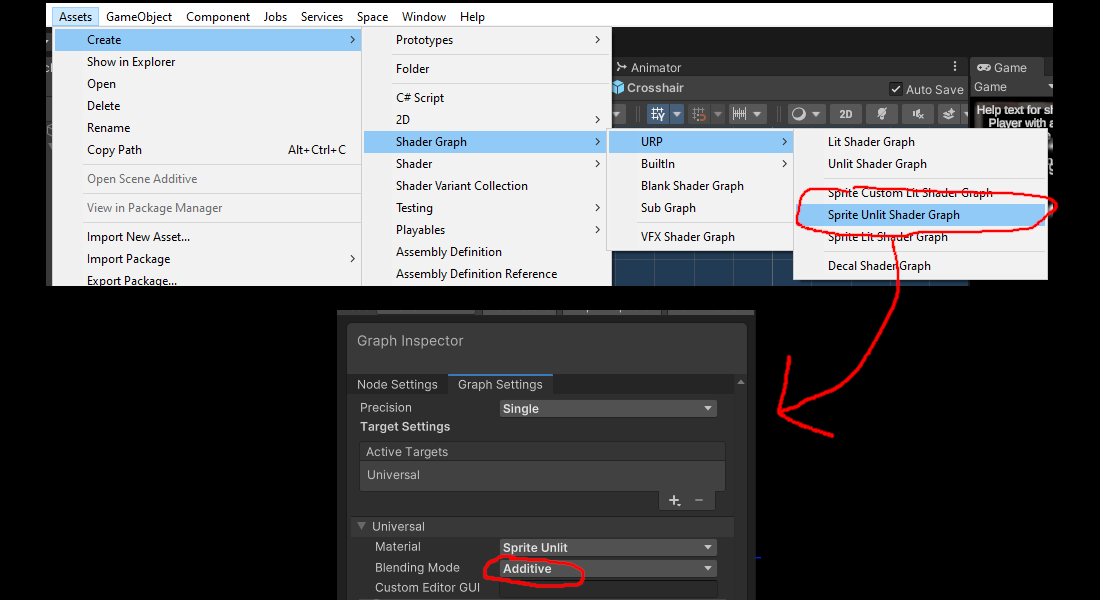
Adding the bloom effect was easy, as crosshairs are world-space UI-components. Nowadays additive GUI shaders can be made by creating a “Sprite Unlit Shader Graph” asset, and setting blending mode to “Additive”; I should probably replace my custom additive GUI-shader with this. It seems that the overlay camera’s bloom is also applied to the base camera, so game view and crosshairs must share the same post-processing effects. I may be missing something, but I didn’t find any way to change this via layers or anything.


This is how the new crosshair looks in use.


Beside this, I renamed and re-balanced some modules. As it often happens in simulations, every fixed feature seems to break two others. So (once again) it took longer than I expected.

My computer is starting to fall apart, which slows down things. Hopefully I get the version 0.5.2 out before I’m forced to get a new one. For the next release, there are plenty of small things going on that are harder to explain than fix. But fortunately something visual too.

I recently found a suitable asset to replace the previous placeholder lens flares: SRP Lens Flare, a free product in Unity’s asset store that is well worth advertising. With a little customization, I got pretty much what I was after, and now the sun and artificial lights look like they should.


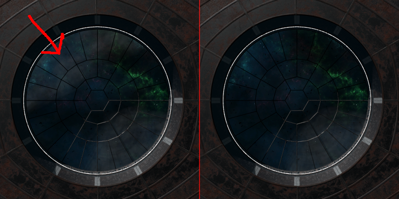
There was also a glitch with the shadows. Hardly noticeable one, but irritating when found. Arena geometry that is never visible in the top-down view was culled from the battle camera by assigning it with a special layer. This geometry included the arena's outer walls. In Unity, only visible layers seem to cast shadows, which made sunlight leak to the arena (see left image below). Fixing was easy: just a change to the geometry's layer. But of course, larger shadows darkened the arena, which had to be compensated by increasing ambient light. Hopefully this doesn’t reintroduce the brightness balancing problems I used to have. Image on the right shows what the shadows should look like.


I also redesigned the crosshair and made it simpler, which I will tell more about in the future. And I created a Twitter-page! As I’ve never been much into social media, the next thing is to figure out what the heck I should do there...

“Crayon/pencil” was my first thought also. For drawing platforms or blocks for enemies etc.

Funny and distinctive combination of semi-realistic and hand drawn styles.

Lovely artwork.

As the game happens on a notebook, there could be holes in the paper for jumping from a page to another, switching from 2D plane to another. Like in the comic “Le Processus” by Marc-Antoine Mathieu. With a nice transition animation of a flipping page, of course.

I wrote an article about the test session held on 28.1. In short, the result was a couple of new gameplay videos and delightfully few issues. You can read more here

Time to start finalizing the next release.

(1 edit)

Damn, it’s hard to get anything written when you keep finding new issues all the time. But here’s a sentence or two about small improvements I made right after the first test session.

I did some GPU profiling (which you should be doing constantly!) and noticed that one render line took almost two thirds of the processing time. The bad guy turned out to be the smoke under the arena, purely cosmetic, embarrassingly unoptimized. The effect uses lit particles, a relatively new feature in URP that looks nice in motion, but seems to be heavy for the GPU. I made the particles much fewer and larger, which improved the performance without any perceptible quality loss (image on the left below). Lower quality settings now use unlit particles (center), and it is also possible to turn off the smoke completely.


In very old computers, the difference between lit and unlit particles isn’t actually that big; GPU and translucency seem to be the bottleneck here. Without the smoke, everything works fine even on very old laptops.

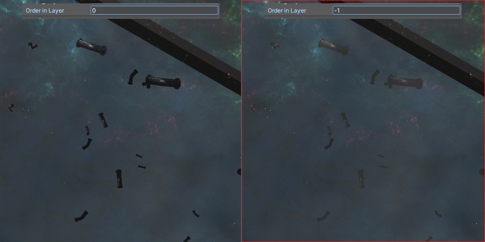
I also noticed that another background particle effect, scrap, looked like crap as it was drawn on top of the smoke. I dropped its “Visual Effect” component’s “Order in Layer” -value (under “Additional Settings”) below the smoke, and now it blends in well.


And as always, the AI tends to abase its programmer more than it does the players. This time it wasted so many missiles on irrelevant obstacles that I had to command it to check if the trajectory was clear before shooting. The checking algorithm isn’t perfect, but certainly an improvement. The balancing seems like a constant challenge also: AI still tends to be either suicidally aggressive or overly passive.

Combats get sometimes too chaotic, which harms the gameplay by taking away the feel of control. A slight improvement was to increase cannon shooting interval from 1 to 1.5 seconds per cannon. This should emphasize accuracy and reduce the risk of tendonitis, hopefully also balance the overpowered close combat ship.

There have also been positive findings: the audience didn’t cause noticeable performance drop on any device, so I can let in even more spectators.

Next post will be about the second test session. With some new video footage.

EDIT: I brightened the images so you can actually see something.

It has been a busy week with ATP and outside it. I managed to organize two testing sessions with different sets of players. I wrote a report about the first one with a couple of videos and an overview of the issues we faced. You can read it here.

I’ll cover the second one in the near future. Before that, I think I’ll have to write a post about all the improvements I implemented between the sessions.

Great use of shading and shadows. Colors and contrasts look exceptionally rich.

More than a space shooter, this reminds me of good old Descent

Images didn’t raise any randy feelings, but the body proportions of those women made me smile. And that is good.

Funny little game. I like the spongy material of the tiles. It makes the climbing funny and unpredictable.

I cleaned up my hard drive and bumped into a set of old ATP clips from early 2019 to late 2021. It took some time to get them in order, but I managed to edit a clumsy little history video with some extraneous organ music. 

It was fun to look back and see how the graphics have evolved. I started as a complete beginner, long relying on placeholder cubes and spheres only. And though I’m still far from a pro, I’ve learned a lot. I’ve also managed to stay faithful to the game’s core idea; apart from a few renamed and abandoned module types, the ships from 2019 are fully compatible with the upcoming version.

In due course these clips will make good content for the floating media cube “Mauno”. I just have to be careful with video format compatibility between platforms.


While suffering from a nasty flu, I had time to further experiment with baked lighting. Light and shadow textures are deceptively large, and my aim was to reduce the build size from the current 1.5GB.

First I switched the lighting mode to "Baked Indirect" since I really didn't make any use of baked shadows. This alone dropped space requirements by a couple of hundred megabytes. Encouraged by this, I completely removed light maps from all dark arenas (small, medium and large; used during the battle), and increased ambient luminance instead. As you can see, the difference is practically nonexistent. The build size, on the other hand, went under 1GB.


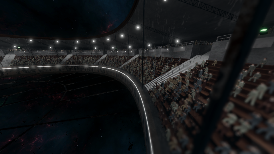
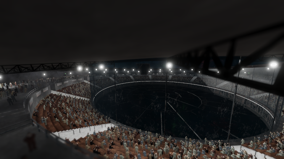
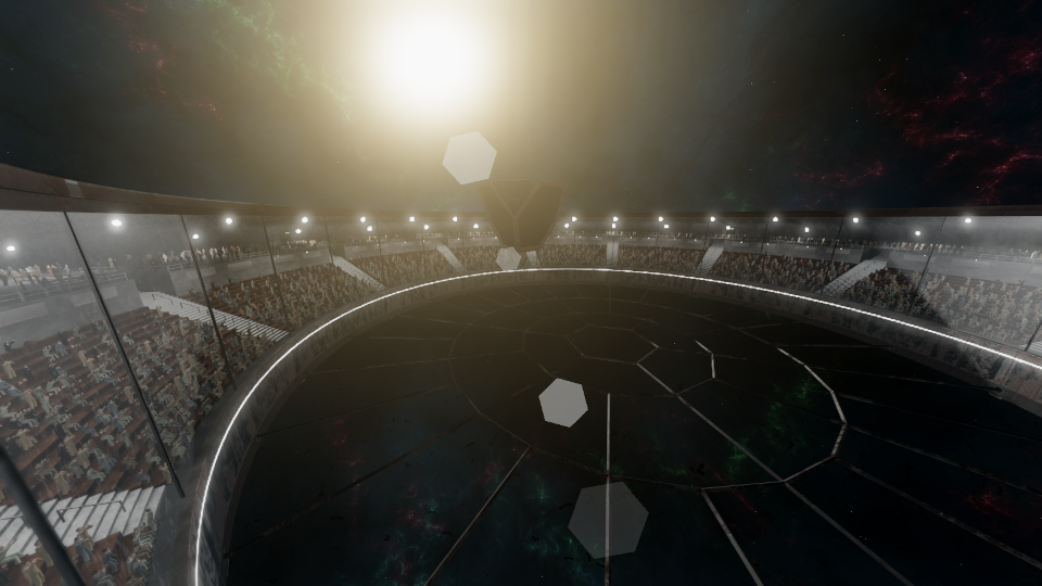
Now there’s only one scene (lit arena behind the GUI) with baked textures. This speeds up the lighting process significantly, as I don’t have to deal with the other three anymore. Here are some images of the lit arena.


I sent the current dev version to several test players for quick feedback. Some bugs were found and fixed, but otherwise the game seems rather stable. GPU load has been increased somewhat, but it seems that 2GB NVIDIA GeForce MX150 is very capable of running the game, so nothing serious there.

I like the colorful, stylized graphics. It will be interesting to follow how this proceeds.

I love how excited the character looks in idle animation. Eager to get back in action.
Beautiful palette and atmosphere effect.

I’ve almost run out of trivial improvements, and all unfinished features seem rather large. I take this as a sign to start wrapping the version 0.5.2 up, and continue other tasks in the next release. I should probably learn to make releases more often. It’s just that my methods are quite experimental and ineffective, so definition-of-done can be rather unclear. I also spend too much time on small bugs, which causes me to miss many of the more important ones. More frequent test sessions would certainly help with this.
But let me summarize the current situation:

  • GUI and controller navigation works rather well, although 0.5.2 will probably have some minor issues still.
  • I’ve refactored GUI widget objects/code, and cleaned up their appearance a little. Graphics will be finalized later; now I should be able to concentrate on them instead of constantly tweaking the functionality.
  • Multiplayer selection screen is usable yet cumbersome. I will redesign the layout for 0.5.3.
  • AI has already improved a lot since 0.5.1, but personalized opponents are not ready. Each one will have a portrait that, with my graphical skills, takes most of the time.
  • I have a vague idea of how to improve the tutorial. It may even make it to 0.5.2.
  • The game currently takes 1.5 gigabytes of disk space (0.5GB compressed). It isn’t all that much nowadays, but almost half of it consists of light and shadow maps that, honestly, don’t even make things look that much better. I’ll rebake those; very low resolution should suffice for darker scenes.

Away from home, without access to my dev machine, I won’t be jamming the thread with GIFs this time.

Have a happy whatever you’re celebrating! And if nothing, be happy anyways.

There has been a minor issue that ship paralyzation (game over when all the energy sources are lost) isn’t clear enough. Besides a small info text, only a power-down voice has indicated it.

So I added this fancy lighting effect, boosted with a distorted sound of electrical failure. Hopefully they make paralyzation clearer.


Doing such an effect was surprisingly tiresome for the eyes. Luckily for the players, it usually appears shortly from a distance.


Besides this, I have extensively tested the game solo by relying solely on the gamepad. Apart from some minor issues, the controller navigation seems to be pretty flawless; must-have features for the next release start getting ready.

I watched the trailer without any prior knowledge of the game. Here’s some of my thoughts.

It’s basically a moon lander game. Music and overall mood is OK, but you could tighten up the editing. Takes are pretty similar, so the video would fit in 20-30 seconds without any crucial information being lost.

If there’s some specific twist or uncommon game mechanic, you should probably concentrate on that. For example, one short scene of each feature mentioned in your game’s description: “rescue survivors”, “recover resources”, “settle a new planet” and “allow your people to thrive”. Total four takes.

But I think that’s a technically good start. TV-commercials are usually around 30 seconds long, and you’re going to notice that it’s extremely hard to summarize anything in that duration (especially without lazy explanatory texts).