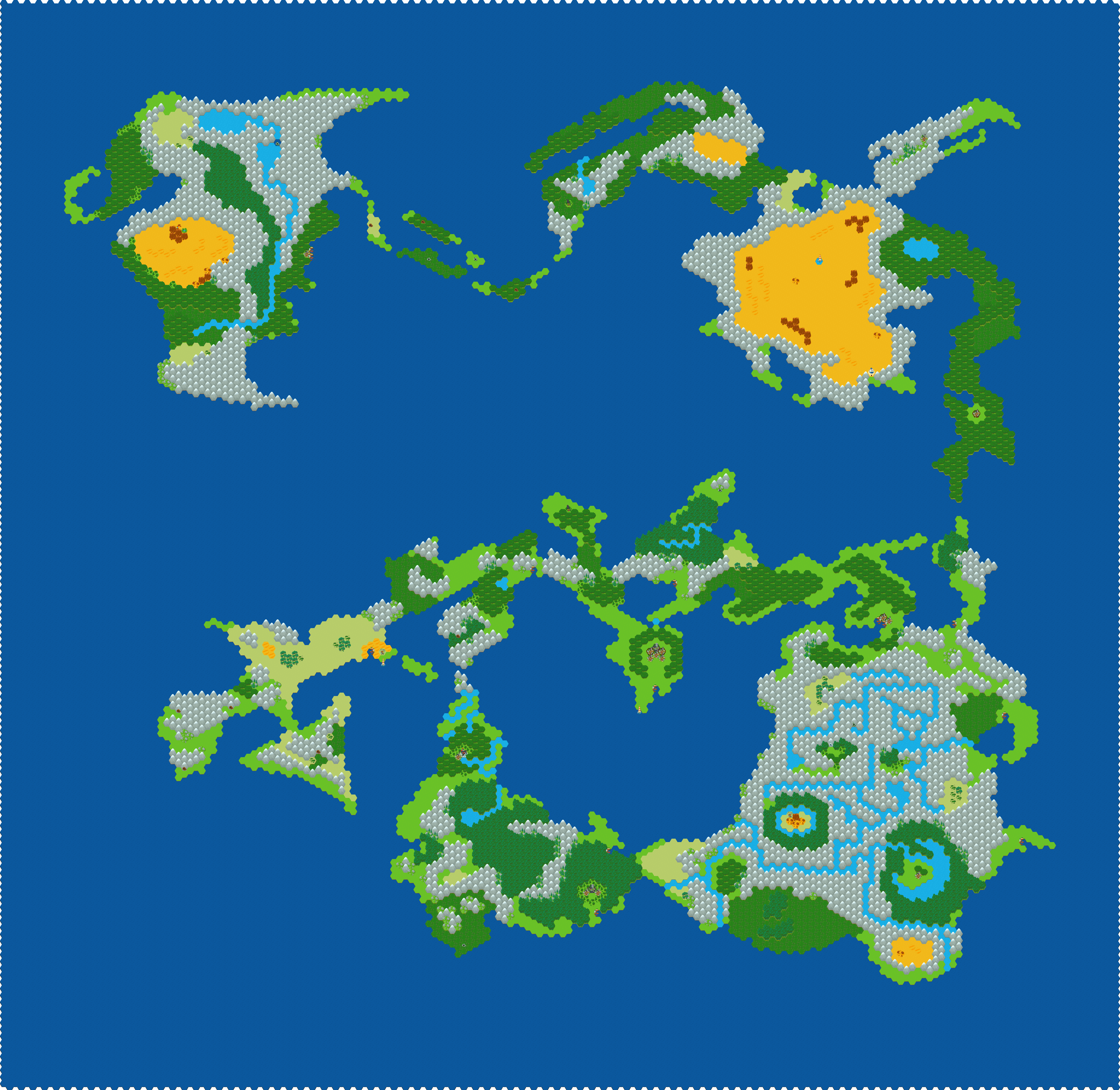
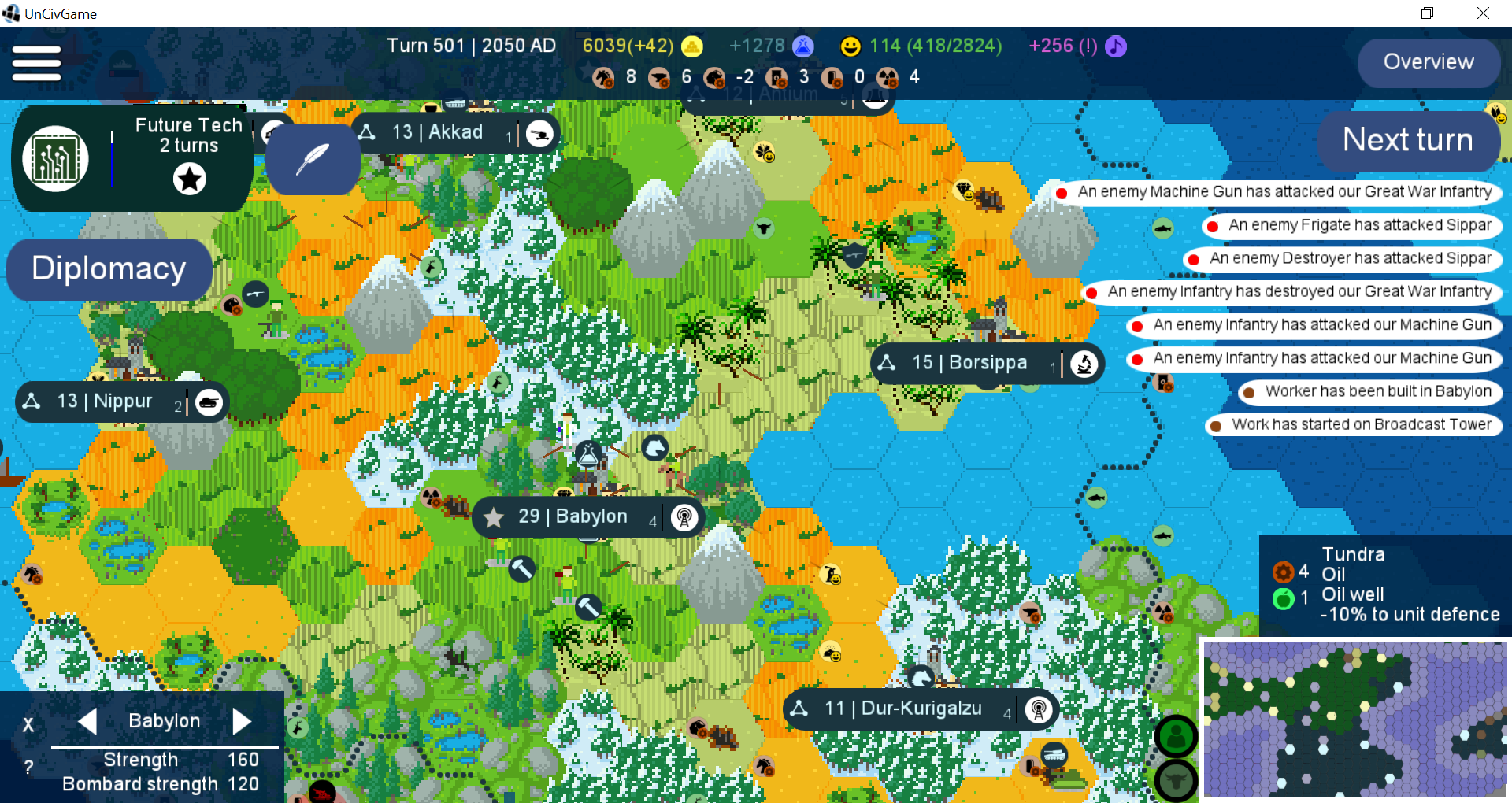
I actually took the tiles I could find in the comments, organized them as best I could and as I considered to "make sense", and also created a few new ones, mostly by cutting, pasting, and photoshop voodoo:
Most notably, I "externalized" several assets, such as the graveyard(s) so that they can be used on any background; it turns out that Tiled handles .png semitransparency just fine, so shades can be created quite easily by painting a black with an opacity of ~13%; some may require more creative uses to look good on certain backgrounds, for example, the "tents and stones" which are intended for a desert background required using just plain red for shading to look good (imho).
I also organized everything into a foldered .psd with a helpful custom background, which I might as well share: https://anonfile.com/Xa52M3y2nb/Tileset_psd
I'm pretty OK with manipulation, however, I'm terrible at original assets, myself. What I'd like to see, but am too painfully inept to do myself, are more "random" assets and "markers" or "terrain features", such as temples/henges, various types of ruins, castles, keeps, and I'd very much like to see something denoting a small village, as well as a trading post; just a few houses and a palisade or something.
Cheers, I love the package!
Edit: Also, I've just found out that it is possible to flip tiles in Tiled by pressing "X", meaning that several tiles in this package serve no purpose, including half the harbors. Worth keeping in mind.
Edit 2: Finally, someone correct me if I'm wrong, but the Tile Properties setting(s) for these tiles is Orientation Othogonal, Grid Width 32px, Grid Height 48px, Drawing Offset (0, 2); Map Properties setting(s) need to be Orientation Hexagonal, Tile Width 32px, Tile Height 28px, Tile Side Length 16px, Stagger Axis X.
Viewing post in Fantasy Hex Tiles comments
Woah. Thank you for taking the time to do all of this! I know tiled can be a bit difficult to get into. Every time I revisit it I end up bit confused and having to relearn it a little. I also keep meaning to update the original sheet with my takes on assets people have made and getting permission from them to put them into the initial set, but life gets in the way sometimes.
I appreciate all the ideas for new assets to sit ontop of stuff too, that's great and maybe easier for me to dig into than whole new tiles for all those things. When things smooth out and I get a chance I'd love to add them!
Be sure to share the things you make after putting all this hard work into organizing it all! <3
Just FYI, I think row 8 is off by a pixel. I created a blank background image to make sure everything is oriented correctly that might be useful for anyone making more tiles. 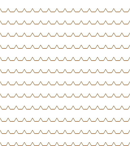
And here's a close up of row 8, showing slight misalignment. 
Also couple pictures to show why I organised them in a tall thin column, 8 wide same as original tiles. it was merely because it gave me more space to use the screen, as I'd rather scroll further than be really zoomed out or have to use up the screen with the panel more than I need.
8 columns: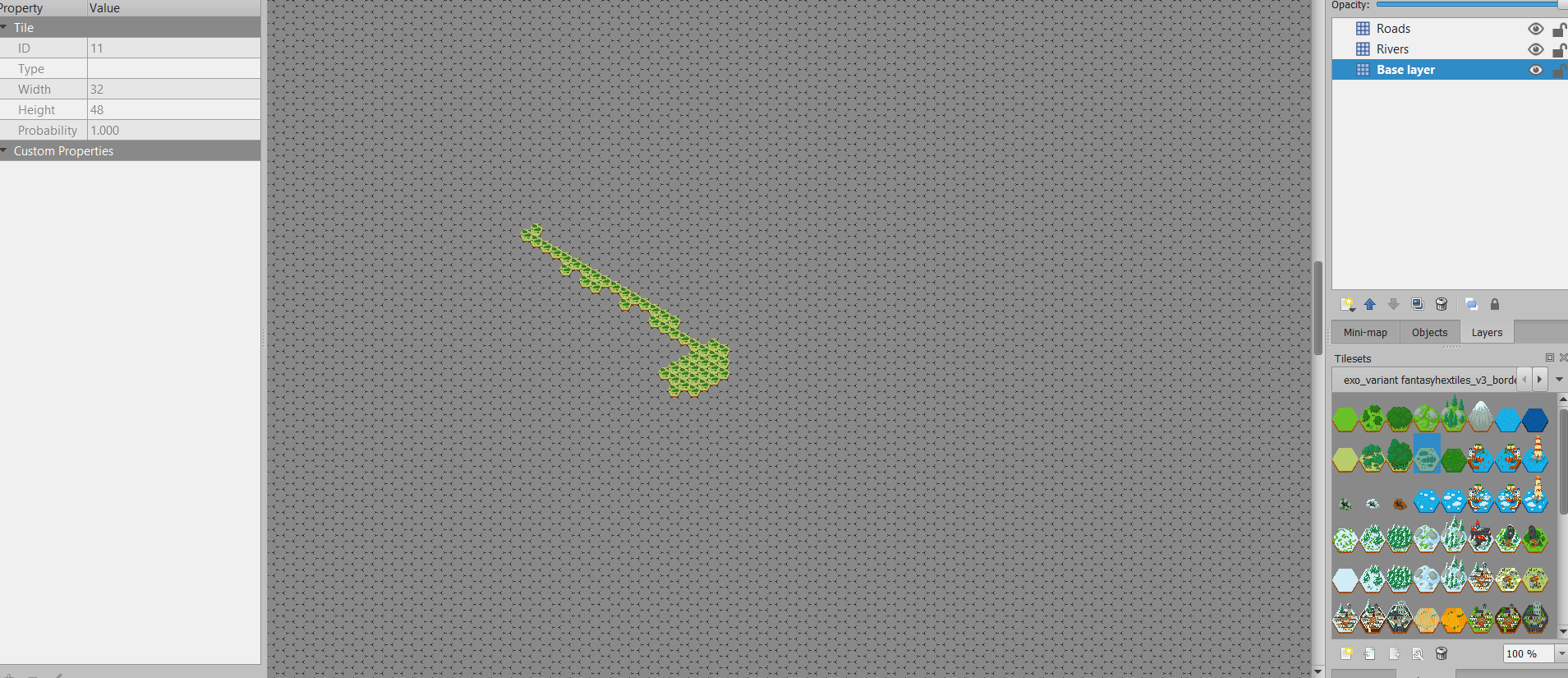
Lots of columns: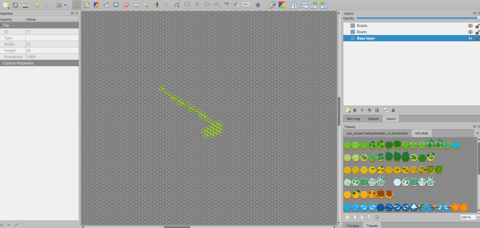
I spent ages organising the tiles in a way that made sense to me with just 8 columns but eventually just decided "good enough" as I didn't want to spend ages figuring out the optimum way to organise pixel images.
And here's a copy of 8 wide blanks in case people are lazy and have the same idea.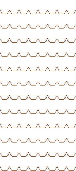
Edit:
Further tile ideas because while I'm here why not:
More ash wasteland, dead and/or burned forests and charred landscapes, settlements that have been damaged or destroyed.
And well it is a fantasy tile set:
Fantasy landmarks, monoliths, giant statues, etc.
If it's possible with such a little amount of pixels to create very different settlements, then:
Non-human settlements, elven, orc, dwarf, goblin, etc.
(if not possible with this sizing of pixels, perhaps CuddlyClover would you want to make a larger more detailed tile set? Not sure how scaling would work, but I could potentially create bigger versions as a test and see if you/anyone wants to roll with it for those that want more detail)
Fantasy forests, i.e. different colours to green, different shapes, or perhaps just really big trees/a central giant tree.
As you said "x" flips the tile horizontally in tiled, could have a lite version of the tileset which just has 1 variant of each tile type, and a bigger set with multiple variants, preferably all alignend the same way, and then pointed out to use x to flip the tile horizontally.
Rather put ideas out there in case someone wants to do something with it related to this tileset
In case it helps anyone - the settings above got me up and running. The only wrinkle was on the tileset properties. When you pull in the tileset and go to tileset > properties, there are two "halves" to the properties display. Properties at the top half of the list and are normal font. That was where I was changing properties and still having problems. Then there are "image properties" in the bottom half. They are greyed out and they are the ones you need to change. You need to click on the image filename, then select the edit button and you can change them. Hope this helps!


