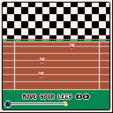
A well done button mashing game. But why is this sad black and white pattern using half of the screen? :(
Viewing post in Pico-Race jam comments
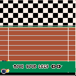
Thanks for all the feedback and those MS skills are better than mine. I think I had it positioned like that because I had preview disabled and as I was more attracted to it being in the lower third (I think this has to do with the Rule of Thirds from photography). With the text though, you're probably right and it needs to be boosted up.
Here it is shifted up 12 pixels:


