Hey Sprit Corgi 👋,
What Stood Out (For Me):
Lively Towns / Cities:
I'm not sure how RPGMaker (This utilizes that engine right?) works, but the way the cars are driving around, and people are walking about and conversing with each other, and the presence of the police, etc, helps immerse me into the world.
Battles: I'm not big on heavy dialogue games, but the presence of battles helped balance this dialogue, and this was my favorite part of the game.
Characters have personality: The dialogue showcases some personality in characters that makes them feel more alive rather than just fulfilling a role.
Feedback:
Get the player making choices sooner? (Just a thought):
The heavy dialogue sequences at the beginning of the game may put off some players who would come to really enjoy features such as the battle system. If you could perhaps shorten the duration between scenarios where the player isn't able to make any interactions with even a few choices (to make the player feel they are part of the story), could help.
Battle Indicators:
There were a few times at first where I was unsure why the card I was clicking, wasn't activating. The dialogue at the beginning seemed to place importance on utilizing quick attacks at first but I noticed I couldn't use them at the start of battle (later I found out I need specific points to activate the quick attack).
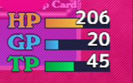
One issue with the colorization of card points to indicate TP vs. GP is that when these bars are empty you can't discern the color of the points and thus, it's difficult to know which cards reference which points.
Is it possible to change the UI to something like this to be more indicative of cards and points?:
Battle UI:
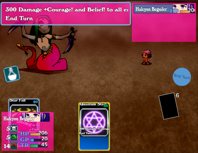
The Character Stat UI is generally in front of the first card (from left to right), perhaps changing the interface to where all cards are readily visible could be helpful.
Also a battle question:
Do you know why I was not able to use this card, is it not a 30 TP cost?

Well done Spirit Corgi, it seems like a lot of effort has been placed into the game so far. Keep it up 👏.

