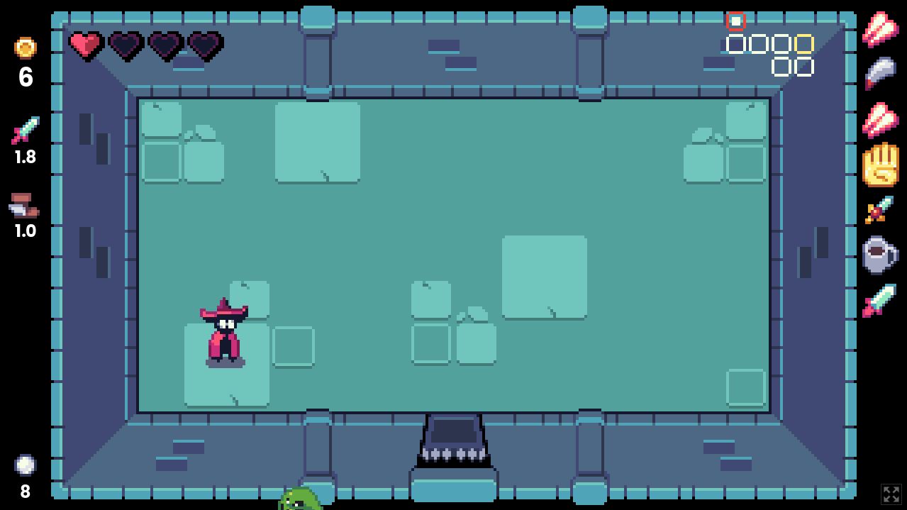
The new build is live! Thanks again for the feedback.
I like the art and the balancing is already very good. At no point I thought the game was unfair. The monsters are also cool. Bellow are some suggestions for the demo. Some points may be not so important for you at this special point of development (or at all). So take what's useful for you :-)
- You should add some kind of animation to the main menu. At my first start I thought the game did freeze, because i couldn't click on "Start Game". Maybe an animated frame for the selected menu-point!?
- Replace the "g" in the shop with the gold-sprite. At first I didn't understand what the "3 gram" beneath the item could mean ;-D
- A hover animation for the shop-items would be nice. Otherwise there's no movement in the shop and this feels a bit weird.
- You should pick a different font. One that fits better for pixel art games.
- After "Set Fullscreen" the keyboard-input does not work. You have to click on the screen to get the focus back on the game window. Does not happen every time. But maybe it's "just" a browser problem, not a Godot problem...
- I don't like Midas Charm. It's cool that I get extra gold, but to get no more hearts/health from this point on (as far as I know) is hard. I would rethink this - however, I don't have a better solution at the moment :-)
- The dungeon stairs should only be accesible from the right side (as you would expect because of the sprite)
- There should be a way to get back from "Essence Upgrades" to the main menu. Just to have a "correct" main menu.
- The symbol for a spawning monster is a call sign in a circle. I would replace this symbol, because it does not fit into the world. Maybe pick something like the symbol of bowsers face.

- this one is very nitpicky: pushing hearts, you can't pick up (health bar full) does not feel "good". I suppose this is because of a circle-collision shape. Maybe you should not be able to push them at all!?
However, I like your book, like your YT content and the podcast is a great idea. Thank you for your work Ben!


