Indie game storeFree gamesFun gamesHorror games
Game developmentAssetsComics
SalesBundles
Jobs
TagsGame Engines
(+6)

This was a great mystery game! It feels incredibly polished and complete, which is impressive given that it’s also ~2hrs long!

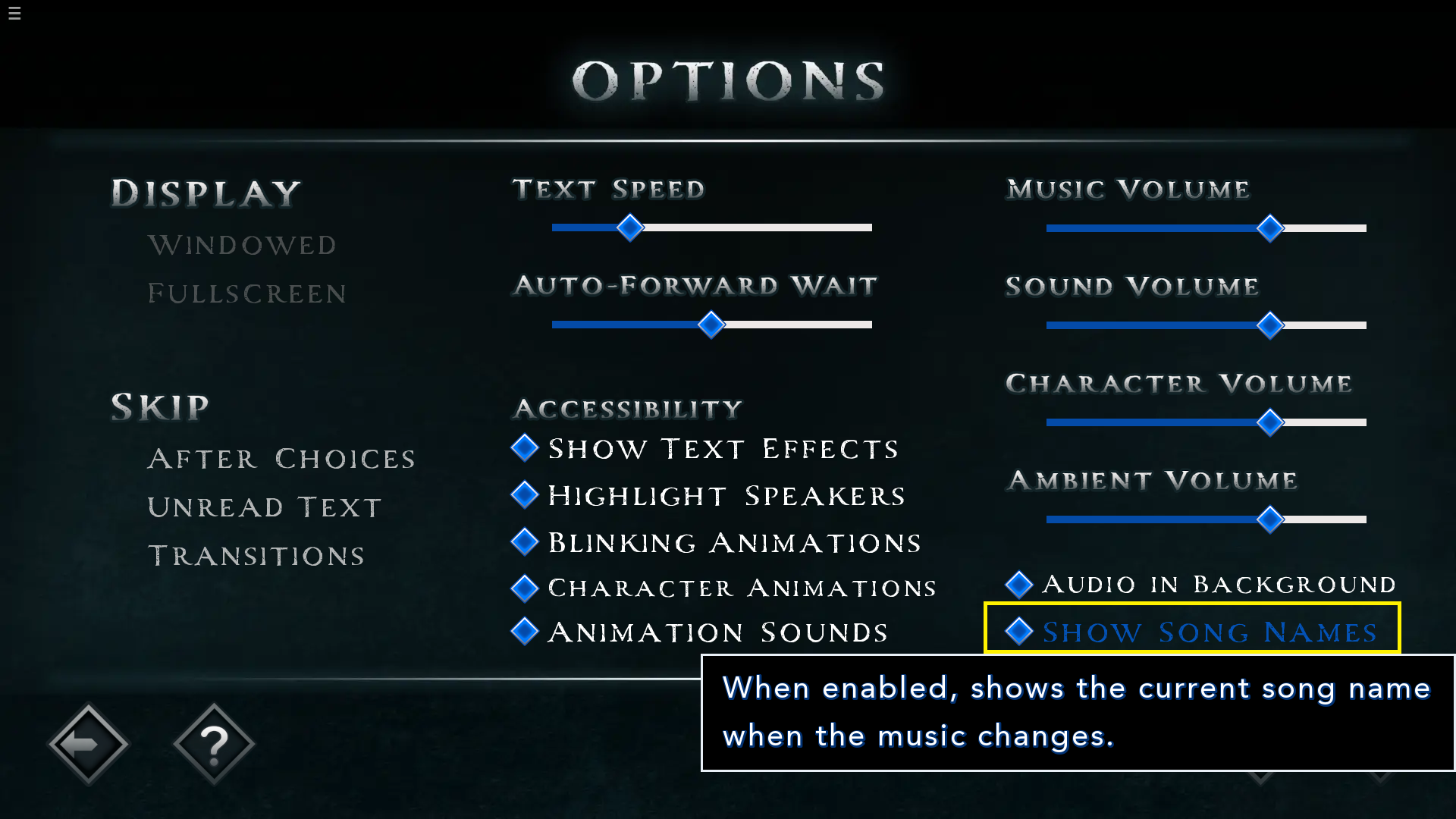
The UI is so well-designed, and the level of polish really sets it apart from vanilla renpy UI. The “now playing” music tab was a great touch for accessibility - it would be awesome if that was something you could toggle on/off in the options menu.

The story was really interesting, and the Clues tab was a great option to help track evidence and build theories. I didn’t figure everything out, but the majority of the reveal felt like something the player could have pieced together, which is nice. I agree with a couple other comments that the pacing and tone of the very end feels a little strange - [POSSIBLE SPOILERS AHEAD] I think you could get away without the last scene back in the house, and keep the fates of those characters a bit more mysterious.

Overall, a great entry with a clever mystery! Very nicely done.

(+4)

Hi, thank you for playing!

The UI is so well-designed, and the level of polish really sets it apart from vanilla renpy UI.

As the programmer for Reaplaced, I appreciate the kind words! 💗  RavEN, our GUI artist, did a fantastic job making the GUI assets, and we both spent a lot of time crafting and iterating on the UI, so I'm glad that it comes across when playing the game!

The “now playing” music tab was a great touch for accessibility - it would be awesome if that was something you could toggle on/off in the options menu.

Thank you for the feedback! 👏  There is actually an option to toggle the "Now Playing" tab off, but the name for that setting doesn't mention "Now Playing", so I can see now why that connection wasn't so obvious. ^^;  I'll keep that in mind for future (including our upcoming Steam release of Reaplaced), making sure the settings better match up with the labels and text on associated features. 👍


(+3)

Oh! Not sure how I missed that - that’s really obvious 😅

(1 edit) (+3)

Haha naw, it's all good - happens to the best of us. :p

And besides, it gave me the idea to use the same image and wording for that setting as the notifications themselves, which IMO looks even cleaner! 💪🎵