Alright. I've spent a couple days toying with this, so here's my thoughts.
The core design here isn't half bad. The early power curve feels a bit stiflingly slow, but it's a story-based tutorial chapter, and it does its job well (even if I'm miffed I didn't get to recruit the precious little kitty cat to my party). Though the game doesn't introduce players to its more interesting systems presently, the unit summoning and merging have some interesting merits and trade-offs to consider, and overall progression feels nice, even though the game itself often feels ploddingly slow, even with a full party. Some sort of speed-up option would be deeply welcome here, especially since combat is, at present, extremely hands-off. The progression carries the whole package for now, which is extremely important for the genre, so that's good.
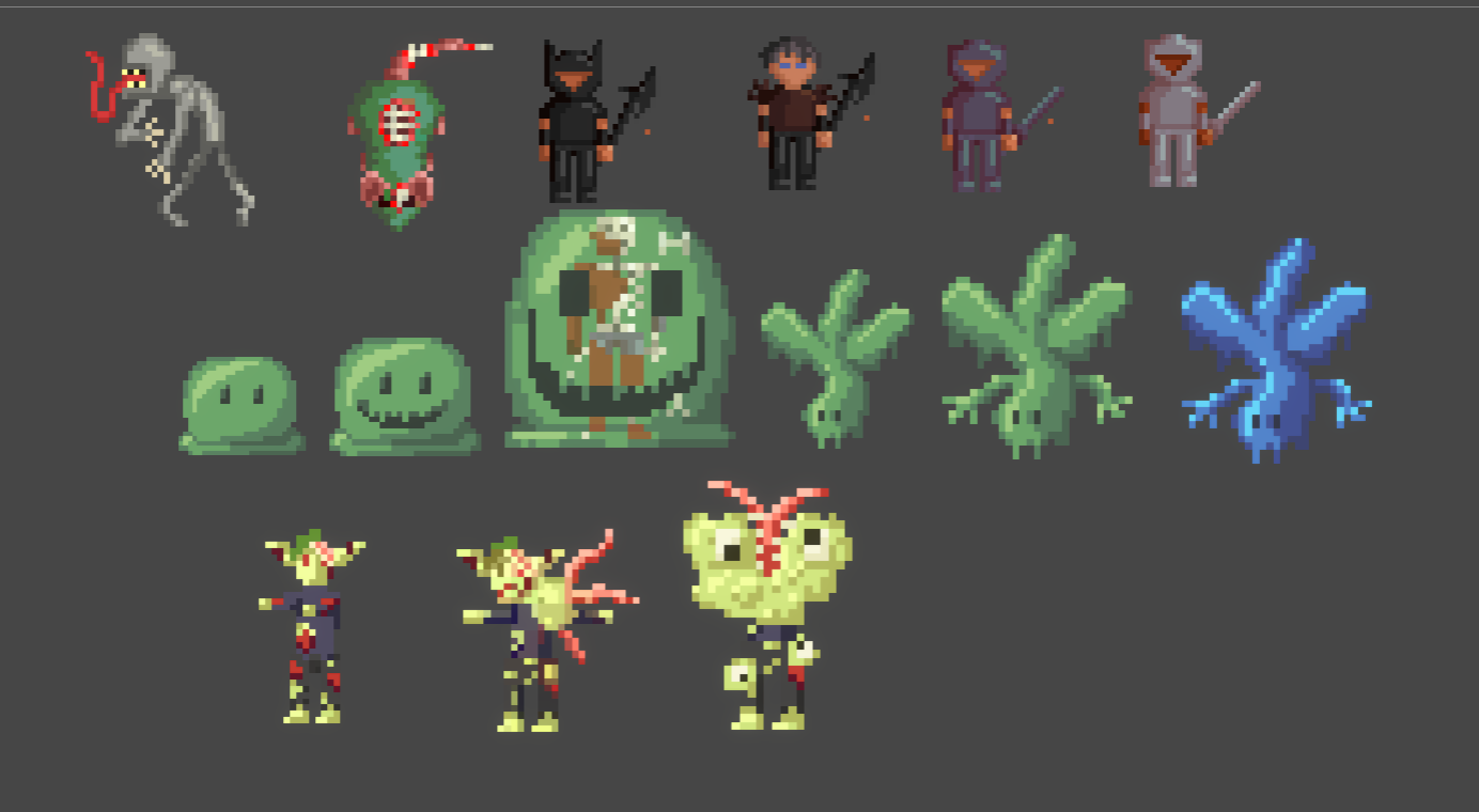
On the presentation front, though, the whole thing is sort of a mess. The assets don't mesh well, and when scaled up for dialogue the pixellation is pretty wild. The calligraphy font chosen for titles and such is extremely difficult to read, and the spelling seems out to create an entirely new written dialect of the English language. Some items, such as the topmost upgrade at the blacksmith, are simply hanging out of frame, obscured by the UI. Flavor text that most games would save for hovertext tooltips is abundant to such degree that it's often hard to parse what an actual upgrade even does, and the text that actually explains that tends to be cramped into a much smaller chunk of screen real estate even though it's the important information. The value of health, mana, and anything else tied to meters doesn't clamp, resulting in action bars spiking out of bounds and health meters entering wild negative values so long that they can sometimes obscure a neighboring unit's meter entirely on your status summary. Sprites in combat are extremely tiny, and they and the field are in an entirely different style from everything else in the game. Screen real estate on a whole seems partitioned off haphazardly on all fronts. It feels like bloom lighting and shadows won out over legibility and basic, functional UI no matter how I slice it.
In terms of actual bugs, you can merge units so long as you have the RP to do so (a number that seems completely separate from the RP used in the church???), even if you have no units to merge. This basically just resets your guy to level 1 with no benefit. It seems like that shouldn't be an option to begin with? The text windows that pop up after clearing the first chapter also do not scale to screen size, which I found out because you're using a lot of it, so I had to zoom out the web page to do much else with my screen
I feel like there's a lot of promise here, or I wouldn't bother with it for so long or have so many thoughts. There's a good, solid foundation here, even if most of the assets are almost certainly sourced from elsewhere. I know the project is early on, so I can be forgiving of a lot, and I've already seen that the next update involves someone playing spellchecker for you so that's already a good start. I hope to see this improve and live up to its potential!


 )
)