you have alot of potential my man :) so im only glad to help ^^ after all it helps me too =P that and ive had a couple of artist friends over the years and ive gotten kinda used to giving appraisals, tips and help xD i cant do this stuff myself but ive got a pretty good eye for it it seems =P
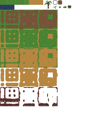
so im having a look att your new stuff while waiting for a meeting to start =P I like what you did with the sprite cheets! its really good! the black squares are kindof unnecesary, but i also like them because it marks of where each "set" ends. wich is good cause it can get confusing. Most however, dont do anything like that.
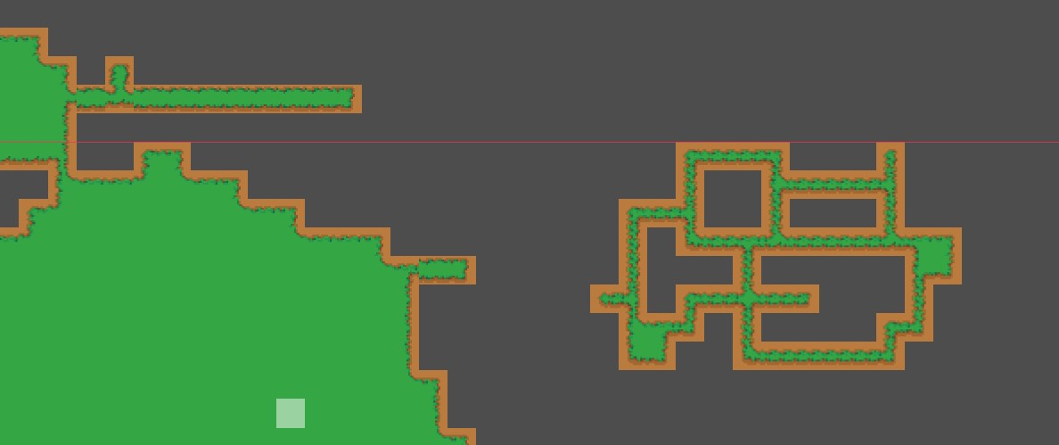
on the autotiling its pretty good! ima gona try using them for a test project and see how they fare.
*Some Time Later*
So! the one called godot 1 is no good. its lacking some features needed to be good.
now, if you look at the 2 to the right you can see that they have "things" in the middle, these mark of certain areas that are conected, in your case it would be another "dirt" collor spot. its for the edges, so say you can connect even more areas with "empty" space between them. not sure how to explain it but err... on the one with the empty spot, black in your case, grass in the other, there should be next to it 2 tiles with 2 "dirt" sports, left one should be one spot on top left and one spot on bottom left. while the one below the spot should have one on the top right and one on the bottom left. ehmn... To be honest, i cant see the diffrence between godot 1 and 3, they look identical to me =P and you really only need the Godot 2 one. all the tiles that are in the nr 1 are also in the nr 2 and nr 2 has tiles that nr 1 does not.
TLDR tileset 2 is a expanded version of tileset 1


