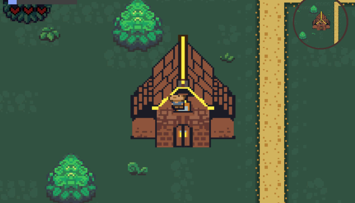
I like the environment art, especially the plants. Best pixel art plants I have seen so far in the jam :D Its a very unique and interesting concept, did not think of this one. Very original!
Here are things to improve:
- You should use a pixel art font to match you game's style (In the menu, the font you are using in-game is pixel art but I don't think it fits with the art style)
- Shadow under characters are too dark
- Shadow should be under plants
- Plants should be on a dynamic sorting layer (Can be both in front or behind something depending on the y)
- Make art for the dialogue box instead of using a gray box
- Its weird that the minimap is round in a pixel art game, but the minimap is cool
- Mistakes in dialogue like "this" instead of "that" and "U" instead of "You"
- Collision on rocks would be good
- Grass variety next to paths and water tiles
- Nice that there are offscreen indicators, you should make a sprite that fits the art
- House is missing detail, there is more detail on the plants than on the houses
- Would be nice to have a tutorial and some sort of guidance. Right now everything looks like side quests
Also, I found a house with wrong collision:


