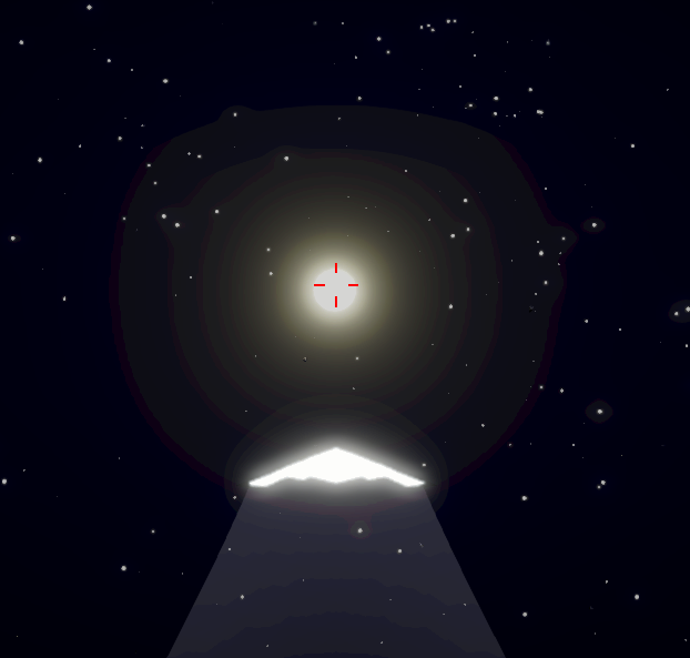
really cool space aesthetic! there’s a sense of minimalism that lets each element shine. I especially like the trails behind the ships, they look awesome. my only complaint about the visuals is that the ship-explosion particles look very out-of-place.
when it comes to gameplay, this feels like a tech demo. there’s not much to it, but what’s there is pretty solid — except for a flaw in how the rotation is handled. it’s a bit hard to explain, but you can replicate it easily. first, make sure the ship is axis-aligned by pressing R to reset. then just hold S, and you’ll see that the camera flips out every 180 degrees. another example: after resetting, hold E, and it seems to be yawing fine. then just roll a bit with A (while holding E), and you’ll see it starts wobbling. the issues with rotation are less obvious when playing normally, but it can be very jarring at times. other than that, the ship controls feel great! it’s pretty hard to hit the enemies, but that might be a skill issue.
also, there’s something weird about the solar system — it seems to be moving away from me, I can never catch up with the sun or planets for a closer look.
finally, I wanted to mentioned that there’s a mismatch between the itch screenshots and the game itself — there’s no color banding around the sun in the screenshots. personally, I actually prefer the banding, it makes for a really distinct style:


