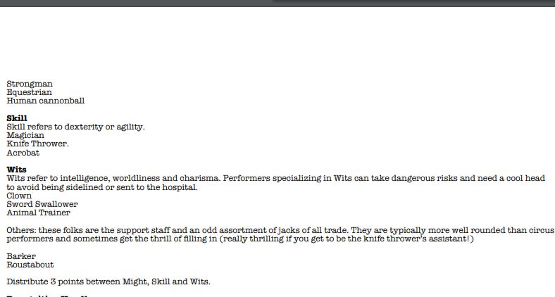
Thanks! I find American Typewriter is a font that fits nearly anywhere not fantasy based. I'm not sure how you want me to tweak the layout. Could you supply an example? Thanks again for the kind words and feedback! Glad you liked it. The series I researched (read: wasted hours reading) was The Barker from Quality Comics up on https://comicbookplus.com
Sure! So what's happening here:


Is that the rules/ info for skills generally and Might specifically overflow from the front page / cover to the inside of the zine, meaning you have to turn the page to keep going. The same thing happens later on with the props list, too. The fixes for these are always specific to the project/layout, but for usability, the less flipping a reader has to do for a particular concept or group of concepts, the better their experience, usually.
Some examples of texts that really nail this is everything Mothership (the core rules, Dead Planet), just about everything Nate Treme makes, and Obachan Panic!!! (sorry, limiting myself to stuff I have at hand).
So an updated layout might have the skills consolidated into three columns , for example, to keep them together, or for the Props to be in four columns to prevent overflow. One other, more minor update could be to move Dangerous Actions or 'Hey Rube' across to the other side of the spread so the reader sees it in one unified spot:

One thing to be mindful of though is I'm just one human and none of this means the game is bad or I didn't love it! I hope this helps a bit!

