fuck you this rules
Michael T Lombardi
Creator of
Recent community posts
oh, good catch! it stands for hit dice, which I'll clarify in an update tonight or tomorrow.
HD determine both your max HP (hit points) and how much you heal when resting. Finally, they're used in some of the options you need to choose between when your HP drops to 0, namely the Use It and Wait It Out options.
I hope that helps a bit!
This game is extremely my shit, a lovely and deep modification of WSCA to create something new, tight, and delightfully evocative, pulling me straight into play before I ever got to the mechanics.
Those mechanics are also clever, mutually reinforcing and echoing the themes and setting.
I love the layout and that this game is itself also a character sheet. Phenomenal.
This game is beautiful and hauntingly elegant, the character creation for the witches is a wonderful winding of truth and tension and being into two people who you can't help but begin to know in the process of answering the questions.
The order and directions of play are similarly splendid, particularly in the phrasing ("they must look at the other witch and tell them..." is so powerful).
I'm not usually huge on duet games but this one is going in my to-play-soon list.
This option is critical for me to be able to move all of my projects to itch for sale; I typically work with and split revenue with a team of collaborators.
Handling the paperwork and payouts separately is a ton of extra labor and time that prevents me from using this platform for all but my smallest solo projects.
This is a deceptively simple and light d6 system with chewy freeform magic and bookmark character sheets - def going in my run-on-the-run binder!
I actually prefer the action/challenge dice over TN from #TunnelGoons!
Swords & Sorcery Science Fantasy is a genre I deeply enjoy, thanks for this! This game does something most major games forget to do, which is describe the core adjudication loop - Intent + Task is so, so, so important to that loop and is explained neatly here.
I love the addition of the gambling for advantage mechanic, it's neat and elegant and super evocative of the source material.
The inclusion of numerous examples throughout the text is also super useful, and you've got advice and procedure for session 0, which is great!
I'm also a big fan of the advancement mechanic, I think it's neat and kitbashable as all hell.
AKSRS is a wonderfully neat, lightweight pamphlet game that takes a lot of old school sensibilities and newer design lessons and incorporates them into a tight, kitbashable package. I love that I can print a handful of copies to keep in my go-bag and break out anywhere for a one shot or use for a longer series of linked games.
It encourages kitbashing immediately, on the front page, which sets the tone for me. It is, fundamentally, a blackjack roll-under-your-stat game of the sort I've come to adore recently.
The five stats (athletics, kinesthesis, scholastics, rhetoric, and subterfuge) lend themselves to Picaresque adventures but you could tweak them to fit, say, being vampire hunters (physique, alchemy, lore, daring, magic).
The freeform skills list, tools, and kit are awesome, something I think again helps the game be kitbashable and widely applicable.
Combat is interesting, fast, and relatively brutal - opposed rolls, simultaneous adjudication, and a 4-hit health bar make things quick and dangerous. The rules imply hanging up is a great strategy because every combatant only gets one roll per round, but the rules leave lots of room for rulings - and in fact, encourage the table to make a few and stick to them! I love this aspect.
This pamphlet is, overall, an elegant engine upon which you could build a house game or a sort of dealers choice implementation, with rules light enough and flexible enough to work in a multitude of contexts.
I'm looking forward to writing a short Pentolan hack as a pamphlet for my own use!
This is fucking superb, a critique, a game, and an object lesson in tight, elegant design wrapped up in one. The layout is clean and readable, love the use of bold in paragraphs to draw my eyes to relevant mechanical declarations.
The teamwork/stress rules are awesome, they pull me into the space effectively enough I flashed back to working as a pizza boy. The recovery/game structure reinforces this, making for a nice (by which I mean: evocative) loop.
One thing I think might be worth including is a sort of permanent stressor optional rule where something like a critical failure may drop your tolerance by one - because my experience working retail/food was similar in that I sorta tallied up major frustrations and let the minor stuff slip until I finally had to or could bounce.
This is so hackable, I could see using this underlying system for say, selling shoes (another terrible job I once had).
This game is awesome and one of my favorite kitbashes from GoonJam!
There's a dedicated thread for revenue splitting you may want to chime in on then! I think if we can get some more of the attention as seen here, it might help them see it as something we need tackled.
https://itch.io/t/391522/split-revenue
Has there been any further thought along these lines? I have this for my projects that currently reside in LeanPub and practically all of my work includes revenue sharing with collaborators, meaning most of it I can't host here. I strongly prefer being able to direct money straight to their hands from sales on a platform.
Strongly disagree with DaedalusMachina's points as even two-person collabs can have more hassle on the money handling than the rest of the project combined - especially if cooperating internationally - and those problems compound the more complex the and larger the collaborative group.
Thanks so much! I wanted to focus in on the Van-Helsing-Bard-Mobster Gonddolieri of Pentola for a bit and they lent themselves really strongly to the jam, I think! I had a lot of fun trying to think of clever ways to reinforce their lore/feel without being too hamfisted. I'm glad that came through a little!
Sure! So what's happening here:

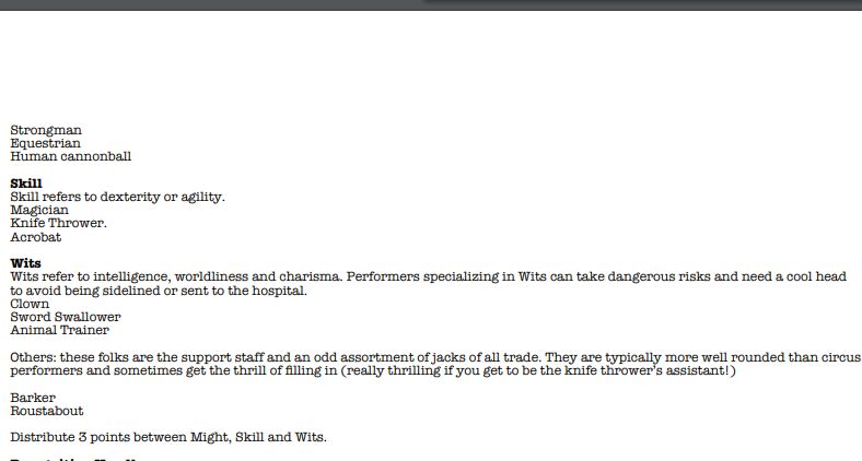
Is that the rules/ info for skills generally and Might specifically overflow from the front page / cover to the inside of the zine, meaning you have to turn the page to keep going. The same thing happens later on with the props list, too. The fixes for these are always specific to the project/layout, but for usability, the less flipping a reader has to do for a particular concept or group of concepts, the better their experience, usually.
Some examples of texts that really nail this is everything Mothership (the core rules, Dead Planet), just about everything Nate Treme makes, and Obachan Panic!!! (sorry, limiting myself to stuff I have at hand).
So an updated layout might have the skills consolidated into three columns , for example, to keep them together, or for the Props to be in four columns to prevent overflow. One other, more minor update could be to move Dangerous Actions or 'Hey Rube' across to the other side of the spread so the reader sees it in one unified spot:

One thing to be mindful of though is I'm just one human and none of this means the game is bad or I didn't love it! I hope this helps a bit!
This hack is lightweight and evocative - it immediately made me think of adapting it for use as a minigame of managing politics in a Spire or neighborhood!
I'd love to see an expansion on this, maybe a couple social situations and NPCs? I really like the idea that influence points are a countdown clock to personal tragedy, but not the end of a character.


