Indie game storeFree gamesFun gamesHorror games
Game developmentAssetsComics
SalesBundles
Jobs
TagsGame Engines
(+1)

Very nice, I finished both levels with an A+

The models, the effects and the destruction are gorgeous and the game ran smoothly at all times.
The mechs in mission 1 were a lot of fun to fight, but I gotta say the map in general is hard to read.
There's very little contrast between buildings, mechs, enemies and even the road, everything has this light beige hue and it all kind of blends together, I had to rely on the radar to search for enemies on the screen.
It's also not the most pleasant of colors to stare at. 

The maggots mission could have used a boss or some actually threatening enemies.
Returning to the main menu always shows you have the autocannon equipped even you you still have the rotary cannon equipped.
And the option menu buttons say this?
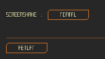

Other than that the game is really promising, the art is so good looking, and I'm looking forward to play more of this.

(1 edit)

Thank you for the feedback and for finishing both levels!

Regarding the readability of both levels: I wanted to vary the buildings and ground more with grass and different areas, but time ran out to add them. I agree that there needs to be way more contrast and I'm going to try and focus on that next. Also need to fix the button with the weapon select; it was a last minute addition instead of a proper hangar and weapons screen so I didn't bother having it save the setting, apologies.

The options menu text is a weird issue, not sure what's causing that. Could I ask what OS you're on? Might be an issue with GMS 1.4 being old software; also trying my best to get resolutions working ASAP, sorry for the bad pixel stretching!

(+1)
Could I ask what OS you're on?

Windows 10

Noted, thank you. I'll look into fixing the issue and test it on a few different OSes.