The new art feels great, sounds are really really loud for me even on 1% volume on my pc though
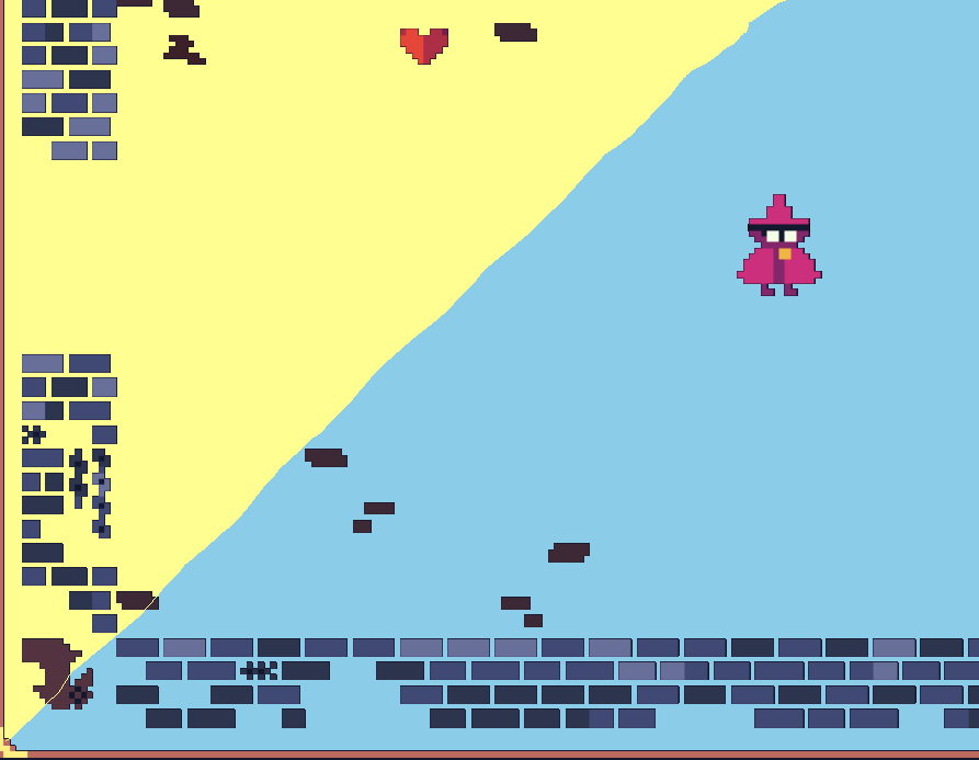
I wonder how more bright backgrounds/floors would look?
Thanks for the feedback on audio. I'll make some adjustments there. Glad you like the look of the new art!
I've got another biome mockup done on the steam page (forest). What did you mean by "bright" in this context. Is there any art you could point me to that is similar to what you are thinking.
Thanks again for playing and for the feedback!
 so i pulled a screenshot into microsoft paint for this, so it is not very well made! But heres two examples.
Generally pastel colors could work i think, since most of the mobs, and the player, are pretty high contrast. And then i Don't know if you would have to redo the way outlines work on your characters or not, but here i just made the inside of the hat stay dark for the mc. : )