Thank you so much for your review, I really appreciate you taking so much time to do it! I’m glad you liked the reference to Space Invaders. Your feedback helps me a lot because I’ve become a bit blind to my own work.
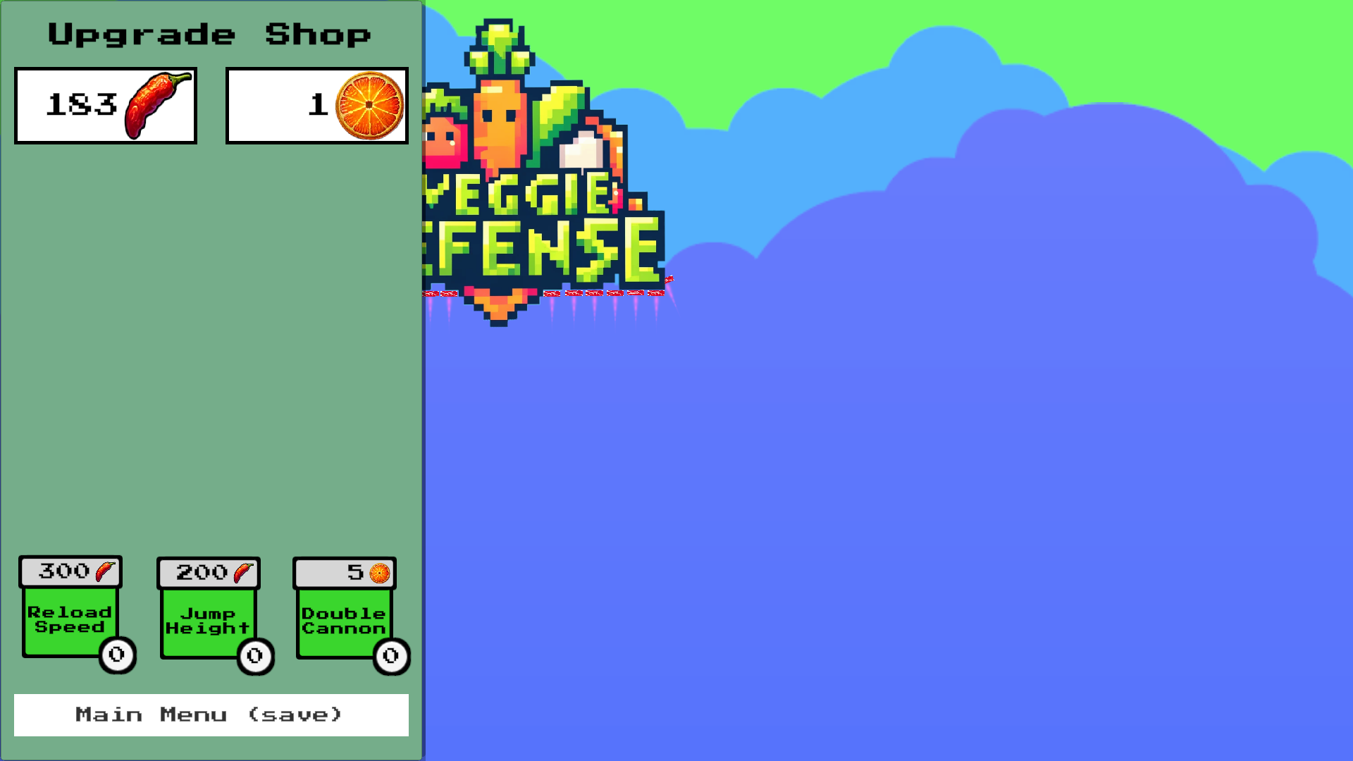
- What I haven’t quite understood so far is that the resolution of the GUI elements doesn’t seem to fit. I’ve assumed until now that Unity adjusts this to the screen size on its own. Just so I understand correctly, you played in full screen mode and the button in the upgrade store was not visible? Could you tell me your monitor resolution so that I can adjust it here.
- The controls should be changeable via the upgrade store in the future, but the lack of control in the air could cause frustration too quickly, so I’ll have a think about that.
- The tutorial is a good idea, you’re the second person who didn’t realize you could move at first.
- The difficulty thing is a good tip, I’ve tested it so many times that I can’t really judge it anymore.
In higher difficulty levels there are other missiles that can also destroy the protective barriers.
Best regards Alex
PS: This is what the menu should actually look like.


