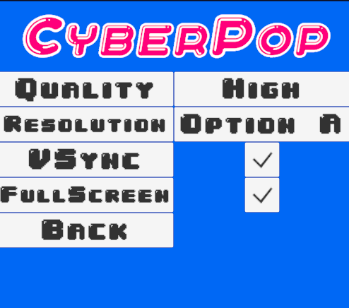
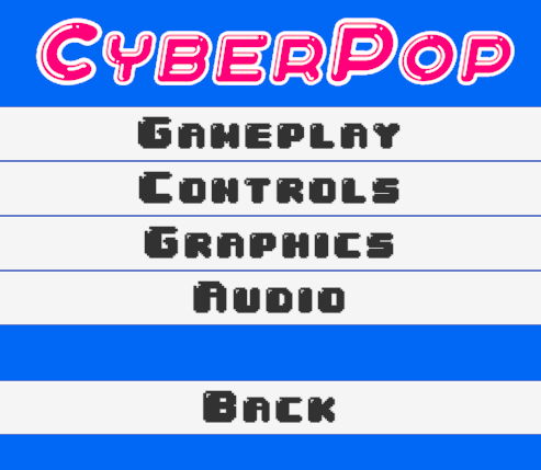
As the game has improved a lot in its segnificant design, I truely would address the Menu slightly as far as the back button is conserned. In UI design there is sort of an expectation to locate the button in a place it was previously as for example indicate to the images below it might reduce the ease of access for some users or potentially expand the irritation towards it. The settings panel on the other hand is masterfully crafted and I truely like the font that it is resembled in.
- 2 -


