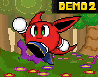
ye, I know you're just begging to see your questions answered lol. I think this will be really fun!
Vicctre Tamaj
Creator of
Recent community posts
no prob! https://www.youtube.com/@vicctretamaj
honestly, if you need to find me anywhere, all you gotta do is type "vicctre" and I'll be there lmao
There are a few issues that have been brought up. Most notibly, if the game is transitioning and you close the window or tab out, it will crash.
This is because the game is set to recognize your screen resolution and adjust itself to that. But also due to this, sometimes the game can be quite zoomed out. Anyone from DEMO 1 might have notice the Pixel tearing happening during gameplay. We aimed to fix this, but seemingly in a roundabout way. We are continuing to work on fixing these issues. Hope it doesn't effect your play experience too much
Seeing this game change and evolve has been a treat! While this build is relatively close to the last two builds I've played, there is so much polish here that it gives a great idea of what the final game is going to feel like.
The polish can be felt in the smaller details; With more NPCs around, the hub feels more lively. Alot have things to say either for fun, or of actual value. Some even get new gear as you progress. Giving us potential potion drops from enemies is very helpful, as sometimes you just lack the funds to maintain your HP/Mana. All races having different sprites for the gear is great and an adorable addition. Love seeing them wear a bunch of different things. Music remains something great. Shout outs to the 1-9 and Boss theme in particular.
I have some small issues, some practical, other more a skill issue. Still not huge on the combat. While its fun to fight things, the optimal strategy is to always lure enemies away from hordes and pick them off one-by-one. Its sometimes tedious and feels kinda cheap. I still think hordes of enemies isn't that fun, and should be overall reduced. Focus more on the chemistry of grouped enemies than just putting a ton of them together as a "challenge". Enemy placement has been slightly improved, but I think could still use some work overall. The boss, from the previous build, did feel a bit better. She wasn't just spamming spells at the previous pace, so it was a good balance of challenge and fun. I still thing having a PAUSE feature would further the strategy of the game, such as being able to change gear or spells. Honestly, maybe just make achieving new quick slots easier. Spells have good utility, but are kinda expensive, and elemental properties still aren't explained much. The only time I recall any elemental weakness coming in handy is against the 1-9 Fire guy.
Still, a fantastic game with tons of charm that I cant wait to see more from! Look forward to more buddy. Game went from a 3.5 to a solid 4 in my book!
Recently, I've been playing some games, and I try to leave a review for every game I play. Its important to give the devs feedback om their projects, and I try to do this extensively. Something that came to mind is that my reviews aren't public, but only the people who follow me personally can see them. Maybe, there could be a review tag for games, allowing people to see the ratings and reviews publicly. The author has the choice of making them public or not, so there is no pressure. Maybe dont give a "generally positive/negative" synopsis, just give it a tab and allow the people to take a look if they so wish to see more opinions.
As someone who tries to give as much feedback as possible, I know comments are available and public, but I didnt want to overtake a comment section with my huge review. I dont know any other ways to review or leave feedback, as I am relatively new to Itch. Maybe this isnt even worth the effort, but might as well give it a shot.
An absolute gem of a game that's one of the coziest games I've ever played. There's so much charm in the most basic of ways. How the world and character feel so grounded is a part of the charm.
The dialogue with the main character (I'll call him Balue Patterson) is endearing, but true to form. Balue is clearly just a dude, in his crummy apartment, unmotivated to do much. For a lot of people, that hits pretty close to home. He seems a little cold, but after doing some basic chores and making the place cleaner, he opens up a bit more about his feelings, not unlike some people I know IRL. This vibe is only accentuated by the music. Its all super chill, kinda like music my mom used to play while we cleaned up the house when I was younger. Its uplifting in the best way, something to keep you moving, or just sit down and listen to the score. A great showcase of "Peppsen" musical talents, hitting you with the feel good jams.
Gameplay, realistically, takes a slight backseat from the style of the game. There's no score, no timer, just you, your cup of tea, and a dirty apartment. Cleaning up is as easy as taking a sip and using your energy to pick up and explore. Its fun for sure, keeping up a work flow, and its just nice to see Balue become happier with himself. There might be room to expand upon the gameplay aspect!
I wouldn't mind doing some of the chores myself with the mouse or something. Say I have to organize the dresser, give me like 3 places to drag and drop different clothing. Or maybe I can hold the watering can to water the plants? Just a thought, but plenty of games work with the one button action approach. I think something that would be fun for the final game is giving us like a "recipe book" for all the different teas you get, kinda like a fun way to play around and collect as many ingredients as possible. Maybe a new feature could be making pitchers of tea, and storing them in the fridge for later. You then have to heat them up to drink, but it would be a great way to further the player feeling like they are living in this home. All suggestions, nothing wrong with keeping it simple, as making the player feel like they can "lose" wouldn't be good for the vibe...it would be a hard balance for sure.
The game is very heartwarming, almost making you root for Balue as a majority of us have been in a similar slump before. This game show a ton of heart and effort all wrapped up with a great presentation and good feeling vibes with some basic cozy gameplay. Hope to see this game only further and improve, cuz what we got now is beautiful. If you got 20 or so minutes to spare, this game is definitely worth your time. I was already having a good day, but this just puts me in a better mode :)
I'll make sure to let you know when the next update for my game drops! We've been working really hard to make even more awesome things, and judging based on some feedback, I think youll enjoy what comes next :)
There are being small changes here and there that will paint a better picture for what we want the final product to be like. Hope you get a chance to play it soon
I had some good fun playing, though initially I did run into an issue where enemies were invisible for some reason. Heard it might've been addresses, so I decided to play through it all today.
For one, I really love this games presentations! It truly feels like a complete project, and I'm shocked you guys only did this within a month or so. The art really is beautiful, and the sprites are also well done. Only issue I have is how dark everything is. I understand it fits the environment and overall vibe the darker side of dreams, but enemies were sometime hard to make out. Some objects were kinda hard to tell if they could be interacted with, which made some areas feel cluttered, also doesn't help Arias wearing mostly black. The music was really nice, def fit the overall aesthetic you were going for. Overall, it still looked great, just minor things.
Id say my biggest gripe was the controls, mostly using the grapple move. It might be a little too specific for my liking. Sometimes I swear I was hitting a bulb to grapple on, but it just didn't happen. This also lead to me falling a lot more than I would like to admit lol. Mid air grapples are kinda tough to get, but that might be a skill issue on my end. Level design sometimes felt a little odd as well, feel a wall jump would make it feel a bit better to platform. Sometimes I just miss a jump and then you just slowly fall down lol. Not
Shout outs to the final fight with Shame, was pretty fun and engaging. Thankfully, i had so much HP that she didn't immediately destroy me. Which was a p nice reward for exploring a bit.
I thought the Voice acting was a really nice touch, its not something you see very often in even full indie game releases. Still amazed at what yall managed to accomplish for a game jam! I mainly heard of this game through a friend who was on your team. Great work overall.


