Thank you. 😁✨
Bold Aesthetic Creative
Creator of
Recent community posts
Thank you, Aun. Really good observation with the camera movement.
Actually, we were iteratively lerping the camera movement since the end value keeps changing which AFAIK, is not possible to make it framerate independent even though the parameters use delta time. Gotta find some elegant solution for that! 😁
Would you mind playing another FREE game of ours too? 😉
https://boldaestheticcreative.itch.io/plasma-pursuit
Thank you very much. I didn't expect someone to like this tiny game (I guess I need to have an open mind about it). And yes, I am aware of this annoying bug.
Will fix it for sure in the next update. I will be adding two new keywords/elements: One that doesn't care about shields and simply damages health (thereby, giving health more importance and forcing the player to choose health more than shield).
The second is to simply add one (or more than one) card in the next row. (instead of three? four/five cards to choose from) But I am not sure whether that is gonna be effective or not. Gotta tweak it to decide if it really matters.
Deckbuilding isn't something that I consider as of now. Maybe, an element that allows players to 'store' a card from the current row for use later on whenever the player likes. This seems quite powerful IMO. What do you think?
Yeah, a tutorial level would have been great. Actually, I kinda tried to make a very limited 'hideous' tutorial (tutorial that's not apparent but still helps the player in figuring out the game) because I don't like the idea of having an obvious tutorial (not sure if that makes sense). That was very limited in nature tho. Basically, in the start screen, you must swipe to toggle music or sound or play the game (3 directional swipes; I did add a brief animation for that tho) rather than tapping the buttons. The game that happens after it uses the exact same controls as well along with the same white colored indicators.
What you are doing is awesome, you know. It helps us and you too! IMO, it is a sure way to understand and get better at making games. :D
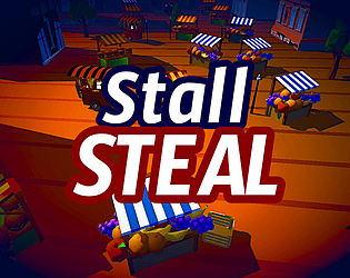
Thank you so much! I really liked your feedback and I am so glad to see such a good analysis. There should have been some variety with the stall audio and the stall priority should have been made clear (which btw, is fruit > burger > fries).
As for the score and hearts/star thingy (which I also agree btw but felt like explaining a bit), I tried to add depth to the game by adding the concept of combos: basically, grabbing up the same type of stall multiple times consecutively. You will notice the multiplier popping up on the screen for that and as you do it, the food that you receive multiplies which is also why if you get double the amount of food required to win a level, you will get three hearts. Now, here's the caveat to it: it's all random and procedurally generated whenever you play the game, without accounting for this mechanic (combos) as well as the food amount to win.
With that said, I should have somehow given a clue to this mechanic and also, implement it into the procedural generation but I was afraid that I would end up making it even more complicated so I ended up with just what it is.
Play for FREE Here (on Browser or Windows)
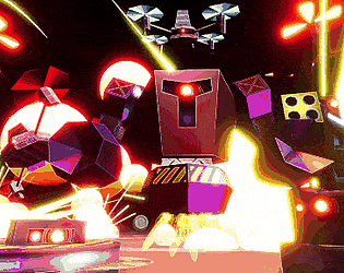
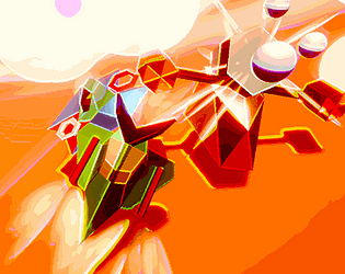
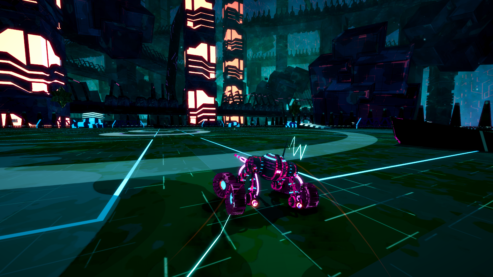
Control the 3 Hover Mechs and obliterate all hostile entities while protecting all of the Mechs from getting destroyed.
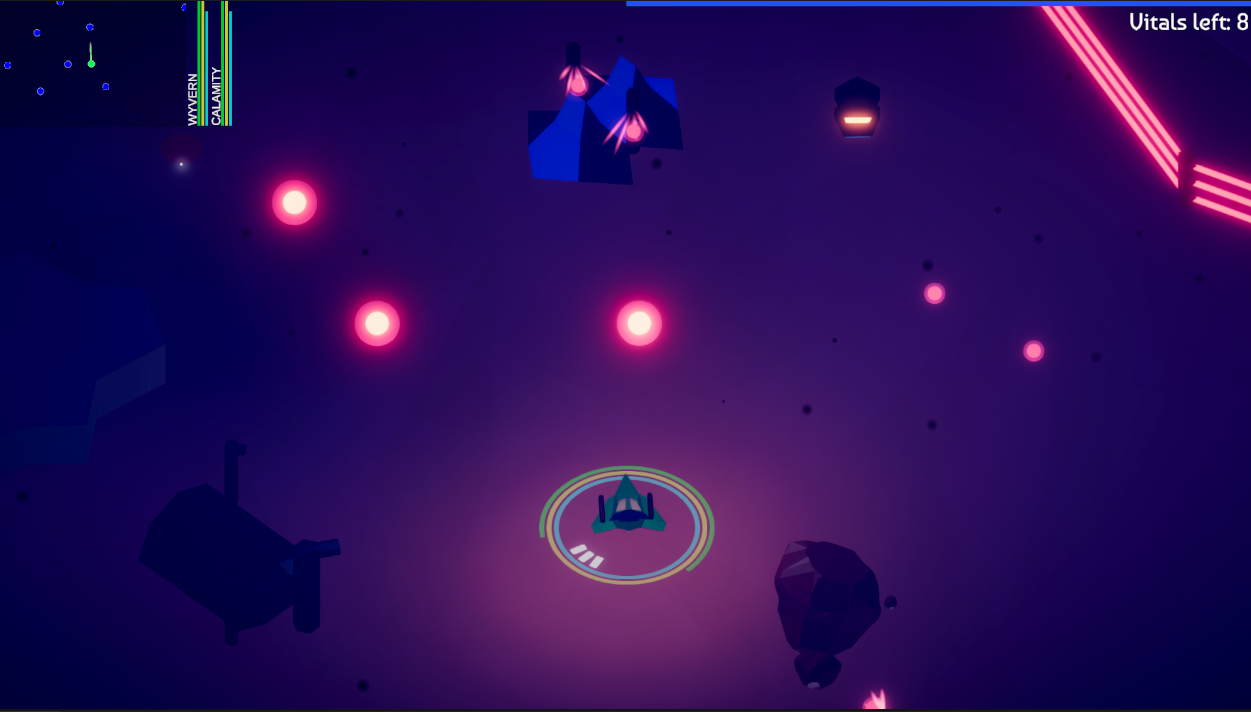
Objective: Destroy all 6 Vital Points/Buildings (displayed as a red cross on the minimap)
Controls: Mouse Pointer for Direction Tab to Switch Mech WASD/Arrow Keys to Move Space to use Boost Left Mouse Button to use Basic Weapon Right Mouse Button to use Special Weapon P to Pause
Game Duration: 15 minutes to an hour
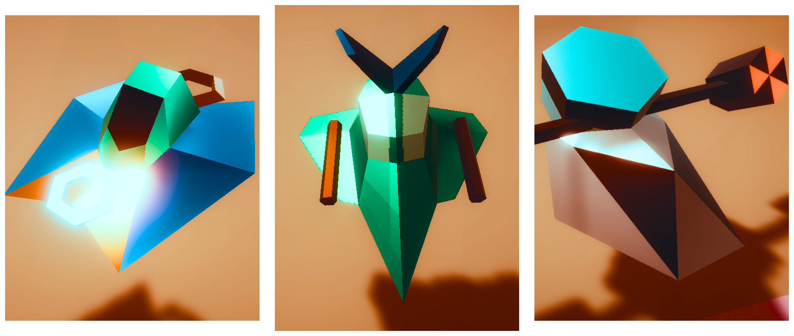
Each Hover Mech is coupled with its own strength and weakness and gives a unique taste to all the encounters.
Don't forget to try out the Dark/Night Mode! It really adds *oomph* to the gameplay and style. :D
This game is developed in association with the HomeTeam GameDev community.


