Ah, not a bot then. A hall monitor. I see the confusion. This is Witch's Teatime, not AI Witchhunt. More cozy, less Stasi. It might not be... your cup of tea.
Caffeineforge
17
Posts
50
Followers
16
Following
A member registered May 31, 2019 · View creator page →
Creator of
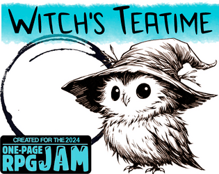
In this solo one-page RPG you Trim a tiny bonsai-world over tea and use curses to set things right.
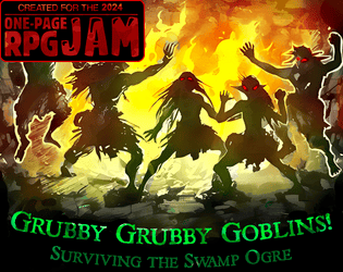
Lead your tribe to conquer the swamp and become a great chieftain, or fail and become dinner. The choice is yours!
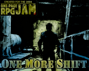
This is a solo journaling game with dystopian vibes that is part mystery and part horror story with multiple endings.
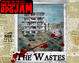
Navigate the post-apocalyptic wastelands and find your way home in this single-player one-page RPG!
Recent community posts
Vampire Couriers: Dusk Till Dawn Delivery jam comments · Posted in Vampire Couriers: Dusk Till Dawn Delivery jam comments
Talking to Dragons - an Earthsea-inspired One Page RPG jam comments · Posted in Talking to Dragons - an Earthsea-inspired One Page RPG jam comments
Very nice start. If you placed the cards next to each other it would make for less cutting, also, if you included the 1-5 items a single time on a 'Character Creation' card it would give you even more room to add to the character sheets. That said, I think you did a wonderful job of distilling and differentiating the classes.


