Fun little game, thanks for making it ^^
I did find a small bug though, if you jump while standing still, it will reorient the character towards the same direction every time. Maybe for the jump animation you key framed the entire transform instead of just the Y position? Not a big deal, just something I noticed.
In other news, the linux version works great on the steam deck! Though it would be nice if it supported a gamepad out of the box. Even so, it was fun to play =]
Chimeforest
Creator of
Recent community posts
This doesn't add up for me.
The character data in the main download for Modern Interiors is only 83MB(including the "old" folder) so unless the generator has over 156 times as many options, it has no right being 13GB.
I also get the header error when using 7zip.
Also, something odd, the download is only 147MB, but it expands to 13GB when unzipped? That seems seriously off. Most of the data has to be empty, or trash.
1. Ah okay, I didn't realize that, that will help immensely ^^
2. I see, I was wondering why "cleaning" was listed as the main job of custodian when they only thing which gets dirty is the solar panels.. and I'm not sure I've ever seen the custodian clean that.. A new production job could work too, I just thought of the custodian because all he does in my game is collect poo and refill the wood burner.. It feels like 95% of the time they are just standing waiting to fill the wood burner. Maybe once you get a bigger base he is more busy, but in my game (I just built my first metal machine) he has lots of free time, so I've been leaving that roll empty.
3. If you keep the build menu system as it is, I would go with the order of: Building, Furniture, Light/Deco, Ranch, Production, Automation, Resources, Economy, looping back to Building. This way the main base building ones (Building, Furniture, Lights/Deco, Economy (and maybe Ranch b/c of fences)) are all right next to each other. And all the main farming/automation ones(Ranch, Production, Automation) are also right next to each other.
The one thing I'm unsure about is the placement of Resources.. It's one which I don't really use, so I'm not sure where I would put it.. It's basically decoration right? So maybe it should go near Light/Deco. Or maybe It should trade places with Economy.. that would put all the inside stuff(Resources, Building, Furniture, Lights/Deco) next to other inside stuff, and outside stuff(Ranch, Production, Automation) next to outside stuff with Economy(which has inside and outside stuff) between them.
4. Ah, that makes sense.. is it the weapon sprite? or the the little cloud puff sprite which has the hit box?
5. Yeah, a larger range could do the trick, that way he's further from the player, so he doesn't get in the way, but the player can also approach him to give him pets =] It's not a perfect fix, but it would definitely improve it a lot and probably wouldn't require as much code to change.
6. I was wondering if it was something like that.. does Game Maker not have an "On Application Exit" event? It really should if it doesn't =/
UI seems to be something that I'm kinda good at? So I like thinking about how it can be improved for games that I play =]
From what I've heard, UI in Game Maker is a real pain because you have to basically code it all from scratch.. is that right?
This is a really cool game!
I have a few suggestions though.
1. Uniform Controls
Right now, similar functions require different (sometimes contradictory) inputs.
* For example, if you want to exit a menu, it can either be Q, B, or Tab depending what menu you have open.. and EDIE's menu doesn't have a key to exit out, so you have to click the exit button. Also, sometimes if you hit Escape, it will close the menu and bring up the "do you want to quit" screen, but sometimes it won't close the menu (depending on what menu it is). I would like it so that I can just hit Escape and/or Q to exit any menu, and when all the menus are closed, then it brings up the "do you want to quit" popup.
* Another place is adding items to shops and machines. Q takes from the shop, but adds to the machine(if one ingredient). E adds to the shops, and sometimes adds secondary ingredients. You can remove items from shops, but not from machines. It would be nice if E was always add, and Q was always remove, or something similar.
* Some things you can hold down the add/remove button to speed up the process, and sometimes you can't. Shop you can, machines you can't, and junk piles you can't. It would be nice if this was available everywhere.
* Scrolling. 3 different scrolling options by my count. Mouse(Build and Weapon menus), W/S(Player Upgrade), and R/F(Trade booths). It would be nice if this was also more uniform.
2. Custodians also restock machines
Currently, you have to restock all machines by hand (unless I am missing something), and since you have to hit the key to add each item individually instead of holding down the key, it takes a lot of clicks. For Example, if you want to make 1 piece of metal, you need to click a total of 28 times on different machines(16 to add veg to oil, 4 to add oil to stone, 4 to add oil to metal, 4 to add stone to metal). Alternatively I could hack away at a junkpile and get a piece of metal every 8 clicks, all in one spot, with a chance of getting plastic.
All this to say that if the custodian filled up machines, as well as the wood burner.. that would be nice. Or if you could hold down the buttons, that would be good too.
3. Change order of build menu
Right now, the build menu seems kinda random. There are certain sets of tabs/categories which I often use in conjunction, and they are never next to each other. For example, when I am building, If I'm working on production/farming, I often switch between production, ranch, and automation. These are all two clicks apart. Likewise, if I am building actual buildings, I'll need to switch between Building, furniture, and light/deco, which again are each two spaces apart. It would be nice if these tabs were grouped together, right now I've seem to have memorized 2 sets of build menu tabs (Auto->??->Prod->??->Ranch, and Building->??Furniture->??->Light/Deco) switching between the two or looking for something not on those lists feels random. I'm sure with enough time I'll get the hand of it as it is, but until then it's pretty frustrating..
I would organize it something like so: Building->Furniture->Light/Deco->Ranch->Prod->Auto->Resources->Economy->Building
4. Bigger weapon arcs.
Right now it feels like I have to be looking directly as an enemy to deal damage to it. when there are multiple enemies/friends/corpses, and damage numbers flying over them, it's hard to tell if I am hitting anything or not. When I die in a fight, it's often because I am swinging my machete over a corpse, instead of the enemy right next to it.
5. Puppy priority last.
I really like having the dog follow me around ^^ and I like petting him occasionally..
But he'll often get if the way when I am planting, watering, harvesting, filling machines, tending animals, looting, etc etc.
It would be nice if the option to pet him only showed up when there is nothing else in range which I could use the E key on.
6. Can't click the x in windowed mode to close the game.
Not too big of an issue, but it puts me a little bit on edge when a program won't let me close it by hitting the close button..
Sorry for such a wall of text, I didn't intend for it to be so long >.<;
I really do enjoy the game a lot =D
It just needs a little bit more polish I think =]
P.S. Are you programming this from scratch, or are you using an engine? If an engine, which one?
I love all of these collections, especially the Hilly Terrain one!
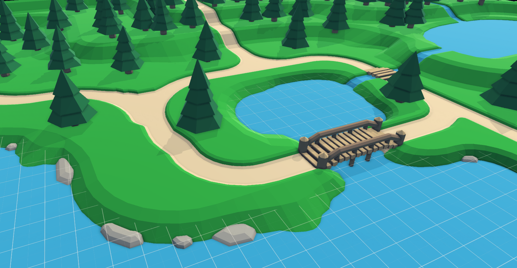
In fact, I like it so much that I made a small expansion for it for use in a game which I hope to someday finish.
Thank you for the awesome assets =D
Hello Everyone!
I've made a small expansion for keithdfox's Hilly Terrain.

It adds 12 pieces that allow you to make terrain and paths which look more natural. I made them for a game I was/am working on, but I figured I might as well share them =]
This includes:
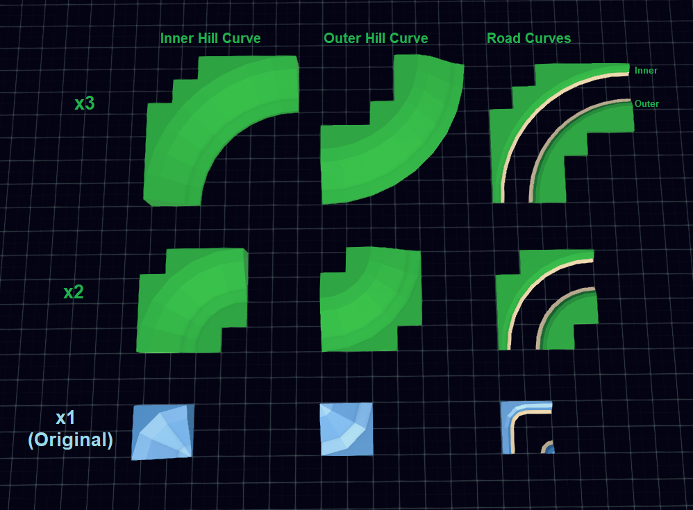
- Larger Slope/Hill Curves (4)
- Larger Path Curves (4)
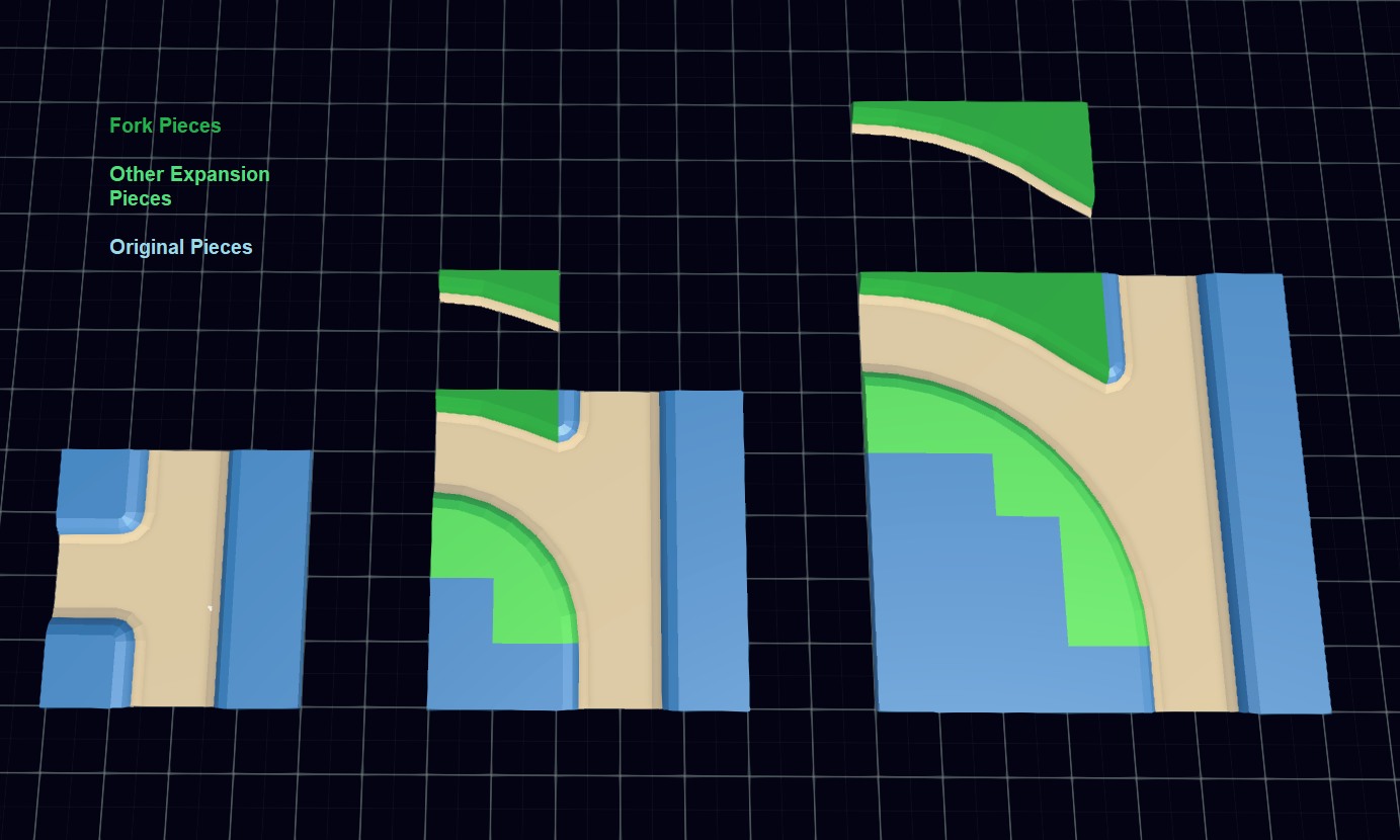
- Path Forks/Bends (2)
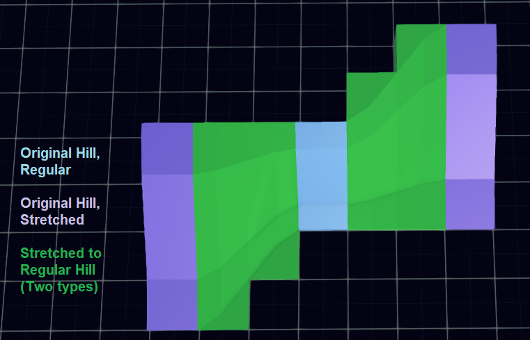
- Stretched Slope/Hill connectors (2)
I wanted to add some more pieces to this set before I published it, but it looks like I will be too busy to get to them for a while.
Free for all use (including commercial). No credit is needed, but it is appreciated. In either case, I'd love to hear about any projects that this gets used in =D
Download it here on OpenGameArt.
The Pieces
Curves

x1 to x2 Slopes

Forks/Bends

I actually ran into this as well.
Turns out that it can be fixed in unity during import, under the "Model" section uncheck "Use File Scale" and set "Scale factor" to "0.2"
Every time you import an object from asset forge, you'll have to do this. You can make a preset for this, which will make it a little easier.. but if you set it to default every other model you import from other sources will now be incorrectly scaled.
So.. it'd be really cool if we could just set a unit scale in Asset Forge (which gets saved in between sessions) when we export FBX then we wouldn't have to worry about importing it into other programs as much. Given that each FBX file has a "UnitScaleFactor", hopefully it wouldn't be too difficult to implement?


