Indie game storeFree gamesFun gamesHorror games
Game developmentAssetsComics
SalesBundles
Jobs
TagsGame Engines

Clearlynoone

8
Posts
3
Followers
A member registered Jul 08, 2020 · View creator page →

Creator of

Recent community posts

Oh no, that's really unfortunate !

My instinct is that the game asked for more ressources than what your computer/browser let it use but I could be wrong.

Anyway, thanks a lot for including the error with your message, if we ever come back to this game I'll make sure to look into the problem and try to solve it as best I can (I'll also include a downloadable build next time so that this sort of problem won't stop people from giving our game a try).

You're right, it's a bit hard to understand at the start (we didn't pay enough attention to giving signs to the player) but I'm happy that this was still fun to you !

Thanks a lot for your feedback, I'm glad you enjoyed our game !

Thanks a lot !

Thank you !

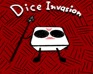
Thank you ! I too love the animations my brother made and he impresses me even more considering it's his first game !

Thanks a lot ! We're really glad that we ended up with something to show for our efforts.

Thank you for the kind feedback!

For the concept : Yes i would have liked to put more informations for the player and provide more signs for how and what to do but we ran out of time but I'm glad you found it fun nonetheless.

For the aesthetic : I definitely agree that the menus and character aren't in the same style. To be honest, we didn't think ahead about the style that we wanted for the overall game but concentrated more on the dice enemies and improvised the background and UI in the last hours. I'll try to keep more in mind the overall game next time I do something like this. As for the main menu's background, that one is from OpenGameArt.com as my brother was still busy animating.