Indie game storeFree gamesFun gamesHorror games
Game developmentAssetsComics
SalesBundles
Jobs
TagsGame Engines

Corey Martin

29
Posts
974
Followers
71
Following
A member registered Nov 06, 2016 · View creator page →

Creator of

Recent community posts

They sure are! They're both almost complete, we'll share news soon.

hi! the base game and lost memories DLC are sold separately. 

Thats lovely to hear, thanks for sharing!

Not particularly, but there was a weird coincidence involved!

So, Teo Zamudio (who drew all the game's art) drew it after we decided on a latin american tropical aesthetic and i added the title text. Then days later, i came across this book at my partner's house and was kinda stunned by the similarity. Narrow, serif font, in yellow, over stylized tropical plants! Maybe i saw it earlier and it inspired the pairing subconsciously. Who knows. :)

Great! Glad to hear it,  my pleasure :)

(2 edits)

Hi xchemist!

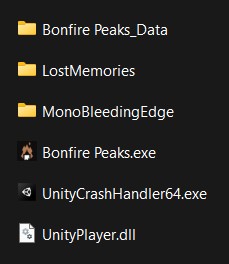
The DLC zip contains a single folder - did you extract that folder into the root, or the contents of that folder? The former should work, the latter will not.

The game folder should look like this after extracting:


Let me know if that doesn't work, I'm happy to keep troubleshooting. :)

Thanks for playing! and for the patience, as it's taken me a while to get back to you. :) 

I really appreciate the thoughtful message. In that first example, I chose to be extra permissive to avoid annoying the player. It doesn't enable unintended solutions or cause any issues, so I decided to allow it. Ideally it would be accounted for in the animation (the player pulls the crate towards them as they turn) but I never got around to implementing that.

The second example is fundamentally disallowed by the system. It would break most of the game to allow it.  

While i agree that it's very easy to argue that the first situation has too much clipping to be allowed, there's still a pretty big difference in the two scenarios, as you can see here - 
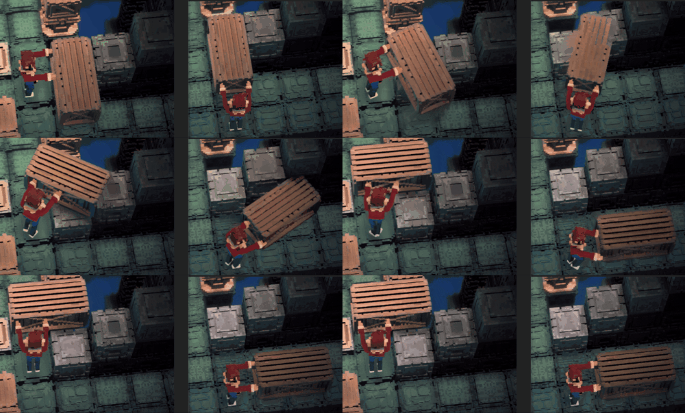


So at some point I have to draw the line of "that's too much clipping", and I chose "when a face of a crate/block is pushing directly against the face of another". Hope that's a satisfying answer!

Sorry to hear! I'll take a look soon and update this thread. 

https://coreymartin.itch.io/hiding-spot

https://coreymartin.itch.io/pipe-push-paradise

Thanks for the report! This is fixed in 1.0.23, live now.

Sorry to hear! It may be because Gatekeeper is determining it as unsafe. Can you try running it through the itch app if you aren't already?

Otherwise, you can try following the instructions under "If you want to open an app that hasn’t been notarized" on this link:
https://support.apple.com/en-us/HT202491

Let me know if one of those works, either way we'll figure it out! 

The current build is intel-based, should run fine on your M1 though you will have to disable anti-aliasing (M1s flicker with AA enabled). We're working on a fix.

oh no! really appreciate the support

(1 edit)

It's 10% off here too! :)

ty berrt!! <3 

Have you tried launching it via the itch app?

It's a universal build with 64-bit support, but I haven't tested it on Catalina. I'll look into it and follow up.

Thanks berrt! It'll be on Linux :)

Oh no! Thanks for letting me know, that's definitely not normal. I'm getting the same results on my end, it must be an issue with that particular Unity version and some recent Windows updates. I'll try to update it ASAP.

Right, this is a Unity/Linux bug where it incorrectly identifies your native resolution as 1 pixel by 1 pixel. I'm patching it now, hopefully it'll work for you. :)

Aw thanks for letting me know! There were some QA issues with the Linux version that I couldn't resolve in time. Anyway, if you send an email to corey@toboggan.work, i can send you a "no promises" Linux build. :)

Of course, here’s the FLP: http://toboggan.work/tmp/fetal-position.flp

It just uses Native Instruments Massive VST and the stock limiter.

Thanks! I used FL Studio and Native Instruments Massive VST.

Glad you're enjoying it! I agree that the character movement is generally pretty unpleasant (like you said, mostly due to that extra inertia when you move). I might come back to this eventually and tighten it up, or expand it into a bigger game, we'll see. :)

thanks for the heads up! just added config dialog to v1.0.2.

Done! (v1.5) :)

I tested with a friend who is "red-green" color blind (the most common) and he helped me pick colors that he could easily distinguish. The letters were actually just an aesthetic choice, but you're right - adding them to the boxes would be a good fail-safe. I'm on it!

Hey Ingix! Thanks for the feedback. I just updated (v1.4), you can now click the level image or number. ENTER should work if navigating with arrow keys (SPACE should now as well).