Indie game storeFree gamesFun gamesHorror games
Game developmentAssetsComics
SalesBundles
Jobs
TagsGame Engines

Credendo

14
Posts
9
Followers
A member registered Sep 18, 2021 · View creator page →

Creator of

Recent community posts

Which of the new classes were you referring to in particular?

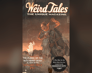
Excellent layout and love the vibe. Wish I could see the covers that inspired you to be able to rate that easier.

For anyone having issues reviewing, his account is new so you have to click the I understand the risks button to download.

This is what I wanna be when I grow up (Yes I’m over 40, I still have growing to do dang it!). Both a slugman and someone who can layout and design something this freaking cool! Congrats on making such an awesome entry!

Gorgeous art and loved the creepy concept. Unfortunately I didn’t see the assigned covers in the pdf or on the shop page, which made it hard to rate the Inspiration. That map is insanely cool and I love the creepy vibe it gives with such a simple layout.

I love how you managed to convey a very strong sense of danger and intrigue in so few pages. Well laid out and seems like a fun one to run indeed!

I love how you managed to convey a very strong sense of danger and intrigue in so few pages. Well laid out and seems like a fun one to run indeed!

I looked and his inspiration info is on the store page itself. I was a little confused about the rules of this myself.

What a wonderful and well written little module! I love the use of metaphor and the cultural tie ins. You made a really sweet little story in a grimdark world which is an impressive feat.

Love the simple to read layout, and the Family relationship table and RP guidance. a super fun looking scenario.

Excellent little gauntlet and love the use of the goblet. I suspect this would be a great one shot for experienced Shadowdark folk to start some new characters off. The use of secrets as a mechanic seems super fun

Excellent layout, and easy to read over. Also the sad little wolf guy in the cage looks like he could use a hug. I’d definitely encourage my players to do so.

That layout is so dang clean, and I loved the use of consistent styling to signpost what each section was. What a complete delight to read over.

The whole vibe of snakes getting worse and worse as you go deeper and deeper is a delight. I loved the use of so many senses in your descriptions to evoke the feel of the areas extremely clearly. The layout was super clean to read through and felt like it would be a breeze to run.

Absolutely fantastic. Loved the way you integrated all three covers.