Play Adventure Module
Dacian Draco | A Shadowdark Adventure Module's itch.io pageResults
| Criteria | Rank | Score* | Raw Score |
| Usability: Practicality and playability at the game table. | #2 | 4.278 | 4.278 |
| Overall | #10 | 4.019 | 4.019 |
| Vibes: Overall atmosphere and feel of the supplement. | #18 | 3.944 | 3.944 |
| Inspiration: Effective use of assigned "Weird Tales" cover elements. | #24 | 3.833 | 3.833 |
Ranked from 18 ratings. Score is adjusted from raw score by the median number of ratings per game in the jam.
Leave a comment
Log in with itch.io to leave a comment.


Comments
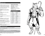
Beautifully put together, interesting character class, fairly balanced game concept - looks fun. The wolf shrine takes the cake as my favorite picture :) Very nice work!
DUDE!!! I SIMP LADY LUNA.
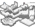
Wow, this looks great! Fantastic layout, great maps and the covers is gorgeous.
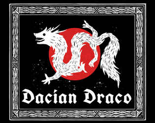
Thank you! My wife drew the Wolf Dragon! I was so thrilled that she wanted to do it, especially since she has NO interest in RPGs haha
Really like this one. Amazing artwork, design and writing one of the best I've seen for this JAM!
Thank you so much! Yours was brilliant! I watched Erik Frankhouse’s stream reviewing it last night 👏👏👏
Love the isometric maps. I was trying to see if I could find the cartographer, kudos yo them (or you)
Thank you! It’s deceptively simple! You should try with some isometric grid paper, it’s a lot of fun when you’re just tracing over blue lines 😅
Very nice exploitation of space, you fit so much info in few pages, the isometric maps are very cool, very moody, and I have to recon that "the Mystery of Acatlan" was a tricky one (haha).
It was a little tricky 😅 I had a character based off of that cover, but his role dwindled as space ran out. I put in a description based on the color of his clothes, but then I went and made the Weird Tales covers greyscale… so that was smart haha
Of course it was the red and green ruana cloak (AKA mexican poncho *wink*), now I have to say, I'm feeling the vibe (haha) I kinda want to write that Mystery of Acatlan one-shot.
Do it! And then send me the link!
Clean layout that manages to pack in a lot of very thematic material. I want to talk about Whywolves!
Love a good isometric map. Beautiful work!
Thank you for the landscape design! I believe its intended to be an A5 booklet, yeah?
It is! I wanted it to sit nicely next to my Cursed Scroll Zines. I didn't even think about it being at 9 pages in the export though, just hoping that doesn't disqualify me haha
Really love this one. For clean and usable with immaculate vibes.
Really love this one. For clean and usable with immaculate vibes.
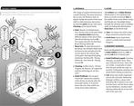
Excellent layout, and easy to read over. Also the sad little wolf guy in the cage looks like he could use a hug. I’d definitely encourage my players to do so.
He could! Haha, thanks!
Love this. Very clean. Great map.