Hi, the pack is free now.
Drasnus
Creator of
Recent community posts
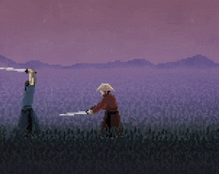
It was made in GameMaker Studio 1.4. The game uses a state-system. The normal state is 'idle', allowing for basic movements and raising/lower the guard. The dodge input gives a burst of speed in whatever direction you're holding, and puts you in the 'dodge' state. You can't move in the dodge state, but the friction is lowered so that whatever speed you're moving at will last longer, and holding a direction will affect that friction, so if you hold the opposite direction you'll skid to a stop quicker.
Essentially the dodge movement was designed so that you could reposition yourself and try to get behind opponents. Rather than making a singular, timed dodge, I thought it would be more fun to have two dodges: horizontal and vertical, so you would have to read incoming attacks, and the attacking player could read your dodge and adjust their strikes to catch you. This meant being able to hold the dodge input, and as a consequence, you could use it to skid and cover more ground. This ended up being a lot of fun, as you could also use it in place of a dash to quickly reposition yourself, and players always responded really well to all the dashing and sliding, so it stayed in.
I use GML code. They just call it 'GameMaker' now because they dropped the 'studio' title recently. They have a subscription model these days, but I bought GMS1 on sale a long time ago and I still use that version, which is unsupported but it has no subscription. Currently they only sell GMS2, with a subscription.
Thanks!
I intend to publish the game when it's finished, either later this year, or more likely, early next year.
I already did some work to improve the sidestep in the new version - a forward sidestep now has its own animation, the character will move a little each time a blade passes over, and I've been experimenting with a soft gradient drawn over the sprite to add depth.
CyB0RG200731 is right, I'm currently using the blog on this page to post progress. I think cross-posting, and smaller more frequent progress updates would be more valuable going forward though.
I see a lot of people have been asking for a Discord which is fair enough. I don't often use Discord myself, and I generally prefer to keep updates somewhere easily archived and accessible, but I'm sure it'd be convenient for people to get pinged whenever I post something. I'm going to update the blog some time soon with more of the new content so I'll consider making one. Thanks for playing.
Hi, I just did some testing. It seems to occur with the Master AI because it attacks so quickly that it doesn't have time to position itself closer before swinging again, and it keeps getting pushed back by the block. I couldn't replicate it with the other AI modes. This is an oversight, and I'll patch it some time soon. Thanks for the info.
Hey, sorry to hear you're having problems. The original custom map was intended for maps like 'indoors', with a flat perspective and a wall right behind the players. The 'foreground' image is intended for the floor section under them. An image like this dojo would work best with the other style of stage like 'Temple', with blood spreading on the floor instead, but the Custom stage doesn't support that feature in the old build. Right now updates to the old build are very low priority for me since I'm so busy with the new version.
You read that right, when you do a 'high' attack the sword will end up in the low position and it will take some extra frames to bring it back up to the top again for subsequent high attacks, but you can combo it into a low strike for a faster follow-up attack. The less-snappy sword positions do make each player slightly more vulnerable, but it's only by fractions of a second, and you can still easily react to enemy strikes in time to block them because the attack windups take much more time. In practice it's not a huge change and the game feels much the same, but it now allows for more mind-games and tactical depth when reading your opponent.
Hi, thanks for playing. I just typed up a slightly longer message only to accidentally hit refresh, so I'll summarise a bit more briefly:
- Right now the plan is to give it an 'edition' title, ie: 'First Cut: Sharpened' (just an example).
- I'll figure out some cool secret maps for sure.
- The Custom stage loads the 'custom' image included in the game folder. You can edit that image to create your own (indoor) background (ie: https://itch.io/post/5001628). I'll try to include a folder in the new version for loading multiple images.
- The fighting system works the same way, just with some improvements to increase depth. Changing stances now takes some extra time and repeating the same attack takes longer than comboing. The old game had a 'fatigue' system to slow down attacks if the player was spamming and missing repeatedly, this is removed in the new version since it was made redundant by the new improvements to combat.
- I'll include more options this time around, including a blood/gore toggle. I've already included a blunt wooden sword that can be selected to avoid drawing blood. There are also more gore effects and variations in this version (you can cut off the head partially, then take the rest off). There's a control-bindings menu now so you can remap your keyboard, mouse, and controller buttons. It should work with any standard usb controller, though I haven't tested it with a nintendo one.
- Currently there aren't any plans for multiple weapons (except reskins). Maybe I'll address the idea post-release, but it's very important to keep players on equal-footing and avoid creating a 'meta' build since each fight can end so quickly.
- I like the near-hit idea, and the oni mask. I've added them to my notes.
Sorry to hear that. I noticed that the fix seems to work for some (including on my machine) but not for others which is frustrating.
Did you try the original workaround: opening the options.ini file in notepad and changing 'SleepMargin=1' to 'SleepMargin=10' ?
Supposedly it could be related to 'vertical sync'. You could try changing 'AlternateSyncMethod' to 1 in 'options.ini'.
Does your laptop's GPU have a control panel (ie: Nvidia Control Panel)? If so, you could make a profile for the game on there and try changing the Vsync setting.
Essentially it's a square surrounding the character which can be drawn on whenever a blood spurt passes on top (a 'surface' in GameMaker terms). The character sprite is then used as a stencil to cut the surrounding edges of the square, leaving only the interior visible (I use 'blend modes' to do this). This is drawn over the top of the character to create the impression of being covered in blood.
It's similar to the approach used in this game:


