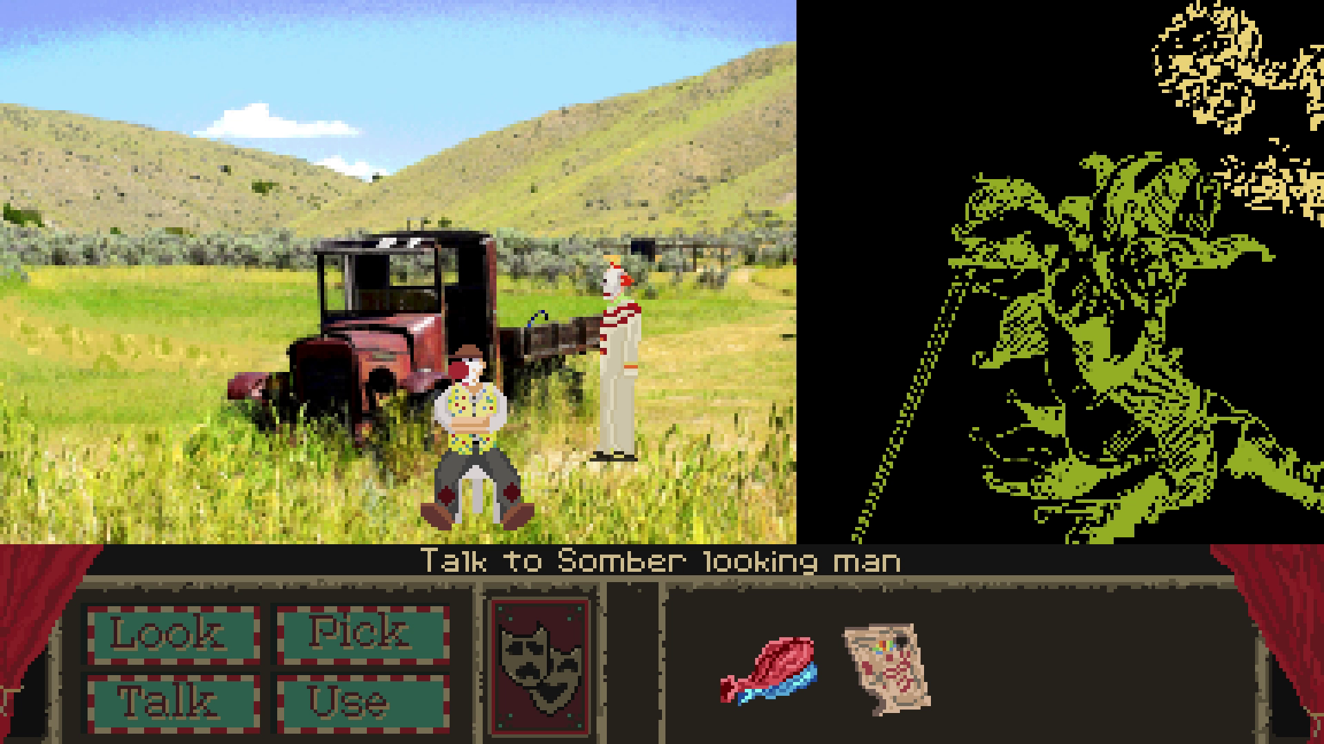
Played today finally! Enjoyable mini adventure packed with interactions; nicely nails the balance of thinking and tinkering (had to try a bunch of things before finishing it!). There's clearly potential for an expanded game with these 3 kobolds, I could totally see them bantering all the time with their own personalities quirks. The "shiny" room backgrounds were really good!
EmanueleK
Creator of
Recent community posts
Hello there! I've recently made a demo for a Point & Click adventure. It's a surreal comedy, with a few anxious bits.
https://emanuelek.itch.io/clowntown
I'd really like to collect any opinion on the whole thing (narrative expecially!). So if you download it I'd like to hear from you, even if you dislike it, me taking note on something like at what point did you lose interest would be very helpful for my future projects!
hi! I released a short adventure game demo, lasts about 1 hour and is a dark comedy. I'm eager to get feedback on writing and puzzles/progression, negative ones are welcomed to let me improve in the future!
Hi, I've made a little post about how I made the background art for the prototype/demo I made for a point and click adventure Clowntown.
Feel free to give feedback if you try it, it was my first time writing an adventure so I'd like to hear from you if there's something you enjoyed in it (or not!)
https://emanuelek.itch.io/clowntown/devlog/737594/background-process-showcase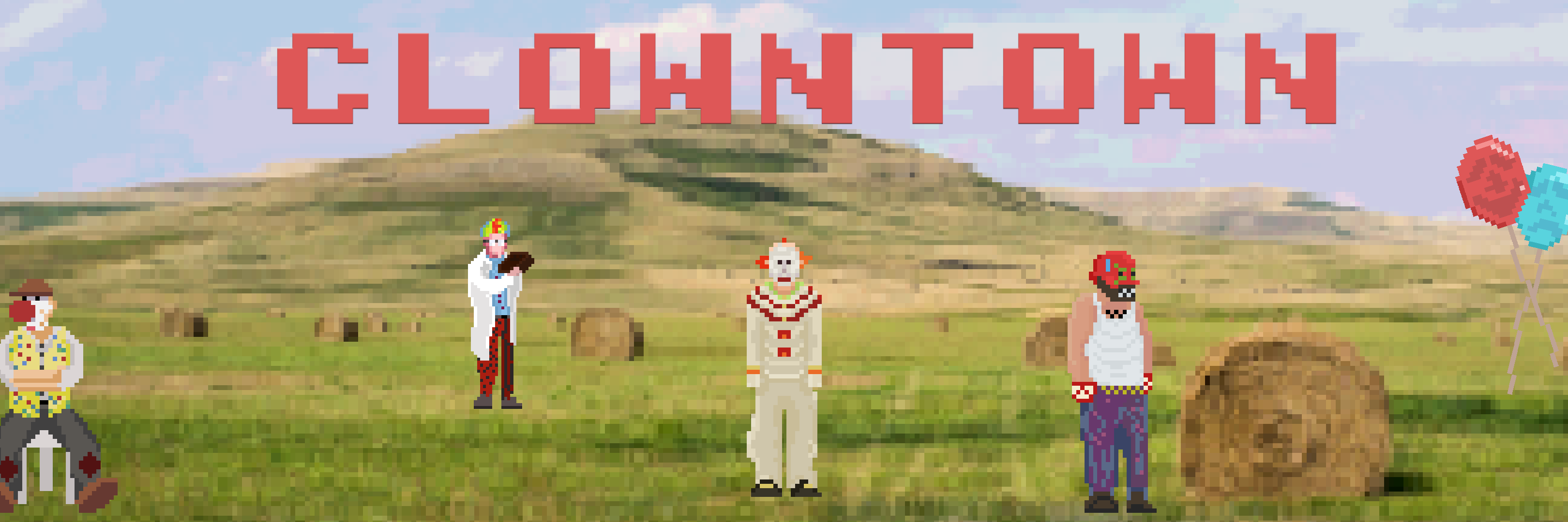
https://emanuelek.itch.io/clowntown
panic-inducing comedy / forced smile tragedy about carelessly trying to advance, only making it worse along the way.
A surreal 4-verbs Point&Click Adventure. Completion time: about 1 hour.

Right, that could work in rooms where I already haven't set a region to scale based on height (as intended).
Talking about that, to avoid making another thread, I was wondering if there's documentation on how the scaling work, because I have rooms with very different perspectives and I my original plan I intended to use (and maybe abuse) the scaling regions while keeping a single sprite with fixed sizes, but I'm seeing more and more that the scaling is a bit unpredictable and the sprites get deformed in so many different ways, which is fine for very small downscale (like in distance), but a bit less convincing when I need just a little scale down up close. I wonder if anyone was ever in my situation and how it was tackled, maybe create the same sprite at a small subset of sizes?
Hi, first thing first: thank you for powerquest, it's an incredible tool.
I was wondering what's the process for scaling sprite /characters. Is the only option to create a smaller source file (i'm using the aseprite import pipeline) since scaling down the prefab is useless? (I've come to understand that everything done in the prefab is overridden animation-wise by the framework, like when placing manually characters prefab in a room gets ignored)
https://dr-locrian.itch.io/deaths-gripper
An endless runner with an end, heavily themed and stuffed with references to the band Death Grips, if you don't know them it will be difficult to apreciate all the jokes. It was made for learning purposes and fun, it seemed kinda decent while making so I decided to publish it, even in this raw version and with just a 3 weeks time span of work behind it. I planned to make it endless and with various phases but I ended making it timed and synched with the song (wich is 90% of the joke). Used mainly free assets found here and there, i'm not familiar with any thing graphical so... It will be my next object of study though.
mac version is untested, linux version look kinda darker, lights are not working like the windows version
