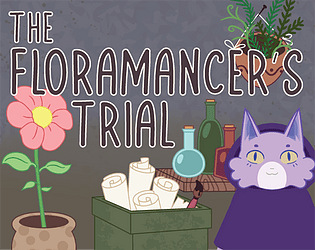
Thank you! we're working on balancing the games a bit better to more gradually build the difficulty. A rank is great! (honestly it's a bit broken to get the highest S rank right now so it's the best you can reliably get). The rune drawing is a known issue in chrome, we're working on fixing it for the next release, though it does work fine in the downloadable version as far as we know. Thanks again for the feedback!
ennWaveStudios
Creator of
Recent community posts
Well it depends, it's not so much a question of what fonts I like, because it's a decision that needs to be made in the context of its overall use, right? Like in the case of your game, the in-game color pallet and design motifs read kinda like a late 1800's - 1910's, old-timey vibe. You used warm colors, golden surfaces, and organic swirling shapes for the structure that hold the glass terrarium and UI elements. It feels like an ornate, or refined script may have been more in line with the game's tone, than the contemporary, casual feeling font you did select in the end. Another thing to note, the color selection for the thumbnail and title treatment is also off because again it's very bold, modern feeling colors: pure white, vivid green, and an orange color; colors that aren't really featured in the game itself. So, making these kind of design decisions is more about putting two things side by side and asking, does this go with that? And in order to bridge the gap between two elements, they need to start to share design qualities, whether is color or line weight or flow and shape. I hope this is helpful.
thank you! Yes the rune drawing can be hard, i actually had to lower it's matching radius a bit to improve performance in browser, so a final version of the game may be a bit easier.
The method for matching is far from optimal, but I didn't have the time to come up with something better. Each rune has a line2d with a set of points matching the sprite loosely. When the player clicks they generate another line2d which is just a series of points following the mouse. Once the mouse button is lifted I took the generated array and added points in a radius around it (otherwise you'd need to have pixel perfect accuracy hitting the runes points, which are not always where you'd expect them)- this value I exported so you can adjust how lenient the matching is. Once I have a 'thickened' array I check to see if the Vector2s match and add them to a separate array of matching points if the point had not already been matched. The match percent is just the size of the matching array in comparison to the rune array. The biggest source of headache came from not having the points being snapped to the grid, so there are several checks that round all the points so they don't have any decimal values. It feels like every step of this process could be done better and is likely why the game crashes or stutters in chrome, but I had to move on once I got something remotely working. I hope this description was clear enough for you and that I didn't leave anything out
Hey there, we'd appreciate a play, thanks in advance. Here's the link: https://ennwavestudios.itch.io/floramancertrial
This was a lot of fun, one of my faves so far. I liked how overtly visible you made the cake color, even at great distance, so I never spent too much time searching for them. It kept things really fun and dynamic. Overall it gave me like Octodad vibes in that it was super silly and easy to pick up and go. It also ran amazingly smooth in the browser, so good job with that.
Thought this was super chill and enjoyable. I didn't realize the bottom slider was for brightness, I thought the game was just dark at launch, haha. Only criticism would be the styling of the game's title font and submission thumbnail really don't match the in-game aesthetic. But great job on all the other visuals.


