It would be better if the location of the cursor was in the center of the palm of the hand, not at the wrist.
entity01491
Recent community posts
https://vimeo.com/1031170272?share=copy
Here is how it currently works for me if you want to take a look.
This game needs more visual feedback. The effect of colliding with obstacles is only visible if you keep an eye on the energy bar, there is no real visual feedback to indicate if something is harmful or beneficial to the player.
The obstacles also start spawning too soon. I just started a new level, and already hit a randomly spawned obstacle because it was right next to my character. There should be some buffer zone at the start before they start being spawned.
The character's movement is tediously slow. Not at all what I expected with these hyperspace visuals.
And finally, the energy- It just keeps running out, and I have not found a way to refill it. I thought the yellow and green obstacles that looked like batteries might recover it, but they only took away from it.
If some rare pick-up-ables recover it, then the game is just too reliant on luck.
Sure, I'll look forward to it!
By the way, I think that Tokatonton sounds better than its English translation.
Especially in conversation saying I play "Tokatonton", vs saying I play "Clang Clang Ting Ting", Tokatonton rolls off the tongue better and just sounds less weird in general despite meaning the same thing.
If someone checks someone else's profile, they might see all the games in that user's collection if the said user decided to share their collection.
The problem is that it also shows adult games even if they have not agreed to see adult content. Well, just having them listed isn't the main issue. The issue is that a lot of adult games have adult content directly on their thumbnails to gain more viewers.
This can easily affect those who do not wish to be exposed to such content, or are not legally allowed to.
My suggestion is to blur the adult games' thumbnails if the viewer has yet to agree to see the adult content.


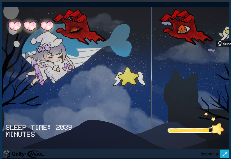
 I managed to achieve the ideal sleep time: 34 hours of sleep.