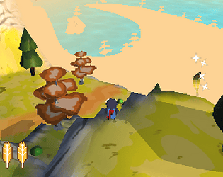
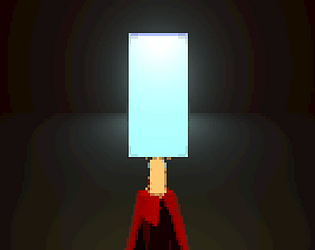
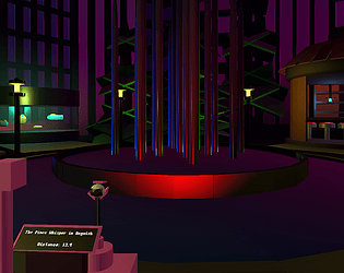
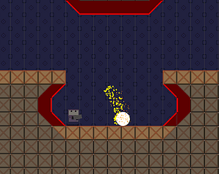
Ok yo I didn't see this last week but I need to comment on this now just to say it rules and I love it.
FINNJC
Creator of
Recent community posts
Miles this is wonderful. At first I wasn't sure why I needed to walk around the space to press the button, but once I had press it 300 times with my face glued to the button it made sense. The level acting as a sort of deprivation chamber drew me aggressively towards hitting the button, and your choice of sounds was equal parts motivating and horrific (Bass boosted Fortnite music really got to me). I will say the presses counter resetting for each sound wasn't entirely clear at first, and I'm still not entirely sure how to read the range. I would almost prefer there be more, clearer data, but out of the way of the button so players could be more isolated in their shame. Overall though, this is a simple idea that you have managed to knock out of the park with an incredibly elegant execution. Well done!
You've so nailed the feeling of swimming its wonderful. From the high speed you move at underwater to the little delay on your turns, and especially breaching the top and getting a view of the surprisingly detailed world above, its all fantastic! I will say I've not managed to find my family, and while I think the big map is great, the lack of landmarks does hurt it. I got a call back once, but I was already swimming away at speed and I wasn't able to find it again. Perhaps making the space slightly smaller but with more distinct biomes would help. But other than that, the sound design and feel are all here and feel incredible. Great job!
Ahh Nate this is so good! Tbh I avoided the first Terry the Spider out of a genuine fear of spiders. Playing this now I'm really impressed, and genuinely quite creeped out by it (in a good way!). The inverse kinematics on the legs is just so impressive, feeling both natural and spindly in a way that really gets to me. The play space you've made is really fun to walk around in, and wonderful to see that the tattoo squid now reigns over the world like an eldritch beast. I will say the physics feel a little floaty, and its hard to play this and not want to climb the walls of the cage, as hard as that would be to implement. But this is a really wonderful prototype and it feels like it has so much room to grow into a crazy creepy crawly adventure game. Great job!
This is really nice! Your choice of music and sound effects gives it a really chill, vaporwave-y vibe (I kept thinking of Paradise Killer for some reason) that made me want to keep playing, even when I kept dying. The multiple flower sprites are wonderful, and the little up and down bob of the cloud is such a sweet engaging touch. My main issue with the game is honestly just that the hydration health meter being the smallest element on screen, as I assumed it was less important. Same with making the cloud rain, I assumed that only letting it occur infrequently meant it was more of an aesthetic choice. It feels like the priority and pricing of some of the elements could be rearranged to really hone in on the already wonderfully chill and focusing garden care here. Truly lovely job!
This is so radical. I was worried the concept was slightly convoluted, but within seconds of playing it made sense both narratively and mechanically. The multiple screens you have to keep track of really make it feel like you're having to manage an entire car that this cockroach doesn't know how to handle, and balancing following its instructions and preventing it from dying is a perfect balancing act. I do have minor complaints, like the steering wheel direction mapping to 4 directions instead of just being a wheel. It meant that sometimes me and the bug would steer in opposite directions, and it then wasn't clear what was the stealthiest way to get back in line. Equally, I love all the text but I don't know if its the bug talking, the car talking, an AI talking or who. Grounding it in the space a bit more might help. But really that's all ideas for further development, as I really love this game as it is, and everything it could be. Great job dude!
This is a cool clicker take on the prompt! I love how you leaned into surreal visuals, and having this ocean of salmon above you be the currency is a really neat idea. It was rad to keep going to find the new items you could buy too and the effects they would have on your salmon count. I do like the idea of letting you move around in 3D, but that wasn't entirely clear at first which led me to just staring at the floor for a while. And your slow move speed combined with the sometimes very long distances the spawner objects spawn from you meant it never felt like walking had much point. I think if the enviroment was a little denser and smaller that mechanic may have worked better. But I wtruly watching all these salmon swim through the sky is a real joy, and the feeling a giant one breaking through the ground is great. Good job!
This is really rad. The opening did not prepare at all for what was behind the door, which feels perfectly appropriate for this. Clicking the box to cycle through the text has a great disorientating effect. And honestly, when the eyes responded to poking them it was quite shocking, and its an upsetting (in a good way!) visual to have in the background as I write this. I do wish I could poke the other two eyes, as its hard not to feel I'm missing some content somewhere. But honestly given that this is intended somewhat to disorient and startle, I think this is really perfect as it is. Even being unable to poke some of the eyes has a great uncanny feel. It's a great use of the assets while still feeling totally unique from other interpretations. Great job!
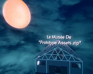
Nice to see someone else took the museum approach! This is really nicely and neatly laid out, it really feels like you wanted to display these as compassionately and fairly as possible. The different sections make it really feel like a museum. I love that you get to choose which skybox is active, as it affects the whole space. Interactive elements are something I wasn't able to get to in my museum, but its great to see them here and it would be rad to see them taken further. I want to especially shoutout the object's name appearing when you hold the mouse over it, as its wonderfully subtle but again greatly contributes to the digital museum feel, though I think you could increase the range slightly. Great job though, really enjoyable to space to chill in for a while!
This is a great concept and execution. The slow amping up of the screen shake as you shake the sprite is wonderful, and the physics of the bottle flying up and sputtering out are so well nailed. The background you've made is surprisingly cohesive given the assets we had, and overall this just feels like a wonderfully complete package. I will say that I did struggle at first because the bottle starts aiming down, and I didn't know I needed to turn it. Giving some indication of the spin controls on screen, or just starting the bottle facing down might help the game more immediately connect. But other than that this is truly just great. Well done!
This is incredible! You've managed to congeal all the disparate aesthetic of the assets into something that totally meshes and is really enjoyable. Special shoutout to the banana guns, you put a surprising amount of work into the different animations and feels and it totally pays off. My only small complaint is that at first I thought the sprite and eggs were enemies, possibly because of their size? I eventually figured it out but differentiating them a bit more might be ideal. Overall though this is again really incredible, not just as an asset exercise but in terms of actually making a really fun and balanced FPS. Great job!
Ah Jordan this is such a great idea and you've executed on it so perfectly! I was able to pick up immediately which key I needed to hit, and once I got the premise my hands were glued to the keyboard trying to nail the sequence. The art you've made is ofc incredible, and really sells this little ball of something trying its best to be the pet others want it to be. And mechanically, everything feels perfectly arbitrary, where even if rolling over 3 times feels repetitive, I want to do it because I want this little slime to have a home, and the arbitrary-ness makes sense given how desperate to impress the slime is.
My only real issue is that I accidentally skipped over being both denied and adopted the first few times as I slammed the red button before having a chance to fully read it. Having the game slow down a tad there, or even just changing the colour of the button to alert me to look closer might have been nice.
But really otherwise this is incredible, from the visual design to the button choices. Great work dude!
This is so sweet! The music choice and the little bubbling sound effects make this just a wonderfully chill and touching little experience. The tank is really lovingly detailed, and being able to turn the lamp is a very nice touch.
I do wish their was a little more interaction, even just by having the lamp affect the lighting on the turtle, or if it could go behind the castle or seaweed. I also managed to get the turtle stuck off screen accidentally by spawning some food at the bottom of the screen, leading to it to swim presumably forever to try and catch it.
This is again really wonderful, and has been wonderful to keep poking at even as I write this. Great job!
This is truly just incredible. The sand and water physics alone are a pure joy to play with and amazingly well executed given the time we had (thank you so much for posting that tutorial below, I've been wondering how Noita did it!). But then on top of that you have the crab, the fish and the ball, which all have unique characteristics based on what material their in, plus the nice little emojis. And then you have some beautifully chill music and background, special shout outs being to those chill clouds and smoke particles. This is a really unique take on the pet game prompt given you don't technically have direct interactions with the pets. But getting to see how they react to water and sand led to me actually playing with them like a pet! I really am just blown away by this, so again, incredible work.
Goop is very good! The name paired with the idle animation really sells this amorphous, sentient blob, and particular shout out to that eye poking the goop out at the top. It's small, but I love it. The pizza eating animation being super quick too really works in the games favor, especially with the big Feed Goop button at the bottom. I can feel how important it is to feed Goop, even without any context.
I will say at first I didn't notice the bar was changing colour as I expected it to shrink in size or slide off screen. It also would have been nice for Goop to change a little depending on how you feed them, maybe growing larger as they eat pizza or having the animation speeding up as they look for food, but I'd also understand if the unchanging nature of Goop was important to the concept.
Really excellent work overall, and an incredible amount of atmosphere with the relatively sparse assets.
This is a super fun concept! Climbing a giant set of stairs to both assist and be assisted by little creatures is extremely cute, and I love all of the designs you've done. Each new creature was a delight and the player character has a real powerful, persistent vibe to them.
The creatures spinning around the player and knocking into one another is great. Sometimes I found they can knock a new creature off screen before I can grab it which sends it into a wild orbit, so trying to ease that out a little might be nice. I think it would also be appreciated if there a little more indication of upwards progress, even through just slight changes to the stair and BG colours as you go up.
Overall just incredibly charming though, I truly love seeing this little guy scoot up some stairs with their friends.
To begin with, i was only able to play by myself, but I find this concept so cool. It's such an elegant use of the 1 button prompt, creating a really intense momentum driven fighting game. Even just by myself I fun swinging around the zone trying to manuever around as quickly and as competently as possible. I only know a little about Capoeira, and I would be really fascinated to hear how this acts as a streamlining of the art, cause it definetly feels like a strong distellation of a larger concept.
If I have one complaint, its that it wasn't always easy to know which player will win in a fight. I can't tell if I was just getting confused or playing poorly, but the player I was expecting to win often wouldnt. I know your meant to hit the pivot point, but sometimes it felt like both players hit eachother's at the same time, or none was hit at all and still somehow someone lost. Again, my solo play limits my understanding, but fine-tuning how that works (perhaps with some invincibility frames) or how its presented would help alot.
Overall this is just a super elegant concept executed beautifully. Well done!
I'm really enjoying this! For one, the fact you've managed to communicate an entire space and event with one low res pic of a crowd and a few blocks of colour is really impressive. The sense of acceleration is surprisingly tight, and you have nailed the arc of the little cubes jump. I get so hopeful watching it rise in the air, and I always just end up proud of it by the time it lands. Plus, it always felt like the foul line came at a slightly different time, which I can't say for sure is true, but is more to say that it never lost the tension of the first run.
If I could offer some space for improvement, the main one would just be a way to fix the bug that prevents you from running if you let go of space, as it made multiple runs difficult at first. More than that though, some way of panning the camera from run up into the jump would really help unite the two emotional arcs of each stage, and better show off how my run affects my jump. This would also mean that you would get to see yourself foul, as opposed to cutting away from the foul just as it happens.
Overall I really want to stress how fun this is, you've clearly nailed some numbers and physics on the backend, and the lack of visual fluff highlights that rather than distracts. Really wonderful job!
This is really stunning stuff. The clean visuals, sharp sounds and chill music bring me back to spending hours playing chill mobile games, and this fits that genre perfectly. It's a wonderful comtemplative rhythm game with alot of depth, and the way mistakes can lead you to spiral out of control I actually found really powerful. To keep track of the various barriers and direction of the wheel, I needed to stay calm rather than panic, which resonated quite strongly.
On that note though, if I could offer a suggestion, it would be in just be to add a little more juice. I could sometimes get confused which way my wheel was turning, or which barriers had been hit. If the wheel turned quick but smoothly, rather than in a fixed step, or if the barriers emitted some coloured particles when destroyed, I would be able to grab my bearings much quicker and make a plan, rather than spamming the space bar in the hopes of regaining some sense of control.
Again though, this is truly really incredible. The art is intensely detailed but still comes off as minimalist and undistracting, and the same goes for your sound work and the game concept at large. I keep playing again and again not to beat any high score, but because I find your high tension rhythm game of protecting a heart from wanton beats incredibly soothing, and thats an incredible achievement.
This is really neat! The concept of being a river carving a path into a desert is really strong, and the water has a strong weight and force to it thats really enjoyable. Plus, the movement is surprisingly deep (even in just remembering which way you're going to turn next) and the cactus placement is quite nice, leading to challenging but never impossible situations, and for me to take dangerous routes for a fun bend.
I do just wish there was a little more to it. Sounds would help sell the work your water visuals are already doing, and a scoring system would incentivise me to keep going back. A long shot idea, but one I would love, would be if the camera could pan out and show you the path of the river by the end. But all that to say that I do love what's here already, and all I really want is more excuses to dive back in. Really good job dude.
This is so wonderful! The title alone is brilliant, and you've executed on the concept so strongly. The amount of different charecters and dialogue continually surprised and charmed me, and the fact that the CPU is playing as well led to so many cute moments where I fumbled around awkwardly trying to be affectionate only for the other person to beat me too it.
My only slight issue is the minigame itself, which isn't to say its bad. It's simplicity puts the focus on the strong aesthetic work you're doing, and it allows for the multiple game states you created. It just doesnt fully congeal with the rest of the game, and I think even just making it slightly smaller and cleaner would help alot.
But truly to your credit, you manage to capture a very specific vibe of trying to ascertain how intimate you should be in a social situation with someone you like, and you make it look easy. Really incredible work, and would love to see the concept expanded.
Thanks for commenting! Getting the three different actions and enemy types down came after like an age of thinking, but from there it was pretty smooth to go from design to implementation. The second two were specifically designed to combat spamming and force closer attention on the game, and I'm glad that came through! Also thanks for the sound comment, all of the juice came together right at the end but I'm pretty proud of it.
The soldier dog issue is definetely present though. I find when a dog comes just behind a soldier and you're able to take both out in one hit, that can be very satisfying. But the soldier's jumpback in particular can be pretty varied depending on the frame you hit him, meaning that the dog can end up in some pretty inopurtune positions. The last round in particular was designed with that fault in mind, but can just be impossible if you don't get the perfecting timing at the start. Finding a way to ensure correct spacing between enemies would be a number 1 priority were I to have more time fleshing the game out. Also thanks for the comment about the heart tank bug, I havn't seen that before and I'll look into it.
Thanks again so much for the feedback! Really useful and actionable stuff, and I'm glad you had fun with the game!
Ahhh thanks Nate! I'm glad it connected as a rhythm game to be honest, I was a bit worried it would come off as pure combat with a weird beat thrown in the background. And Nidhogg was definetly on the palette of inspirations, so I'm really glad to hear the aesthetic pulled through.
The enemy pushes are a little jank though. I originally designed them just for the dogs but then sort of ran out of time and just kept them for the rest of the enemies. It was a difficult balance overall to have smooth enemy motion that also stayed in line with the beats, and having some underlying system to control that would likely be the focus were I to return to the project.
Again thanks so much for the feedback and I'm glad you enjoyed it!
Thanks so much dude! I'm glad you were able to enjoy and push through the final levels, I certainly didn't make them easy. I was worried the kinda disparate graphics styles along with the rhythmic beats wouldn't manage to mesh, but hearing they worked for you is really great to hear.
Fair comment about the hit boxes though. It was tough to fine tune because the hit box for killing an enemy is the same one they use to kill you, so they had to be both fair to hit while also not too large to kill the player from far away. If I could go back I would likely separate those functions into two hit boxes to resolve it. And thanks for the note about the clipping, that I can hopefully remedy soon.
I like your idea about it being set levels though, the ones in the game were certainly really fun to build. And it would help to address the difficulty curve, which I did make quite steep.
Thanks for the feedback again!
Love the idea of remaking this in 3D, and you've done a great job of it. I'm amazed how similar it still feels and plays to the original, from the player's movement, the enemies and the tree spawns. Also the little 3D touches like adding in the red bike trails and explosions really elavate the experience! I do wish you had managed to add a few more details like that in, either by taking it in your own direction or putting your own spin on some of the elements in the original that you didn't manage to get to. I would also note that when you shoot with the bike, the bullet stays in front of you regardless of how you turn afterwards. I can't tell if this was intentional or not, but it did make it appear at time like bullets were passing through enemies without killing them. Overall, I'm very glad you took it in this direction and you did a great. Well done!
This clone is great! You've managed to nail the look of all the sprites and I want to particularly shout out the rate at which you increase the speed of the background sprites when you move over them, as it just feels wonderful. I nearly missed the score system entirely, so the degree to which you've made it feel identical to the original is truly impressive. My only tiny complaint is that the green and blue squares move continuously, rather than in steps like the original. This is an incredibly minor and fair change, but given the accuracy of everything else it's really the only detail I miss. Also of course M O U SE, but that change is incredibly good and full of alot of detail of its own, so no complaint there. Really incredible work!
Wonderful clone here! The audio has a wonderful feel to it, the slight adjustments to the biker sprites(?) as they change angle is really impressive, and the effects are all wonderful, from the particle explosion to the black screen sweep after death. The shooting does feel slightly inconsistent however, as sometimes my shots seem to lock on and others not. Equally, the slower turning speed and the bikers wavering patterns sometimes made them difficult to track and I lost them entirely on a couple of occasions. Most of the times these systems worked great though, and overall this is a really incredible recreation. Well done!
Really well developed here. The behaviours of all the different parts all feel accurate, and the timing is spot on. The interface layout is the major sticking point, as the screen seems zoomed in as compared to the original, and some of your text elements are in the wrong locations. The rat also sits in front of the computer interface rather than behind it, which honestly does your presentation a disservice. Really great work overall!
Loving this clone! The movement really feels great and I like the extra emphasis place on accuracy for the shooting. I also want to compliment the trees, as I found it often transitioning between high density forests and low density fields, which made it feel like I was genuinely moving through space. The transitions between day and night are wonderful too. I do think your speed increases a little too fast with too high a cap, as it never took too long to catch up to the enemy bikers (though forgive me if the original had a similar issue). I also had some framerate issues especially when first starting a round. But overall this clone feels fully developed and faithful while still putting neat emphasises and spins on different parts. Great job!
Truly incredible sound effects, and the feel is much smoother than my experiences with the original. Getting the in-range notifier and launching a shot feels great.
The trees are the most significant issue, as their location is hard to parse and it felt slightly out of my control as to whether I would hit them or not. Great work overall though!


