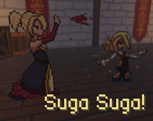
I wanted more gore, but yeah I am the villain
Gabriel "Syll3x" Ponzoni
Creator of
Recent community posts
Enjoyment: I loved it!
Presentation: I liked the pixel art and everything else. Just the buttons sometimes don’t give me feedback.
Concept: Cool. Everything fits together, from the colors to the assets.
Use of theme: Good, almost too good to be true.
Use of prerequisite: I loved breaking people to get blood. Almost too good to be true.
Controls: Okay.
Wishing you all the best, and congratulations on the game! If you need any further feedback, feel free to ask.
Enjoyment: I didn’t enjoy it much. I liked the map and assets, but I couldn’t solve the puzzle, maybe that’s why I didn’t enjoy it as much.
Presentation: I liked the atmosphere of the game, but the text was difficult to read, especially the poem. I don’t know about the font… 10/10 for the 3D models though.
Concept: The obscure ambiance was intriguing, perhaps reminiscent of a villain’s lair, but I would prefer more evil motivations than just place and a poem.
Use of theme: Okay.
Use of prerequisite: I didn’t feel the impact of blood in the game machanics.
Controls: Okay.
Enjoyment: Good, I liked the game idea and progression.
Presentation: The palette of colors, transitioning from purple to red, gives off a good vibe, but the UI fonts? Why don’t you try using pixel art fonts? It would be cooler.
Concept: Cool and creepy, I liked that! The pixel art and sprites were well-fitted.
Use of theme: We don’t have a direct villain; we maybe have some objective.
Use of prerequisite: OK.
Controls: The range to drain the blood sucks sometimes.


