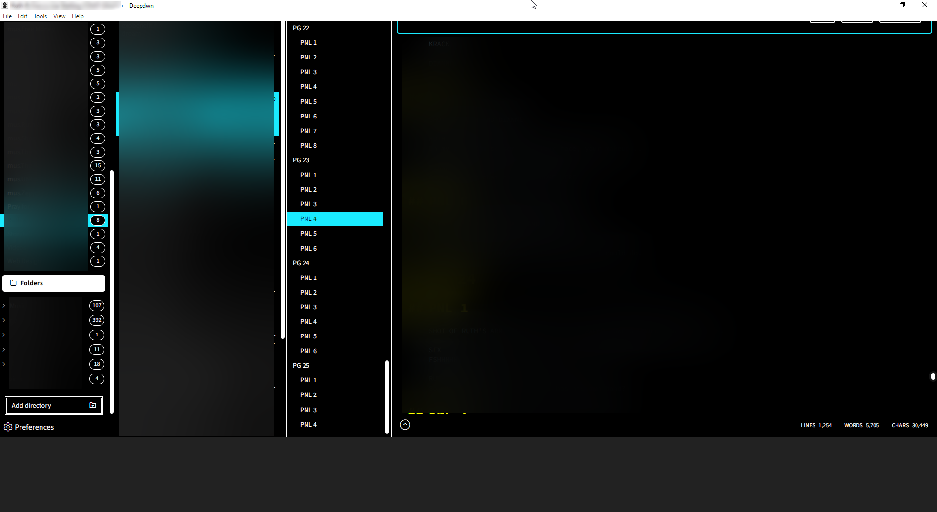
Something I should mention is that like, sometimes the modal will pull up fine for me and I'll see it normally, the way your screenshot looks. but sometimes it'll do the weird pushing up thing, and I'm not totally sure why it does that
geno7
Creator of
Recent community posts
Hey, first of all gotta say deepdwn is a great app and it's become like the main thing I use for writing. comic and video scripts, lyrics, even just random ideas for planning stuff out. I've def become addicted to the interface.
Anyhow, there seems to be some kind of strange graphical bug that will happen every so often, usually just when I'm in the middle of typing stuff out.

I've blurred out my text and file names for privacy. the main focus is like, it seems like some kind of notfication modal pops up above the main editor view, but it shows up underneath the top bar so it's too obscured for me to read it, and when it pops up the entire interface seems to get like, pushed upwards, leaving an empty grey block at the bottom.
By hold clicking and moving my mouse over the area where the modal pops up, I've managed to highlight and copy the text in it that I can't see because it's behind the top bar -
"This file has been changed by another application, and you have unsaved changes.
You can save now to keep your current edits, or you can reload to adopt the other version instead"
And I do have Autosave turned on, so if I had to guess it's some sort of bug with the autosave feature. also, since the file I'm editing is in a Dropbox folder, it may have something to do with it reacting unfavorably to the file syncing system in Dropbox. Though I'm not sure why it would push the interface up like that.
In my experience, clicking the un-obscured part of where I assume the "yes" button would be seems to fix the bug and put the interface back to normal, but if you go to File > Save the modal just goes away and the interface stays pushed upwards like that, so I have to close and reopen the program to get it to work.
Hey, I'm a writer and I've sorta been using Deepdwn to keep all my scripts organized and accessible from one place. I don't know if this is what Deepdwn's intended use is though, correct me if I'm maybe barkin up the wrong tree here, hah.
Either way though, As I'm just getting into using it, there are four big things I'm noticing would be extremely helpful -
1. A way to select both a category and a tag at the same time, possibly even multiple tags at the same time. It would help me immensely to stay organized if I could narrow down my searches more by being able to see like, all of the files with a certain tag inside of a category, or even all of the files containing a set of tags. Just making tags and categories selectable at the same time would be a godsend. I haven't been able to see the point of having both a "category" and a "tag" if they're both on the same level structurally. Though again, tell me if I'm using it wrong
2. tags are listed by how many files are in a certain tag from most to least, would it be possible to make it toggle-able to have them be listed alphabetically? again just to make it easier to stay organized
3. A toggle-able feature where a YAML section is automatically made at the start of a new document. This would just save me the time of having to like go into an existing document and copypaste a YAML file every time I create a new one.
4. A way to control the size of the headings, rather than it just being a switch that makes them big or small. Like, maybe some kind of slider that would let you control how big your biggest heading would be. Just because like, I've been using Deepdwn to help me write comic scripts and divide them into pages and panels, and sometimes I don't want a giant heading every couple lines, but I do want some kind of size distinction. I could in theory just put more hash marks to make them smaller but again it would be a headache to have to type four #s every couple lines or so.
Anyway, thanks a lot for reading, lemme know if any of this stuff is stuff you'd plan on implementing. It is a great application though, there's a ton of polish and I'm getting a lot of mileage out of that Outline tab.


