how
Jokes aside, completely impressed that you used google slides for this, I def was not expecting to play a game with it. A fun, short and sweet point and click adventure with very smart implementations to avoid having players reach out of bounds and actually play the game. When there's a will, there's a way, and if anyone's got you, I know google slides got you. Some things to note, I didn't realize I had to click the buy button on the amazon page to continue, but I eventually figured it out through "cheating" (I'm dumb and I think others can figure this out, but I was to awestruck from the gimmick to think of pressing the buy button)
Greeni
Creator of
Recent community posts
Great game, fun story, and I love the spin dash mechanic and the momentum system you have. It is a it hard to grasp and I admit that I don't have it fully mastered yet, but there is potential to what you can do with it. Only feedback would me maybe make the wall jumps a bit higher, and give the player some hp to take hits instead of being one shot.
Fun, fast paced game that feels rewarding once you understand the gimmick and the movement of the characters (Movement is very very good!). It was hard to tell who wanted what luggage at first, but once I figured out that you had to hover over the characters to see what they wanted, the game made sense. I first thought that the color of the people represented the bags they wanted. It also was kind of hard to also tell the difference between similar colored and shaped bags that were being requested since it is so small. Maybe choose less and more distinct colors like red, blue, green, black, white, and shapes that have more distinct differences from each other. Other than that, can't wait to see what other ideas you have in store!
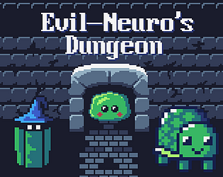
I really enjoyed the concept of the game. My favorite part has to be evil's fight, the music and bullet patterns are great. Overall the entire art design and presentation of the game is fantastic. The sprites, subtle shadow effects you have, title screen and drawings for neruo, evil and vedal, and everything else. The only part that needs more work is the movement and control. Some platforms are a bit too close making simple jumps precise, and after dying, the death transition feels slightly too long. Maybe having dash be on another button would make it so that the player is able to dash even when they are clinging on a wall. Outside of the fine tuning, you have a fantastic game with great potential and tons of charm, great job :)
Fun game, I like the sprite work on neuro and the different tutels, and I like the concept of having to find different tutels to unlock new areas throughout the map. The backtracking is nice, but can get long and annoying when trying to get a tutel that has died. Buttons and some spikes are hard to see at times resulting in moments that I didn't know what to do next, and deaths that feel unfair. I also found it quite difficult to get the necessary momentum and angle on tutel to get him through tight spots (especially at the star that's up top from where the player begins). Outside of that, as a rage game I feel like the game is perfect. It's not my cup of tea, but I know others will def enjoy it. With a couple of additions to the game such as music and some more sound effects such as walking, landing, or the occasional tutel/neruro schizo speak, this would add a lot more charm to the game, making it an overall pleasant experience.


