Ah, so that type of system is already somewhat in place. That's handy, I totally didn't see it. However, I think that making reviews public would be really useful too. I always read Steam reviews and check the rating before I consider a game.
Karai17
Creator of
Recent community posts
I am not sure if this has already been discussed or not, but one major issue I find with most game store fronts is that discoverability is very difficult. It can be very difficult to sift through the sheer number of games to find something that catches my eye. Steam's community curator system is pretty handy in that community members can build up a reputation and a list (or lists) of games they recommend others try, often with their own personal review attached. I really like this idea. The Google Play store has curated lists (editor's choice) but that is not nearly as comprehensive, and is not community driven. Google itself curates apps and games and their obvious motive is to push games that make bank, which is heavily biased and leaves no option for personalization.
Have a scenario:
Let's say I am looking to pick up a new visual novel. If I click the VN tag, maybe a list of 1000 games appears. That's a pretty big list! And what do I see on that list? A single screenshot, a title, and a short blurb. Not much to go on. I can filter it down more such as by platform, price, but I could still be left with a list that is hundreds of titles long. I'm a busy guy, I don't have time to find a game I just want to play one! But hey, VN_Lover_9001 has played hundreds of these games and given them each a rating and created a list of his top picks. Well if this guy loves VNs, maybe his curated list of the best in the genre is all the filter I need! Now I have a list of, say, 25 games with a nuanced review of each I can look at to pick the right game for me. VN_Lover_9001 being a poweruser can feel like he's helping the community (he is!), I get to save time searching for games and spend that time actually playing them, and I can feel safer spending my money knowing that this game is highly rated by a semi-trusted source. Win/win/win!
Another idea on top of this could be to give powerusers some sort of incentive to spend their time (and money) curating (store credit? special badges? featuring their lists, etc), and allow other users to either vote on the user, or the specific list, as good or bad quality (this could help deminish trolling or gaming the system by only giving positively rated users incentive bonuses).
A few different layouts would be nice, for sure. One layout with a carousel of screenshots on top with a display section below, then text/info below that. Or better yet, a few basic layouts with placement options where you can drag different modules (screenshot, description, buy/download links, etc) to different places on the layout.
I think 2D and 3D art are distinct enough to be considered their own things. Animations should not have their own section as animation would be a subset of 2D or 3D art.
Pixels, Polygons, Waveforms. :)
Edit: To add to my point, I wouldn't want 2D to be split into, say, pixel art, illustrations, and vectors. One 2D forum for all types of 2D art is fine. Same for 3D, we don't need low poly, stylized, and photo-realistic sub sections.
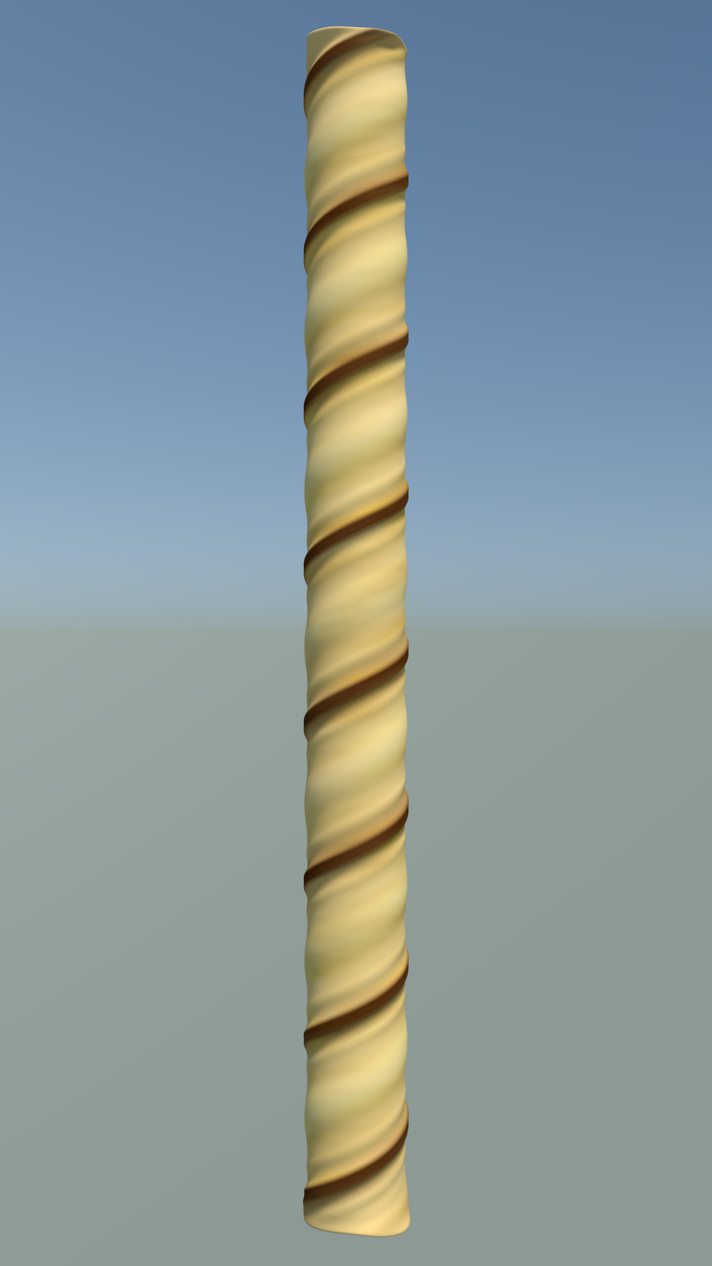
I was having trouble making a candy cane, of all things. Every method I tried ended up not really working out how I wanted. My friend came to the rescue (after putting me through hell with the other methods) with just using a bezier curve and assigning a mesh to follow the curve. So simple. Afterwords, it was a matter of twisting a cylinder and painting it.

Moving away from weaponry, I decided to try my hand at making candy. I wanted to learn how to do vertex shading, among other things, so Pirouline was a good place to start. With this, I started with a basic cylinder and twisted it up so that the polygons spiralled around. I then set the basic colours with the vertex paint mode and then spent a lot of time softening and smoothing colours. I also adjusted the scale of different sections of the spirals so that it looked more natural. Finally I adjusted the top and bottom so that they were not straight edges, making them a little more realistic. I think it turned out tasty. :)
The final piece in the Magical Weapon series is the Magical Spear. This one I am actually a little proud of. I spent a long time working on the wings and I felt they came out very nicely. I also adjusted the footer to have a star shape instead of just a triangle cut out. The central star is supposed to sort of look like a clock, though there are not enough notches to truly be a clock.
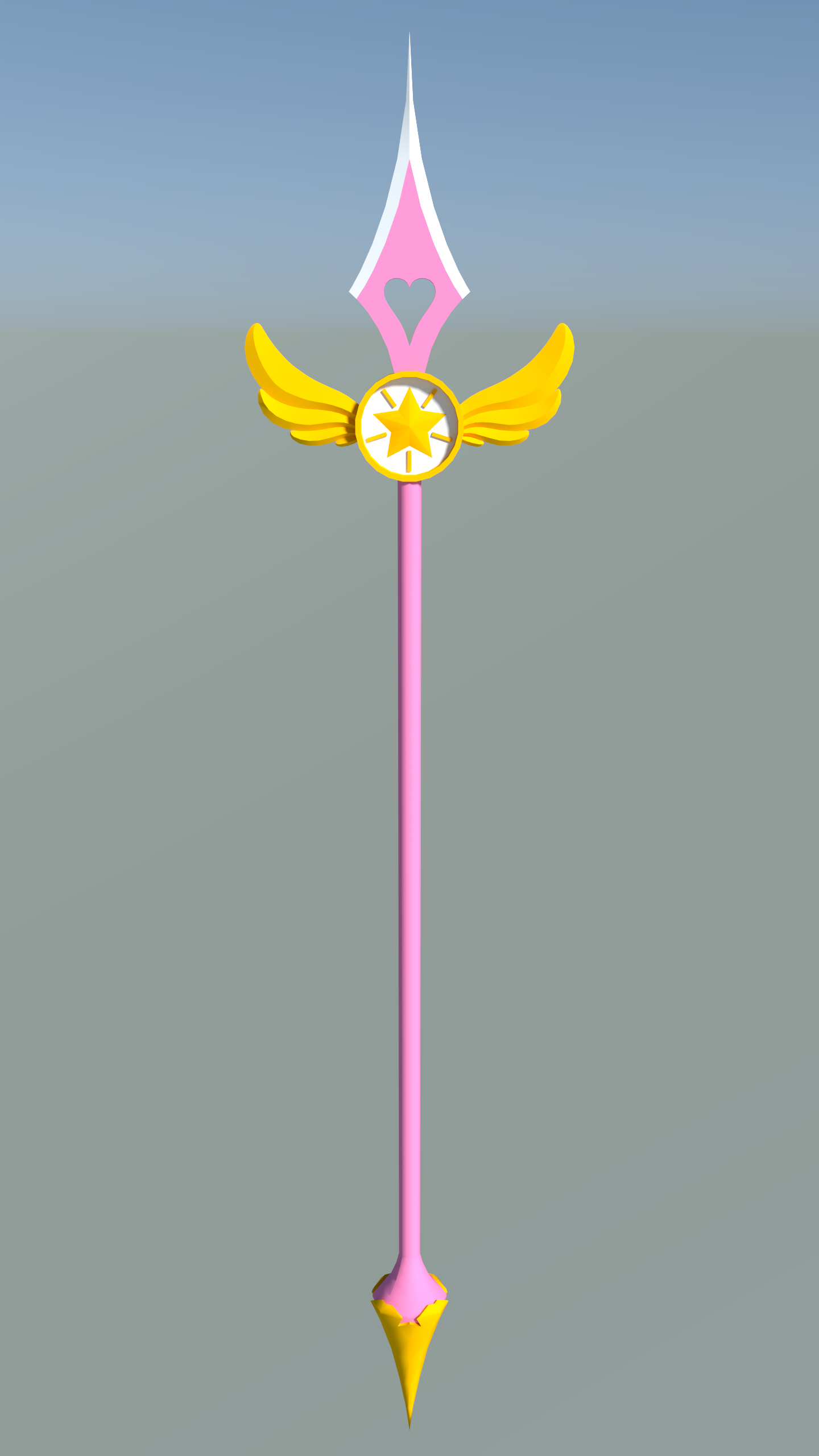
I'll be using this thread to post various 3D models I've made or am working on. I wouldn't really call myself a 3D artist, but I do a bit as a hobby. Feel free to let me know what you think about any of my pieces, how you would improve them, or whatever. All I ask is that you be respectful with your criticism.
I also have a not-so-up-to-date website where I post art from time to time. You can check that out here.
I'll start with an older piece. This is the first 3D model I spent any real amount of time on. It's quite primitive but I think it turned out okay all things considered. I wanted to make a magical girl staff, and so I did. I made this in Blender, like all of my 3D adventures. The orb in the centre is supposed to be glassy, but at the time I didn't really have much knowledge on how to render translucent materials so I opted to just leave it solid.


