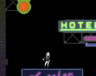
Thank man, I spended a lot of time tweaking the light to give it a night city vibe. Also tested a lot on how the light would look after player collected it so that the light wont just pop out and disappear and actually looks like it dont have enough power and slightly dim away, and fade back in after it regains power. And I know to emphasize the feeling of neon light, I had to implement a dynamic lighting system. It is something that you may not notice until someone point it out, but it is the detail that makes the difference. I'm actually surprised by how little people implement dynamic light in to game as having that or not can make a great impact on the game's atmosphere. I have add a list of events and interactable items on the map and a recommented route under the game desciption. Check it out if you are still interested!
KTgodgod
Creator of
Recent community posts
Thank you for revisiting the game! about your suggestions, there are some reasons behind why did I make it like that.
Maneuvering with blaster is not easy because the blaster was meant to be a weapon, the recoil jump is a "side effect" of the attack. But because no enemy was in the game there for recoil jump became its current main purpose. Since it is a weapon, it should shot forward. But I think I can make it if you hold shift you will shot the opposite side of your mouse, so it is easier to use the recoil after a dash. And the recoil also links to future implementation of player customization, where if you have a tall and buffier character you have less recoil on you and if you have a short and thin character like the current protagonist, the recoil will push you further.
The natural recharge rate was intentionally lowered to encourage player to seek for light source to regen. This also link to how and where I place a light source. During the implementation, I realise that the light source became a strong attraction to the player on both visually and mechanically. You might notice that on ground and first floor of buildings I'm more clustered giving me more room to decorate the lower area and for players to quickly regenerate if they fall to the ground floor. And light source from third floor to upward are indicating possible route to jump onward. If I didn't put any light source there player might not even realize there is a platform you can jump onto. The color of the light source also hint some possible route, if you follow the blue light from the left building, you can get to the final point by dashing across roof. If you follow the green light from bottom of the hotel building, you can use the balcony to climb up. I have wanted to make a red route to go from right too but couldn't make it cause out of time.
The jump lag was there to leave room for a ground roll mechanic to compensate the lack of fall damage. My idea was if you click ctrl in the right timing you will perform a ground roll in to crouch position. The crouch mechanic was also planed because of light and enemies I thought of adding a stealth gameplay where crouching let's you stay stealth easier and when you dash and attacks you will emit light and make you easier to spot. But since there is no enemy in game currently and the crouch state will require me to draw extra sprite and add player state for it, that why I am saving it for future implementation yet the jump lag are still there.
Sorry I was really running out of time and l couldn't write anything about how does the game work or anything about it and has to submmit it with just a name and the folder just before the last second. I even saw the timer goes to negative and thought I didn't make it.
I have just finish writing down everything about my game under the desciption. If you still interested I really hope you can go through my game again. But before any of that I really just want to thank you for willing to download a game without any image or desciption. And even if you miss the gameplay you still willing to leave a comment about my game. Im genuinely grateful about that. If I were you I would just glance through and that's it, there is really no words that can explan how I am feeling right now... I have been working on this since the first day of the announcement. Over the past three days I didn't even sleep for five hours and has been staying awake for more than 30 hours just hoping to finish everything before deadline. This may just be a comment but your comment genuine made me cry...thank you for playing my game. There is a lot stuff couldn't make it in to the game, I could have done more stuff if I had more time. But all of those are already over. And I am just really really happy the someone have seen my game. So once again. Thank you.
Thank you for playing my game.
oh thank mate! I was thinking should I update the descripcion detail since I don't really have anything in the itself. But I don't think I should update the submitted file itself though cause I afraid I might mess with the project summission, or am I allowed to update my submission like fixing bugs and stuff?
the whole game, including all art, programming, music and sound effects, are made after the GameJam begins. That's why everything seems so unpollish, we just don't have enough time.
As for the art styles, that's because we have two artists in the team(I'm the one who drew the pixel art). Before we start making the game, we were deciding which art style we should go for since our art style is so drastically different. That's when I suggest why don't we embrace the two art styles and fit it to the "dream and real world" setting.
Having the less detailed pixel art for the real world and more detailed handdrawn art for the dream are actually intentional. Although I didn't make any line ingame that mention this, but this is because the nightmare had hunted the protagonist so long that the real world seems so faint to him and the dream is getting more and more clearer.
There are a few reasons why the player movement are like this. At first, our initial plan is to even have a different game style in two different world. One would be more about plzzle solving and the other to be more of a platformer to emphasize the theme of duality. And cause of the platformer part, we have to avoid using a point and click interact system which would be more suited for what we have now. Also because the movable space is so small, the interactable items in the real world are more packed together. So the player movement has to be slower as well in order to let the player to control what item to interact more precisely.
For the music box part I know that there are some bugs and I'm still looking for a way to fix it. (ending spoiler ahead) The ending you got is the true ending where the protagonist wake up in the morning finally and escape from his nightmare. The intention of having the musicbox effects the ending is that the "accept" option will only show up if the music box is playing(sorry I can't find a way to code it in). So that if you break the music box or the music box is not playing, there will only be a "kill" option. And if you keep choosing the "kill" option, the sleeping pills will eventually run out and all left in the real world is an empty pistol and a bullet will appear at where the shadow stands. I spent more time on this ending so it should looks better than the true ending, maybe you can go back and try it if you want :)


