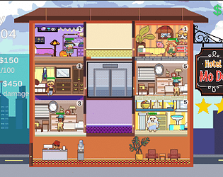
Wow the graphics are so cool! I see a comment saying they don't like the filter, but I like the filter. Maybe it could just be toned down a little, like 30-50% less, to accommodate both kinds of player.
Also I like computer themed games, and I think the logo is inspired by CMake's logo right?


