Hey, thanks for playing! This was my first completed game so it's pretty rough around the edges. Hopefully my next game will be a little more intuitive!
LikeTheRogue
Creator of
Recent community posts
From August 1st to the 16th I spent an inordinate amount of time working on my first game. As someone who has only spent the past couple of months pursuing game development in earnest, I needed a way to stop generating an assortment of half-baked concepts and prototypes and instead release a completed product. LOWREZJAM allowed me to do just that, but perhaps not in the way I was expecting.
My experience in gamedev thus far can best be summed up as a trial-by-fire-where-everything-is-on-fire-and-new-fires-keep-popping-up.
The trickiest part of this whole process has been bridging the gap between expectations and reality. I’d tried to establish manageable goals for myself, and I don’t think my rationale was too unreasonable: a game limited to a 64x64 canvas using PICO-8. The constraints were so small that a game just had to get made, right?
That was how LOWREZJAM began for me: cleaning the barrel, loading the chamber, and priming the trigger just so I could shoot myself in the foot down the line. I’d read several beginner's guides to game development and gotten it into my head to not start with my dream game. That was fine. My roguelike dating sim will just have to wait. From there I reasoned, “Well, why not use arcade games as a template? They’re simple and straightforward with plenty of replay value.” Not a terrible point of view to approach the project from. No, instead what was terrible was how much I allowed that initial concept to evolve into a Frankenstein’s monster patchwork of ideas and mechanics. The game, whose final release title is A-Taco-Lypse Driving, was supposed to be “an arcade-style vertical scroller where you deliver food to customers while avoiding hazards and battling enemy competitors. Easy enough, right?*
*see previously linked video
The original proof of concept drawn by my brother.
With a concept in mind, most of the time spent on the game was taken up by learning how to code. I’d attempted other projects in Lua before, but this was the first time I’d really dug into the language and what it was capable of. In spite of my best efforts, the problems that arose seemed to be unending. For every issue I solved two more would pop up in its place.
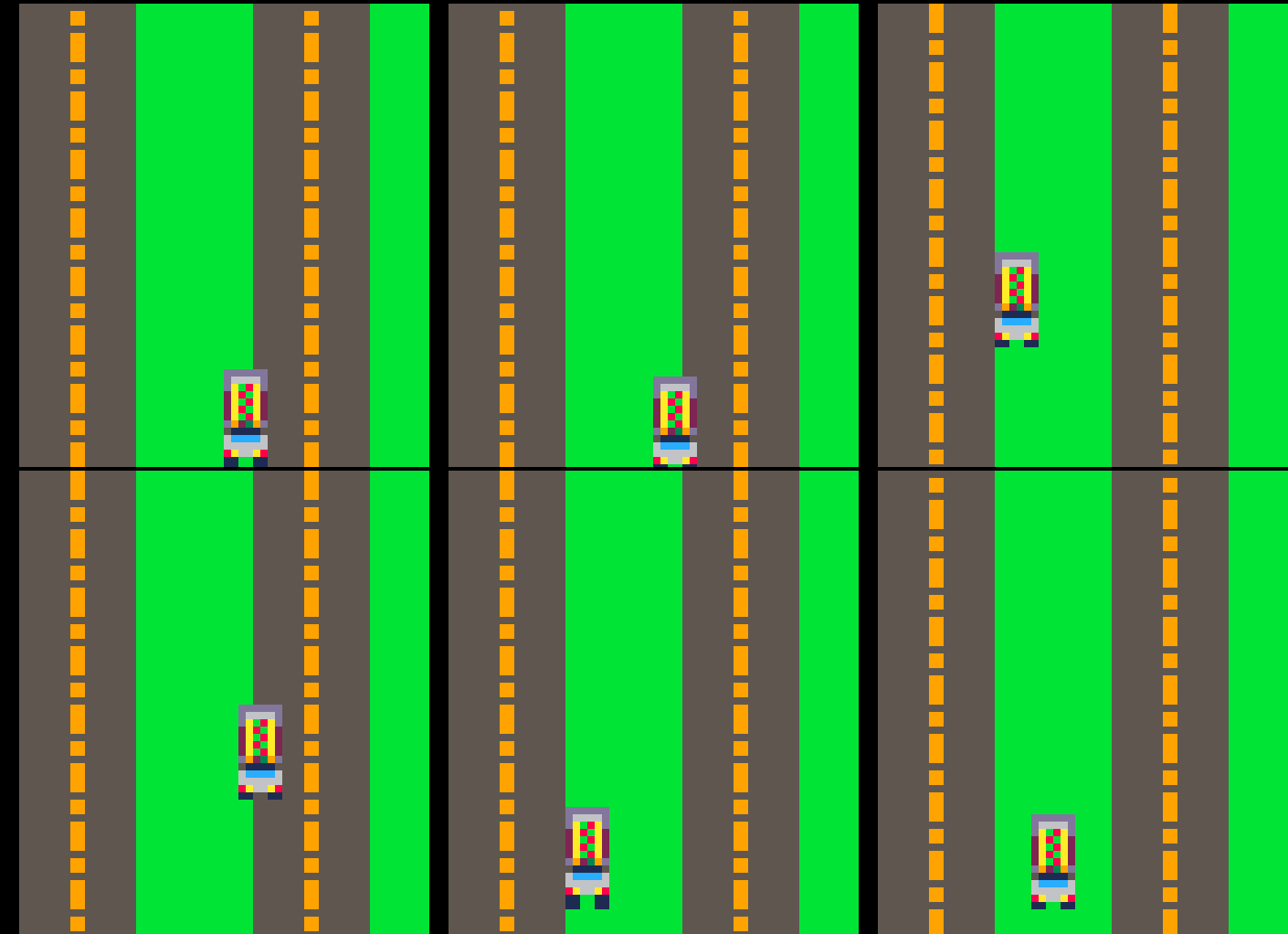
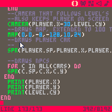
One of the issues I encountered early on. Lesson learned: be better organized.
For several days my process essentially boiled down to throwing possible solutions at the wall until something stuck. The big paradigm shift that increased my productivity occurred when I approached the game on its more elementary levels. For something that involves so much math and logic, it’d taken me longer than it should have to realize that planning out possible solutions with discrete data and information produces better results.
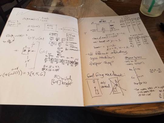
Remember kids: always show your work.
This was also the point in the development process where I realized my scope was larger than I had anticipated. In a bit of interesting retrospection, my friend Julian had the notion that I may have bit off more than I could chew and warned me as much. In a recent conversation with him, however, he admitted that it was something I’d have to find out for myself. While coding proved to be the bulk of my challenges, I most definitely learned more than just programming. Ironically enough, my focus on shoring up coding deficiencies resulted in me neglecting perhaps the most important part of the game: the gameplay.
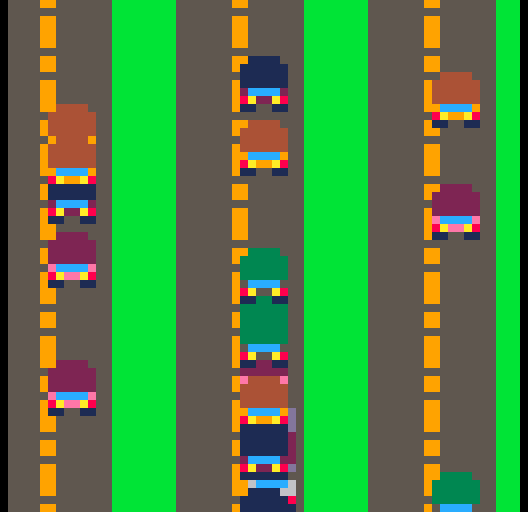
Believe it or not, the released version of the game is just as cluttered and messy, if not moreso.
I had gotten so wrapped up in getting my game to work that I completely forgot to take a step back and figure out if the the game was fun. The development process for me was a triage of shoddy mechanics when it should’ve been a clear roadmap of priorities. My mistake was in not understanding what my limits were and what I was capable of. This goes back to my conversation with Julian where he helped me realize that perhaps this would be (and it was) a fact that I would just have to learn the hard way. The hard way ended up looking like:
- Start with a nugget of a game idea
- Add more facets/features to that nugget
- Figure out how to program it into the existing build
- Realize there are roadblocks and obstacles popping up that prevent me from easily implementing these features
- Spend time to try and work it in anyways
- Be pressured by the deadline and shift focus onto another aspect of the game
- Realize these features also have their own roadblocks and obstacles
- Back to Step 2 and keep jumping around Steps 2 to 8 depending on the mood of the day
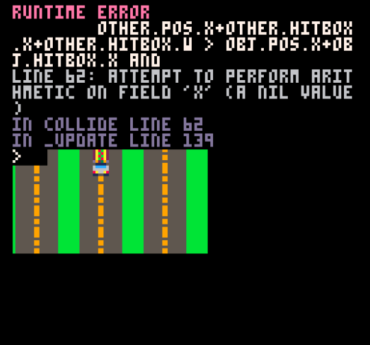
I saw the words “Runtime Error” more times than I care to admit. And I’m already admitting having seen them a lot.
What was interesting to see in how I worked was my tendency to fall back to my comfort zone. On a micro level this meant fixing the issues I could immediately address and/or knew how to address. On a macro level this meant stepping out of the developer role into the manager role. I was fortunate enough to work with two incredibly talented individuals, my brother, Noah, and my friend, Grant, who helped to produce the visuals and sound respectively. Coming from a background in the arts and entertainment, it took me (comparatively) little effort to crystallize a final vision for the narrative aesthetic and tone for the game and communicate that to the rest of my team.
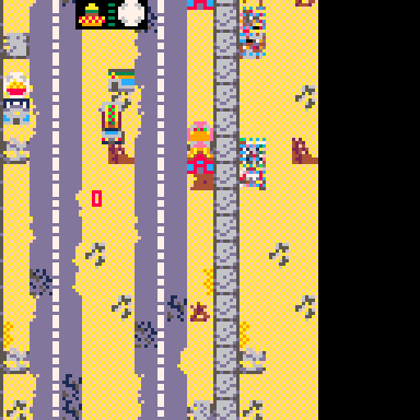
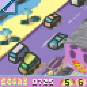
Original game is 64x64 but PICO-8 scales screenshots up to the engine’s default 128x128 resolution. Here you can see the ravaged post-apocalyptic wasteland of the distant future: 1999.
The end result is a game that has a strong personality, but is severely lacking in mechanics. There were far too many moving parts that weren’t intuitive and didn’t mesh well with each other, pitfalls of the game that stem from the seat-of-my-pants approach I took with the development process.
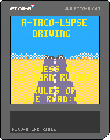
The final PICO-8 Cartridge.
In spite of all the glaring flaws with gameplay and the amount of stress I endured, creating this game left me with a complete and utter sense of satisfaction, something I haven’t felt in a long while. This was entirely a labor of love and I think (read: hope) it shows.
Organization is still very much an issue I face as an artist and developer. Maintaining focus and discipline towards a project is a difficult endeavor, especially knowing myself and how easily I lose interest or steam. But understanding my shortcomings is worthless if I don’t take steps to rectify them. The first step to avoiding these mistakes in the future is to take it slowly, ensuring that above all a finished product will have polish. What that means for me is understanding my limits, both in terms of what I can and can’t do.
And maybe, just maybe, that roguelike dating sim I have floating around in my end will someday end up on somebody else’s screen.
-Kyle
Thanks for playing! The biggest hurdles for me were to focus on the essential mechanics and transfer those ideas from my head into practice. As a novice programmer those issues were also compounded with me stumbling around in the dark when trying to code (at least for the beginning!) There are definitely things that I know need work but this was a good project for me to cut my teeth on. Onto the next game!
As for the objective, I'd originally had a matching mechanic but that felt a little frustratingly constrained in a 64x64 canvas when RNG would give a string of one type of food. To try and work around that I tweaked the matching mechanics a little so that instead, the customers on the right will display the food they DON'T want,leaving you open with two other options. I still stand by that mechanic but I think the thing I'd definitely change is how those rules are communicated. I wanted to focus on an intuitive type of learning through gameplay and visuals but that fell short in a few places. If we're still allowed to adjust I'm probably going to put a giant red X on customer food so it's a liiiiitle more obvious.


