Wow that's a great resource, thanks so much
Littleman27
Creator of
Recent community posts
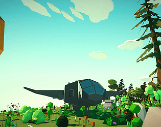
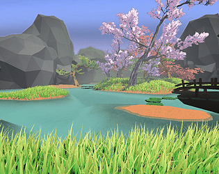
Great feedback, thanks. Yeah, for the next couple of updates, my main focus is going to be on the visual appeal of the game and making it more well-rounded as you mentioned about the skybox and flat land... I took a few things away from your feedback but what stood out most is the importance of making the screenshots reflect the description, I appreciate that and will work on it.
Store Page: Big World by Littleman27 (itch.io)
That is the store page for the game I am currently trying to promote. Since this is the first thing that the potential new players will see in the list of a bunch of other games (cover image) and will be their introduction to my game (store page) which can influence them to download the game or move on... I want to try and focus on this area of development this time.
🎇What do you think I can do to improve? 🎇
Playing this game was an interesting experience. Its nice to see some of the little details that you thought of which although small, they add to the player experience in a positive way. Although I didn't see most of the levels it is also nice to know that you put in the effort of making 41 levels, that's a lot. Great Job!
I only got to the 3rd level but I'll list the thoughts that I had while playing the game in the order that I had them so you can understand what I was feeling as I played from the players perspective...
When opening the game the first thing I noticed was that it is a browser game. I feel that this is a great way to get people playing the game quicker as it takes out the hassle of downloading it. I appreciated this because I could get into the game right away.
I then noticed the choice of music which I thought had a nice beat to it.
The UI animations on the main menu was a nice touch. This is one of those small details that I feel adds to the player experience because it makes the game feel a little more "official" so to speak.
Upon starting the first level I was a bit confused about what to do, but I decided to start clicking around and semi-intuitively figured out the drag and release mechanic of the game. However, I feel that some of the problems – including this one – that I faced could easily have been solved by making the first level be a simple tutorial. A few fun looking art work text labels would likely have sufficed to help me understand the first mechanic of the game as well as my first objective to complete the first level easier.
I noticed that if you drag the stick back too far it flips directions which caused me to hit it the ball in the wrong direction a few times.
It took me about 20 hits to finish the first level as I randomly hit the ball around trying to see if there was some invisible hole that I needed to find or if I needed to take it to the edges of the map to traverse to a new level. Needless to say I was completely confused about what I needed to do lol. Then suddenly the level finished and I was not sure why. So I moved on to the next level.
In the second level there is a line on the left side that looks just the line when that is visible when you pull back to hit the ball, it looked like it didn't belong there.
It was kind of funny to discover after a few minutes of playing the second level that I needed to rotate the map to see the goal. I realized this by briefly glancing down at the game description to find help since I was confused, but I feel that this could have also been explained in a simple text tutorial.
Idea: Adding a tutorial would help but also consider simplifying the first few levels. What I mean by this is that perhaps the first level could have a tutorial to introduce the drag and release mechanic and the first level would be solved by putting the ball in a nearby and already visible hole. Then the second level could have a tutorial to introduce the rotation mechanic of the game. Basically the idea is to progressively introduce new concepts rather then making them available all at one time. Learning these new mechanics also adds a sense of reward that you now have a new method of solving the puzzles. Adding more mechanics like this could make the game more interesting as you continue to complete levels, this way it's not like your doing the same thing for 40 levels. Adds some variety.
When I was about to hit the ball around the edge I was afraid that it would suddenly launch with unexpected speed but it was nice to see that there was a nice and seamless transition. Good Job on that functionality :)
In the first level it was slightly disturbing but by the second level it was more annoying that after each shot I had to wait a seemingly long time for no reason before I could hit the ball again. Is there a reason why there is a delay? If so, then making that reason more apparent would make the delay more reasonable but otherwise reducing or taking away the delay would make the game feel a lot smoother.
Another small detail that I appreciated is that the ball changes colors when you are not directly looking at it but due to the perspective of the game it didn't make it immediately obvious to me that this was the reason why it was changing colors. In fact, now knowing about the rotation mechanic on the second level and seeing the ball change colors because of that... I recall seeing the ball change colors in the first level but I didn't know what this meant either as I never rotated the first level to discover this. Although I say that this mechanic is hard to notice because of the perspective of the game, I don't feel that the perspective of the game needs to change (it just a side effect) but perhaps making the "dither color" more of a darker greyish color to indicate that it is not visible may be more intuitive.
I then progressed to the 3rd level after 14 shots and accidentally clicked somewhere that caused the strength of the pull to be maxed out but I also could not reduce it, I tried to cancel the shot but I was unable to. Also I feel that the ball stops sooner then you would expect it to, perhaps this can become more predictable with experience from progressing down more levels, but perhaps making the roll be a bit more smoother or prolonged would also make the strength estimation be a bit more intuitive.
Lastly I would also say that the game needs more feedback and reward. The idea I mentioned above can add to this but basically what I'm trying to say is that it would be easy for a game like this to get boring after the first few levels, unless it had something unique that the player could desire. I'm not sure what you would do for more feedback and reward but that is some food for thought. Particles, Hoo-ray music after getting the goal, extra points for getting the shot in less shots, changing the environment as you continue to the next levels, and more could be some ideas for reward and feedback.
Idea: I recall that in my initial confusion of trying to figure out why I was hitting the ball, I hit it to the edge of the map thinking that I needed to traverse to the next level some how, perhaps this could be an actual aspect of the game, it would add a reward mechanism to the game by allowing the player to see their progress via moving along in the environment and seeing new things as they move along. Then as they traverse the levels they could collect coins, find secret routes, etc...
I hope something of this was helpful, but overall great job! The fact that you gave it a decent main menu, art work, and music, great job. It definitely has the makings of a well rounded and complete game. It gave me the feel of playing on one of those free online web browser games from when I was younger "minclip", "y8", "kongregate" and others. Also I imagine that you must've put a lot of work into the game mechanics in general, great job for that also.
Well, seeing that I didn't get any feedback on the game yet, perhaps there is a bigger problem even before the gameplay :) So to change the direction on the feedback that I'm look for, I'm now interested in what people think about the games "cover" or in other words, how the game looks before people try to play it. I haven't focused a whole lot of attention on this area before, but since it is the first thing people will see about my game maybe now is the time to consider how to make it more appealing. Was the first post too elaborate? Was the game page not motivating enough and what are some concepts for changing that? Is it too simple of a prototype to grab interest and maybe I need to add some more exciting features first? or something else...
As part of my journey in learning game development, I decided that I needed to learn a lesson on simplicity... and that is the sole purpose why I made this game. I also added a single objective so that it could feel progressive and hopefully fun, but "fun" is not something I feel I have been able to achieve in my video games. Yet.
However, that is one of the things I would like to receive feedback on. Is it fun? Why or Why not? I feel that the controls could use some smoothing out but I'm split between two decisions in this regard. On one hand, I like that it has some complexity and makes my brain do a little bit of thinking because I wanted it to be a game that would make my brain work on reaction time and decision-making. As I play it more, I get better at the controls and feel a sense of achievement in getting more familiar with certain movement combos and increasing my game sense so that I react quicker. But on the other hand, is it soo complex that someone will lose interest before they get to this point? so overall, What do you think of the controls? What do you think I can do to make them better, smoother, or easier to learn?
The music and poor attempt at fading between clips are silly, I know, I embraced it lol, but feel free to criticize it if you like. In my mind, I think that it has at least one of everything that a game needs (I am a beginner at game development), it has a few menus for starting, pausing, and ending. It has music to set the mood. It has the objective to keep the player interested. A challenge to overcome and the ability to regain lives and slow down the game speed so that it does not become too hard. Does this cover the foundation of a game or is more needed? The game idea/concept in itself is also straightforward which I like because it was more achievable but my goal is to sell my games and I doubt anyone would be satisfied paying for a game as simple as something like this. What improvements to the game idea/concept would you have implemented?
I don't intend on working on this project for a long time, but I thought it was a round enough game to get some feedback and some ideas on how I can improve, and then I can take those lessons to improve on my other projects. Thanks.
Link to game: BlockDodger by Littleman27 (itch.io)
That's an interesting point, that building the smaller RPGs has helped you to make larger RPGs since you have already constructed those components. I remember in a Unity convention video on YouTube a guy was talking about prototyping and how for his company they made prototyping quicker by having a library of tools and components that they could just pop in to get things working quickly. That is something I've considered doing but I see now how easier it will be to do that if I focus on my specific genre — whatever that will turn out to be.
I can certainly say that I am guilty of not knowing when to stop my projects. That is something I can work on. For example, my garden game was never meant to be a full game it was just purely to teach me a few principles of visual design/art which I already benefited from.
Thank you, I appreciate those kinds of guidelines to work within. I feel that keeping in mind the time frame of longer than 10 seconds and shorter than 10 minutes will definitely help when trying to figure out which game idea will be ideal for me to put my time into. And thank you for the link as well. Something else I am gleaning from these discussions is that it may be beneficial for me to spend more time in the forums. I generally watch a lot of YouTube videos, Unity documentation, and other articles but I imagine the forums are where I will learn about the "real world" challenges and lessons that people are learning.
Thank you, these are helpful tips. I hadn't considered that "Some genres are just more complicated to program than others." I usually only thought about the game objective itself and perhaps that is why the unexpected things slowed me down.
If you don't mind me asking, I'm curious about my next questions because it's nice to get some experience in knowing the way that other people work on their projects. When you spent 1-2 weeks developing your games, How many days do you think you worked on it in a week, and for about how many hours per day? One of the reasons I am curious is because I generally only have time during the weekend to work on my games and I feel that may be slowing down my progress.
I also appreciate your suggestion to look at the games that are published in game jams. That is something else I hadn't considered. I generally just browse that section and get lost because I don't know what to look for, but I'll try again :)
Something else that interests me is that you said you made an RPG game in two months. I don't generally play RPG games so forgive me if I'm way off... But when I think of RPG games I imagine them including Inventories, characters, missions, maps, maybe some animals, a storyline, interactions, music, rewards, save points, etc... And while all of these things can be cut down — for example maybe the game only has 1 map instead of 5 — It is not much different from what I'm trying to achieve. Perhaps I'm just slower lol, but what do you think helped you to efficiently develop those aspects of the game? and Also what did your "bare-bones" game include or not include that made the initial development phase quicker?
Thank you, these tips help a lot. I think my biggest takeaway was to play games in the genre I want to make games. Honestly, I'm not sure what you would call the genre of games that I have in my head, but I would like to figure out how to make adventure games, so maybe I will start there.
You mentioned that you made 10 small playable games. I would also love to do that, but what do you consider "small" and "playable?"
Also when you say that these games were 30 minutes each I imagine your referring to playtime and that is something I have been puzzled about recently. Because unless it's a story game I don't know how to judge how long the game would be played for. Perhaps not knowing my genre contributes to that confusion but if your games are not solely story games then, how do you determine the length of their playtime?
Hi,
The way I would describe my problem is that I am struggling with the concept of simplicity and what it really means to start small. How small is too small? and How big is too big? On top of that, I have about 3 days in the week that I can actually work on my projects which makes them take longer.
To elaborate more on what I mean by struggling with simplicity... I tend to think of a "small" idea in a 3D world. Something I would consider to be a "Basic and simple concept." However, as planning and later development start to unfold I realize that there are a lot of in-between things that need to be completed in order to make this "simple" and "small" idea come to life. For example, my latest project started out as a project to teach me how to make a visually appealing game, and then once I got to a point in that phase I decided I wanted to make it into a "fun" game that is about "NPC's coming to a garden, making an order of food or a flower and I (the player) have to grow plants and vegetables to fulfill their orders". Something similar to "Overcooked." Because in my mind that seems like a "simple" concept.
I could go into detail about the unexpected challenges that I'm facing with it now, but to keep this short, I'm 5 months into the project (not including the time I stopped to work on another project) and I have roughly planned out 4 more months of development before I feel like it can be considered out of the "prototype" phase. Or in other words when all of the basic mechanics and visuals are in place and I just need to continue to expand it with more variety and potentially a few new features. And although I'm trying my best to incorporate fun and feedback into the design and development phase I don't know If it will be "fun" because it will be my first time making something with the goal of being "fun" and "first times" are not always expected to pan out, which I am fine with except for the fact that I anticipate that this project will take me 9 months before anyone is even actually playing it.
I generally refrain from attempting 2D games because I personally don't play a lot of them and I enjoy the visual appeal and immersion of a 3D game. But I'm not necessarily opposed to the idea if I were able to think of an idea that could become a "fun" game. So I guess the overall curiosity of why I made this post is to get your opinion on what a small game blueprint would look like that incorporates "fun" and won't take months to develop. When you start to expand on that idea, when do you tell yourself "no that's too big." And what would be considered "enough" to now start inviting people to play your game? Because in my case I don't expect people to want to walk around a small garden, look at a few trees and encourage their friends to do the same.
Honestly, I feel this only touches the surface of the challenge I'm trying to overcome but maybe we can talk about it in the thread or I can make another post once I figure out how to write about those other parts of the challenge. But nonetheless, I'm curious to read your feedback.
Thank you.
Hello,
As the title suggests I have finally released a few of the projects that I have been working on as I continue to learn more and more about game development. In my opinion, I would say that each game illustrates a single core mechanic that can be built upon to make something even better. But before I decide to start a project that will take me months, I want to get some feedback on what other people that I don't know think of the games themselves.
For Pothole Reflex the mood is intended to be relaxing with a little bit of "dodge" if you know what I mean. Wink Wink.
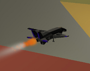
Blaink180 (Pronounced: Blink - 1 - 80) is based on the fact that I feel really relaxed when I play flight games, but I also like the excitement of making quick maneuvers as a jet, hence the reason the name is Blaink180 *Starts ramble* because you make a can make a bank 180 turn in the "blaink" of an eye! Get it? :DD Nevermind. *Ends ramble* But the environment that it is in right now might be a little cramped, so I want to develop a better open-world map later on. It initially was not in this environment but I put it there so its location could have a bit more meaning.
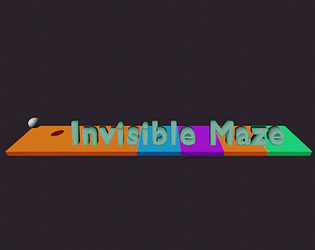
And last but hopefully not least there is The Invisible Maze which after making the game and doing a quick search on itch.io is not as unique as I initially thought that it was going to be. However I still like the core mechanic and I feel that it does have some uniqueness to it that I have not seen before, but I'll let you be the judge of that. I would personally consider this the most prototype of them all.
All in all, I'm glad that I have finally published my first 3 games, and whether or not I will continue to work on these games or work on other game ideas is not yet determined, but either way, I am happy that in making these games, each of them has posed a different challenge for me and I learned a lot from them. Now I want to see what you think about them. If they are enjoyable enough that you would replay them or look forward to seeing updates, and perhaps if some of them were online would you invite your friends to play along with you? Your initial thoughts and opinions and all of your constructive criticism are very much appreciated. Feel free to leave a comment on any of the games after playing, thanks.
Links:
Pothole Reflex: Pothole Reflex by littleman27 (itch.io)
Blaink180: Blaink180 by littleman27 (itch.io)
The Invisible Maze: The Invisible Maze by littleman27 (itch.io)


