14504! Loved it.
littler fish
Creator of
Recent community posts
There seems to be a resolution error with the game window (I had to zoom in 500% in Chrome to be able to see the game) but I was able to play it once I had zoomed in.
The concept is great! Controlling a spirit that moves through bodies is genius. The art is nice to look at as well and the whole idea fits the theme. Great job!
Incredible! The way you did your tutorial, teaching how to swim and cast light, was perfect. Audio was well implemented - the atmosphere got real heavy real quick after descending into darkness. That giant shark was also terrifying to swim past, great job on that! Short and sweet, thanks for making a great game.
Hey we made a fishing card game too! This was really fun - the gamble of breaking your rods and the way Cards support riskier decision making over time made for a satisfying game loop. Getting a high combo going feels so great! The tutorial felt like it took a little long to get through, but it was great at teaching the player how the game works. The UI is simple and clean, and the fish look awesome. It feels like you can keep fishing forever - fantastic job on this!
If you like fishing and card games, give us a check! :)
Start to finish this was a great experience! The music is so nice to listen to and the aesthetic here is just fantastic to look at. The challenge was perfect and the length of the game felt just right. Learning how enemies behave was a scary and enjoyable process. When you figure out how to use smaller fish correctly, the game really makes sense, so I'd suggest making it clearer how that all works.
Other than that small nitpick this was fantastic! So delightful, thanks so much for making it!
As a big fan of Pseudoregalia, I came in with a certain set of expectations, some were met and some were not; I am unsure if that was an unfair approach to a game jam game, but here we are.
The movement is incredible, obviously. Expectation totally met. The rest of the game felt a little tedious, and movement options were unclear for me, but it was fun once I got that sorted out. Thanks for another awesome game <3
Wow this is fun! It's great to see something engaging condensed down into one button. You really nailed it - it was fun to learn how to get control over the fish and master the ability. And this game is definitely cozy - the aesthetics are cute and sweet, while still being on point and meshing with the racing gameplay. As creators of a cozy fish game ourselves, congrats on threading that needle really well!
Great Vampire Survivors type gameplay! I think the visuals are the peak of the experience - they're absolutely lovely to look at. There did seem to be some weird power scaling with the difficulty, where you start off crazy weak and then get crazy strong with all of the damage upgrades. Once you get past that wall, the rest of the game feels like a breeze (nothing wrong with that, it feels great to shoot em up).
Congrats on a terrific game!
Really delightful game. You have such a good handle on your visual style - we actually remembered you from the Metroidvania jam that just ended! Loved the Ecaroh aesthetic then, and love it now.
After awhile, you start to feel pretty invulnerable in this game. Maybe a difficulty curve could be added, but regardless its fun to play nonstop. It would be nice to see the leaderboards working, but it's a small nitpick. This was really fun!
There was a game I played a lot as a kid where you play soccer but you're driving a car (sort of a precursor to Rocket League, can't remember the name though) and this is hitting me with extreme nostalgia for it. Maybe it's the colors/font as well (which look awesome by the way) that are really bringing me back, or maybe it's the perfectly awkward controls. Either way thanks for making a great game and triggering a core memory haha
Wow I could really play this game forever. These fish look incredible! The music is perfect for the atmosphere. I played for awhile and never got tired of it.
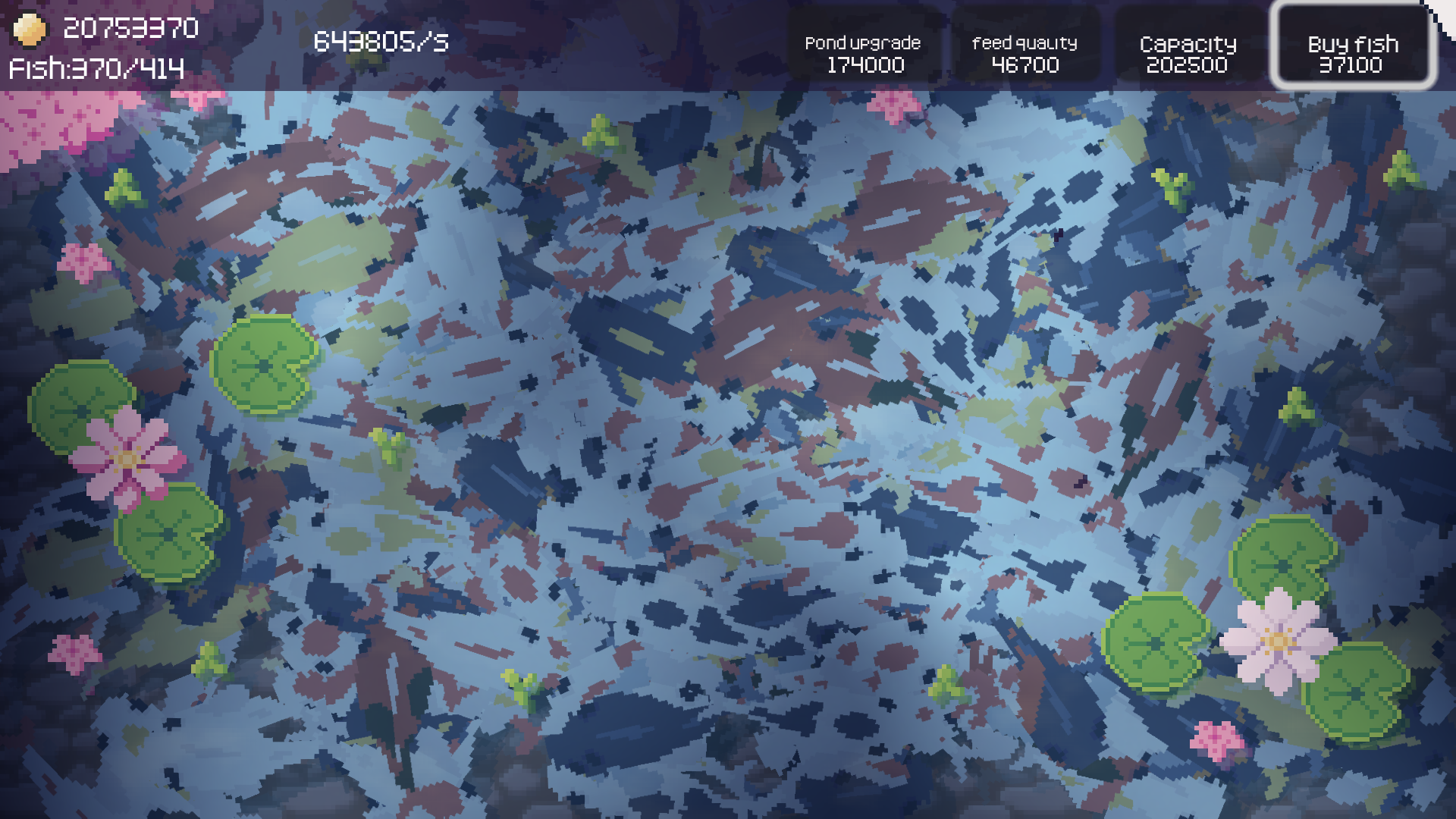
I wanted to see how many fish I could create before the game crashed, and I found it - 370. After this point, the game lagged too much to be able to keep playing. In the future maybe you could limit the actual number of fish on screen to be something like 100-200.
Only complaint was that it didn't go on forever! Very nice job on this.
Dang that fish looks wacky. This has a very sweet retro vibe to it. Great job on the music - hearing distinct themes for each area was a really nice touch. The platforming is pretty solid and pairs well with the design of the character. The dash sometimes felt like it didn't respond to the correct direction of input, but it didn't get in the way of gameplay too much. Also like someone else said, it was a little unclear that you have to press Enter to proceed through the opening. Altogether this was super fun to play - thank you!
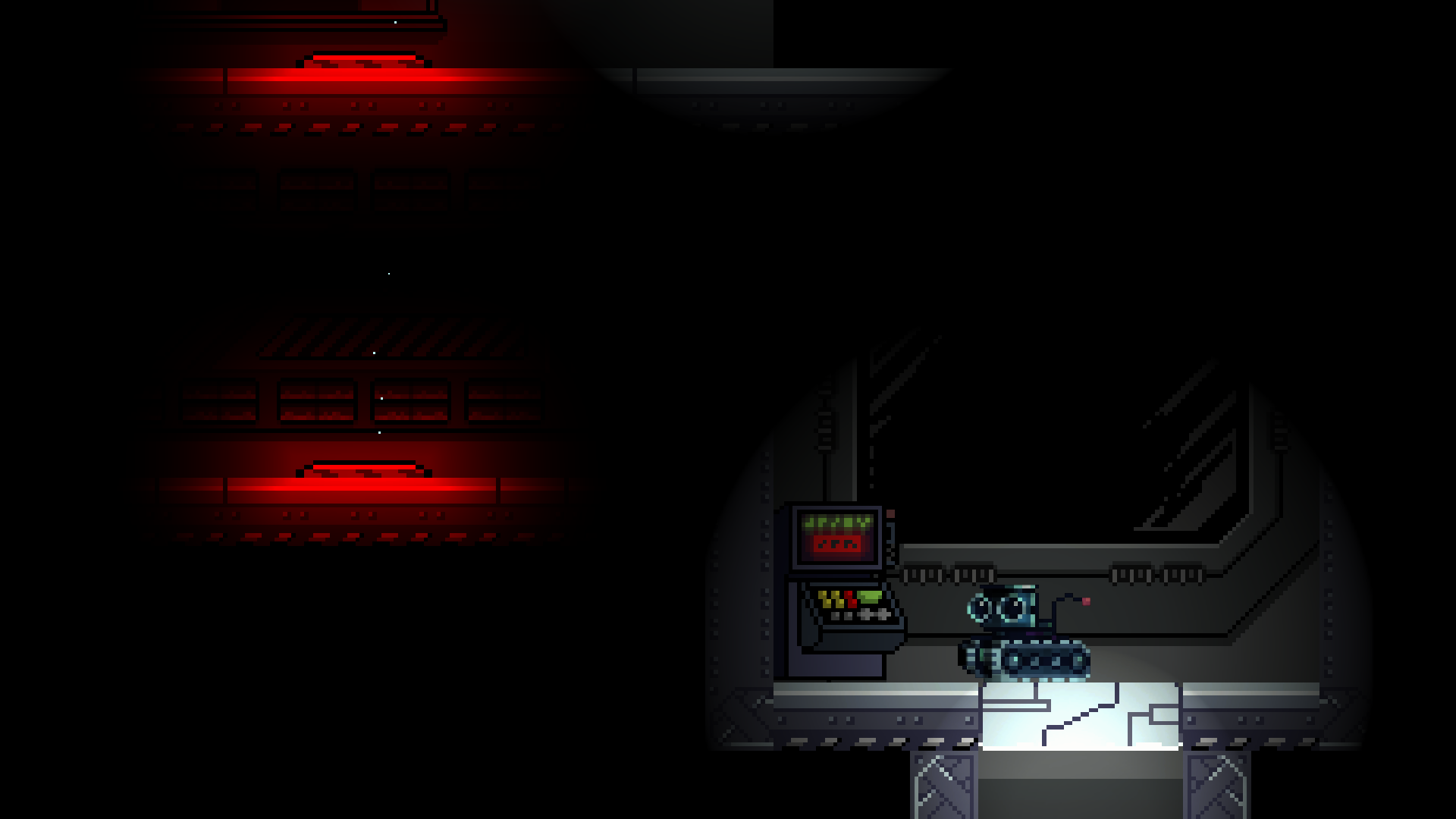
We were stuck in this room for a long time before we realized we had to throw the bucket down and jump on top of it. We actually had to come back and retry the game later, because we were stuck in this room for too long.
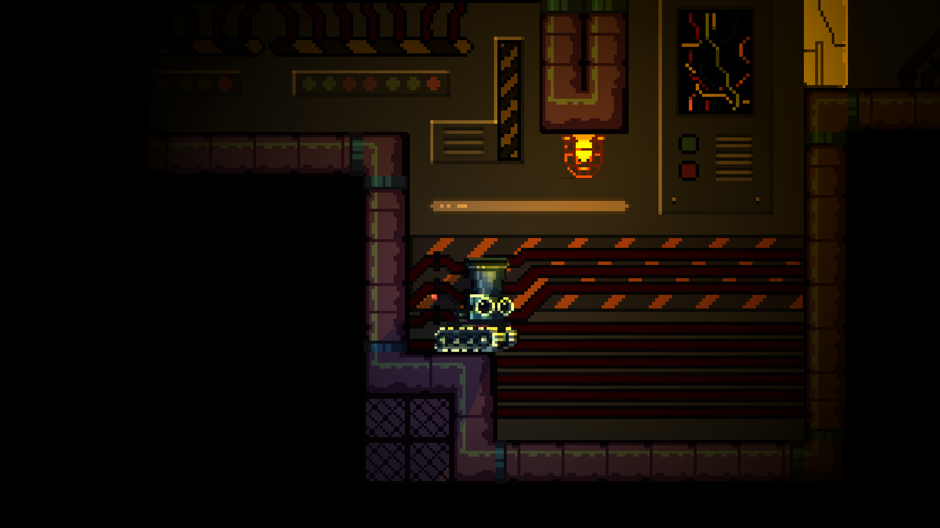
This one we eventually figured out, but it was a little hard to tell that you had to shoot a projectile up to break that door.
Playing through the game again, I think these are the only two outliers. Everything else was designed well enough so that you could discover how to proceed just by experimenting.
Wow the visuals here are so tight! The world feels really well put together aesthetically, with the sounds and visuals working hand in hand. We could tell immediately that a lot of work was put into this - great job!
Also super impressive that you included mode options in the menu - Unlocked and Ultimate - so cool that you guys were able to include those. We did something similar, including our boss battles on the main menu, to try and get people closer to the content as much as possible. Ultimate Mode is also so fun haha.
The camera work was really interesting here. At first we were totally on board with the swaying and adjustments based on your movement. But after playing for a little bit I think something a little more fixed would be a better option. We ended up scrapping a similar idea, where our character's camera would zoom out a little bit whenever their velocity hit a certain threshold - but we decided to keep it slightly more fixed because our game featured a lot of motion like this one, and the constant camera movement wasn't ideal.
Exploring the world you made was a lot of fun! You have something really great here. Hopefully this project will continue to get made, because it's fantastic!
This was so much fun! The art is consistent and everything makes sense in the world. The challenge was perfect and kept us coming back again and again to retry (mostly the first boss) and the platforming was pretty special. Jumping in and out of a jar is GENIUS and a really fun mechanic.
Great job on a great game! This is an idea that we'd love to see evolve into a larger project. Hope the team keeps working on it in the future!
This is one of the best entries we've played in this jam. So much about this is clearly well polished and cleverly designed.
There were a few issues we experienced that made it tough to get through the platforming. Multiple times we found that the solution to get through a room wasn't exactly very clear, and it led to us hitting our heads against the wall for a little bit. But after uncovering all the abilities, the smoothness of the experience really increases. When you know exactly how high you can jump it made it easier to tell what platforms were meant to be accessed.
It looks like, from reading another comment, you were going for a Metroid Fusion kind of a vibe. Very well done! We felt the same kind of horror vibe that the SA-X gives you in Fusion when it chases you through zones. The voice acting is really cool to hear, but it does also dampen the Metroidvania exploration aspect just a little bit. But for the scope of the jam, the size of this world was perfect and exploration seemed like it wasn't the number one priority.
The character controller is really smooth. We loved the wind-up to full speed, the force of the dash, the weight of the jump, and how the abilities helped augment your movement as you went through. Also the particles and explosions that happen when you shoot/dash/recall the bucket are SO NICE to look at.
Altogether we're really happy to have played this game. It was smart and very well assembled. Please keep working on this - we want to see a BucketHead release in the future!
The visuals here are so cool. We'd be lucky to have our games look a little more like this one. The health visual floating right next to the player is also a really nice touch.
The movement and combat were honestly a little clunky to get through. The environment was nicely designed, but it doesn't fix all the issues with movement. Despite the issues with that, the style of this game was strong enough to keep us playing longer. Backtracking was really designed well, and it felt nice to get the attack upgrade and be able to slash through previous doors.
This is something that would be great to see more of. Hope we get an updated version in the future!
We played this early in the jam but didn't make it very far, as we had a lot of other projects to check out. Revisiting this was a priority, as we really wanted to give thoughtful feedback. This game is clearly a top contender in this jam - huge congrats to you guys for crushing it!
The bad stuff first:
- Maybe it's a personal qualm, but we really wanted to be able to skip the dialogue. Not because the story wasn't interesting - because it was - but because it felt like it locked you out of the gameplay for too long and sort of droned on. Our submission was admittedly weak in narrative, so again it could be more of a personal opinion.
- The cloud jump ability felt a little awkward to use. Aiming with the mouse made it so that using the keyboard to play was just a little more annoying than it could've been. A possible fix (at least for us) would be to make it 8-way directional, so that you could bounce from the orbs more quickly without having to use the mouse.
The good stuff:
- A huge map to explore! This is a Metroidvania jam after all, and it was refreshing to be able to explore at the breadth that this game has to offer.
- The art style is consistently satisfying to look at. The character, enemies, tiles, upgrades, etc all look like they belong in this world, and that really goes a long way.
- Enemy AI! It feels really good to battle with the enemies in this game. The way wolves back up when you approach them makes it just hard enough to run past, so engaging with them becomes an actual choice. The flying enemies that shoot bolts at you are really inspired as well.
- It's crazy how little we find attacks with directionality, even in games like these that are heavy in combat. Big thank you for having directional attacks, so you can combat stuff flying directly above you. On top of that the character feels great to control, so getting into encounters is way more fun than it is disengaging.
Take our complaints with a grain of salt - this was such an excellent entry, and one that we really wanted to revisit with legitimate feedback. It was an awesome experience - thank you so much for making a really fun game.
The character controller physics here are interesting. Normally it would feel weird to be this slippery, but to me it feels pretty good. A suggestion might be to add a little bit better coyote time/input buffering for the jumps, because it was pretty easy to slide off of platforms accidentally.
The art style is great to look at, especially those drawings in the opening cutscene. Also a big fan of the slide animation when you slow down, that's a really nice touch. The background parallax effect is really cool as well, nice job!
Another improvement you could make would be adding feedback for health/damage taken. It was a little annoying to teleport all the way back to the fire checkpoint after getting hit and not knowing how much vitality the character had left.
Nitpicks aside, this was really fun to play! Thanks so much for making it!
Comments like these make us so happy to see - this is full of incredible feedback. Almost wish the Cons were even longer, it's more for us to focus on in the future!
Our level design was meant to encourage exploration and give the player time to learn the mechanics, but it's true we could've made the environment a little clearer to navigate. There's actually a ton more content in our game, but it is really easy to get stuck in the starting area before you're able to see any more of the world. If you get the time, we'd love to know you gave it another shot!
Thank you so much for the comment!
Wow! Thank you so much for playing and recording. It's such a treat to be able to see people play our game. And thank you for the feedback! We're really proud of what we were able to get together, and agree there are some aspects we could use some work polishing up.
If you get the time, there's a lot more world to discover after beating the big dino. We have 3 other visually distinct areas to explore, with more special upgrades to find.
Again thank you so much. It means the world to see someone play the game. And we were big fans of Permawilt too - the planting mechanic was genius!


