
I think slowing down audio was *excellent* - definitely retain that feature!
Loressa
442
Posts
7
Topics
79
Followers
135
Following
A member registered Mar 02, 2021 · View creator page →
Creator of
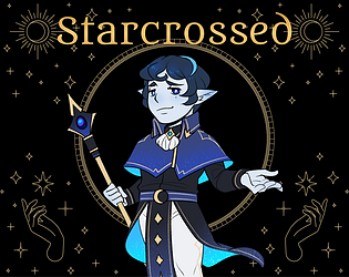
Interactive fiction set on the Martian frontier.
Interactive Fiction
Play in browser
A text-focused choice-based detective game in a mystical setting.
Puzzle
Play in browser
Recent community posts
I think re the tutorial there was a missing instruction about wall jumping. I eventually figured it out on level 1 and it made me think back to where I got stuck in the tutorial and I realized it was that mechanic which would have progressed me.
I definitely want to reiterate that you nailed the retro vibe! It made me feel like I was trying out shareware Turrican on my Atari ST again - eg, I played the original versions of the games you're winking at and your nod hit the mark. It definitely felt like those old games!
Thanks for giving my game a second go!
After i got to couch 2nd time at some point i've got "[undefined]" or smthg like that
I'll look into the couch as that sounds like a bug - after cleaning each area, you get positive stats from interacting with them, so the couch should have been letting you read a book and increasing energy/stability. I'll investigate here as it sounds like there's a bug.
I was confused why i can't just go eat something, i was trying to find a way to do it but all i could do - watch tv or clean
Welcome to depression :/
Also i would like to have some more rough consequences from cleaning action or "right" decisions against demons, like you are becoming tired quickly or increase risk of /cigarettes or summon other demons which can overhelm you now. As i see it - that's more slow process to find piece, cleaning the whole room in this state in one day feels like a miracle, i was going for steady persistent improvement at first (so not making bed - it will be resetted anyway but for fridge for example), i wanted to sleep after that but could not. But this is like the whole different concept probably, but wanted to add my 2 cents here
Could you explain this part a bit more? Your stats do change depending on choices with fighting demons and if you clean/use cleaned areas - do you feel those stat changes were not noticeable or impactful? For example, after you clean the bed you can rest in it to up your energy stat.
Thanks for such extensive feedback! It's very appreciated and overall I really hope this game could evoke something emotionally that you'll be thinking about for a while afterwards.
Notes from gameplay:
Main menu:
- Aww, what a cute little fox
- I like the subtle sway to the buttons, it's dynamic yet not too busy
- Nice job including control schema
- Nice work with settings menu. I wonder what speed up does? This part isn't very clear
Playing:
- Top UI bar is laid out well and easy to understand
- Is there something behind the pause button? Looks like there is a circle beneath it
- Lovely pixel art! I think the trophy looks a bit out of place, however, it looks more high-rez than the rest of the art
- Oops keep dropping boxes. I think you're missing just ONE bit of instruction: let the player know they need to click items first
- Game isn't pausing when I go into menu. Somehow I finished level 1 while on the main menu!
- I'd add the controls tab to the pause menu to help remind players how they work
- How did I beat the level before? I'm sitting here unable to figure out how to move the fox to the trophy
- It seems exiting to the main menu is the only way to complete the level?
- Ok spacebar makes the fox walk
- Ahhhh stop walking little fox!
- Adorable little "poof" animation as the fox bounces off the walls to his doom
- Ohhhh ok, I get it. I thought I was supposed to incrementally move boxes as the fox moves, but it's a set it up and let the fox go so I need to place the boxes stragetically
- Good feedback when the fox messes up - nice audio and visual effects to convey his doom!
- Would be nice if I could click the items from the top bar to select them for placement
- It might be helpful to show the player a walkthrough of the fox's movements for the first couple levels before they place stuff, to illustrate things like his bouncy movement and boxes falling apart
- The UI for selecting items for placement definitely could be improved to be easier to use. Why do the choices disappear between placements? Maybe just move items part of the top bar to the bottom and let us click on those to select what to place?
- Hmm, chapter 2-1 - it's unclear what the pink dot does except pause the game? Edit: oh that's exactly what it does, I get it now. That's clever but took a round of messing up to figure out
- I keep forgetting I can rotate items
- Maybe restart the player at the pink dot if they clear the level to there. It's a bit tedious to restart all the way from the beginning to figure out the second half of the puzzle
- Items can be hard to place when they are next to the blade wheels
Overall, I think you have the bones of something very clever and creative. I think this would do especially well on mobile. The core concept is really great and reminds me of The Incredible Machine (https://en.wikipedia.org/wiki/The_Incredible_Machine) - you've got a tricky puzzler where players need to sit and think about their choices. The art is solid, the audio is great (could use some more music tracks) and the feedback for success/failure/fox movement is all well done and polished.
Where I think you could strengthen this game is:
- Ramp up the difficulty more slowly. Integrate this with a more clear tutorial explaining how everything works and illustrating how to use commands like rotation, placement and removal
- Add an overlay showing how the fox will bounce off of jump platforms. This will make it a LOT easier for players to figure out where to place them
- Have the player restart at the pink dots - treat them as checkpoints. I ended up stopping at chapter 2-3 because it became too tedious to constantly redo everything for the first half of the level
- Improve the UI for placement selection. Right now it's too many button clicks to pull up the items to choose, then choose one, then place it. Streamlining this would make this easier and quicker to play
Really, the biggest issues are tedium in placement/replacement when trying the level again and not being able to predict the fox's movements except through trial and error. Again, I think the core concept is GREAT and this is the seed of something awesome. Definitely following this project to see how it goes. This is EXACTLY the type of puzzle game I would buy for my phone to casually play levels in between other activities (the fact that gameplay is basically at my own pace leans into this well). Keep up the development and I'm excited to see where this goes!
Notes from gameplay:
Main menu:
- Initial splash screen is a bit messy and could be cleaned up. For example, consider making the "stars" a different color from the text
- The word "Core" is hard to read
- Music is bouncy and fun
- Work on spell/grammar check for text - things like misspelled words can make people reluctant to give your game a chance, as it makes it look low-effort
- Nice instinct to show upcoming updates! This is a great way to keep people interested in checking out your work in the future
- The story could be written a bit more creatively.
- Nice job explaining the rules and controls
- Great work including multiple modes!
Gameplay:
- The overall artwork could be improved, but each element is well-done as a placeholder to indicate what they do. For example, bullets look like bullets and the clock is a clock. This is great work telegraphing gameplay concepts to the player!
- The audio is really well done! The music is fun and each element the player interacts with has an appropriate sound, with positive collections like the heart and green dot playing exciting, upbeat sounds while the bullets play "bad" sounds. Again, you show a great instinct to reinforce to the player that they are doing well/poorly - this helps makes the game more exciting to play
- I *love* how the music slows down when you collect the clock. That's a great detail
- The controls feel fluid
- The shield sometimes swaps sides if I'm moving, which leads to me getting hit :(
- After slow-mo ends, there are a TON of bullets. It feels like a burst of extra difficulty after what should be a buff. Is the bullet spawn rate also being slowed down when this buff is active?
- Awesome work with the leaderboard! That's complex work! It looks not entering my name will create a blank value in there (but I think that got overwritten when I played a new game)
Great effort! Keep up the projects and the learning. You've got some solid instincts for game dev :)
Notes from gameplay:
Itch Page:
- Strong layout and wonderful color scheme + background image
- Smart use of gifs in thumbnails to make the game flashy and exciting, draws in people browsing
- I particularly like the font choice - you capture the vibe of a pixel font, while keeping it easy to read
- Top banner with game name could perhaps benefit from a stronger/darker text outline - the moving background can make the overall text a bit trickier to read. Have you tried a black, white or red border to see how that looks? The 86 is much easier to read than "dualverse"
- Unsure how I feel about the mash of 3 fonts. Something about the word parkour feels off
Main menu:
- Great detail of the background on the loading screen
- Definitely captured the retro vibes!
- Music is nice, reminds me of Kavinsky, in particular Nightcall
- Music volume is very low
- Uhh what's the random flashing red? Not sure how I feel about it. It's way too quick. Something less seizure-y but still dynamic might be windows lighting up in the buildings or stars twinkling in the sky
- Options window feels like it could be punched up in UI
- The sparkles on the Dualverse text look great. Couldn't see those at all on the itch page
- Would be nice for credits text to match the rest of the UI. The calligraphy feels out of place
- Credits music is cute
- Digging the floppy discs to represent different levels
Tutorial:
- Excellent job including a tutorial!
- Screen transition with the slashes is very cool!
- Music volume is louder here - work on normalizing sound all across the game
- Text intro is good. It's well-written, sets up the backstory and isn't overly wordy. Leaves the player with a goal and pumps us up to play
- Top bar UI looks nice. I like the font.
- There seem to be some inconsistencies with sharpness - eg compare the red circle in the top bar compared to the lines comprising the ground the player is running out. The red circle seems blurry compared to those.
- Maybe add a black outline around the countdown numbers, as it's on top of a grey background
- Love the little respawn portal animation, but maybe add some color to make it pop more against the background
- Lots of screen flicker during movement from the lines in the background
- Player sprite is nice, feels Tron-ish. The glow around them is nice. Dunno how I feel about the heavy white outline. Might be a way to combine the glow and the outline into something that feels like it fits better into the game world - as is, it feels like the character and background don't quite match
- Player sprite jump and run poses are great, feel sleek and dynamic
- Commands for actions and buttons to press are great tutorial elements!
- Jump feels fluid
- Run feels nice, except when against a wall - feels like it slows down a lot
- What determines how many times I roll? Feels like sometimes I'm rolling multiple times in a row despite only briefly tapping the button.
- Using roll and stopping in a low area will have me roll in place forever, hehehe
- I feel like I want some more sound effects for when I do stuff, like a boingy/bouncy sound when I jump, maybe a minor animation of dust when I land, some streaks around me when I'm running? The sprite animations look and feel great, but it feels like they are missing a few tiny details to make them truly POP and become really immersive.
- Whoa, this switch thing is pretty cool. I was initially thinking this level felt a bit bland visually, but with this mechanic I understand why you want to keep the palette pretty neutral. Looks VERY cool and is a very interesting mechanic! Will this need an epilepsy warning?
- Hang/grab seems a bit imprecise. I slooooooowly slid down the ledge to the respawn area
- I found a floppy disk!
- Hmm, not sure where I'm supposed to go after the second checkout. I'm trying to jump and switch modes to hang from the vertical red pillar to the left, but I can't seem to get enough air
- Can't seem to get past this part of the tutorial, sorry :(
Beta-City:
- I like the loading image!
- Why is there such a long pause and an extra space after the words "floppy disks" are typed out? Guessing it's missing an icon here?
- Music here is also great
- This background looks a LOT better than the tutorial, no flickering with movement
- Lovely layers and parallax, but should we be seeing the black edge of screen at the left?
- The checkerboard far background feels unfinished, given that's the default tansparent background pattern in photo-editing software
- Respawn portal visually pops a LOT more here against the dark background
- The switch here is very cool, red dimension feels a lot more decayed. The hollowed out buildings on the far left in particular are great, hope I see more of those - maybe consider having one where the switch is first organically needed, as it will visually hammer home the difference between dimensions right away. As-is, I had to backtrack to see the cooler part of this dimension
- Few points where jumping can kinda just hang mid-air against the corner of a ledge
- Argh, I keep mixing up B and spacebar
- Got to the second checkpoint with the up arrow, but unsure where to go next. I think I'm supposed to wall bounce, but can't figure out how to make that work. Every now and then I can get the character to bounce off the wall, but it's inconsistent and he just floats back to the wall I bounced off
- Almost got wall-bouncing to work (it's REALLY HARD, but I'm not great at these games), but now jumping and rolling aren't working at all. Had to switch dimensions to get jumping working again (respawning didn't fix it)
- Finally made it to the 3rd checkpoint. Hahaha I'm really bad at this game
- Some basic jumps seem just a bit too high, like I'm sitting here right below the exclaimation mark sign past the 3rd checkpoint and I just can't do a basic jump up to the next ledge, it's always a bit too short. Momentum helps but it feels like some jumps just fail a tiny bit sometimes. Could also just be me sucking and having to go really slow :P
- Roll doesn't seem to work if I'm against the wall I want to crawl through, need to back up and run at it. Maybe intended
- Made it to 4th checkpoint, down at the bottom, but that was sheerly by luck of falling, didn't realize anything was down here and had run further ahead and was smashing my head against the wall next to the floating drone
- OMG I BEAT THE LEVEL
- 12:38:141 hahaha I'm terrible at this. That time doesn't even feel right, it felt like I spent at least half an hour :P
- Hidden disk found, apparently, but I don't recall picking up anything
- Default choice highlighted is restart, but should probably be main menu (or even a "next level" option)
- Aww seems like I can't play the other levels, they are still showing as locked
Overall, what a cool, clever core mechanic! Even if I'm not good enough at this genre to really appreciate it, I bet there is a subset of gamers who are and would REALLY love it! I recommend finding this audience and leaning on them for playtesting and fine-tune balance.
The overall theming, art, UI, music and story are great at setting us in this wonderful retro world. Things could be tweaked here and there, but it's a really beautiful and thematic core project so far with a lot of polish and cohesion. Awesome work! I can definitely see this going on to being pretty darn popular with the right niche of gamers!
Notes from gameplay:
Splash/main menu:
- Cute little egg! Reminds me of an easter egg
- Not really sure what I should do here. I clicked the egg and it just keeps rocking.
- Oh, it eventually popped open. Maybe have the rocking speed up to show the player that it's getting ready to hatch?
- Egg rocks for too long before gameplay starts
Gameplay:
- Music is VERY quiet
- camera rotation seems unable to continue sometimes after I go too far to right/left
- VERY dark. Leaves me very disoriented as a player. Might be nice to have the background dim, but not fully dark
- I hit a rock wall and now my flashlight is shining on the other side of it, so I can't see how to navigate around it. WASD is just changing where my flashlight lights up instead of moving me. Might be stuck? Restarting.
- Ok, on restart it looks like the little demon thing that walks towards me had blocked me in a corner and prevented me from moving
- I found the egg and clicked e to make it hatch. Doesn't seem like anything happened though.
- My score is 10 (from collecting gems, I think?)
- Ok, finally got out the starting ring of boulders
- Looks like there is a lot of game world here! It's just WAY too dark to appreciate.
- I'm seeing light advancing across the world (hour 19, minute 6). I'm guessing this is time sped up from the debug control (opening the egg)? This part is cool! I think you've captured the real-time aspect nicely
- It's a lot better now that I can see the world!
- whoops, I fell off the edge of the world
- The little red guy following me gets in the way of movement at times
- Restarting remembered what time it was I guess, though my score is reset and gems are all reset
- Camera rotation does have some issues, it keeps being stopped from rotating very far, such as if I turn a lot of corners (such as leaving the rock ring and following the road for several turns)
- Jumped into the river and fell through the world
- Found a cute pink cat but I'm guessing the "100" means I need 100 gems to talk to it
- Jump feels very floaty when it's straight up and a bit too abrupt when it's onto an object
- Darn, fell into the river again. Jump is tricky to get to work between objects
- Trees can clip into player view, which makes all we see only the blackness of the tree interior
- VERY COOL to watch the shadows advance!'
- Ok, it's not my fault for falling in the water this time. This time the entire platform vanished out from under me once I got the gem!
- The character sprite is cute. Kinda a fat pink bunny thing.
This is an impressive start for a new coder! You've chosen an ambitious concept and I wish you luck in working on it. To answer your question about the calendar concept, adding a skybox and having it change as the sun moves through the sky would help a lot with conveying the perception of time passing.
Nice work and keep it up!
Notes from gameplay:
Main menu:
- Text/buttons could be punched up. Some shadow might make it pop more
- Nice use of colors in the buttons to create visual interest. Maybe try different shades of green to work better with the background image
- background image is cool, immediately evokes a space theme
- I like how the text field changes color when text is added!
- back button on player name entry screen feels misplaced
- hmm, will I struggle with this as only one player? Single player would probably be a good default, and then all the work you've done for 2 players can be an extra additional mode.
- maybe make it "Go!" as a more exciting button to click?
Gameplay:
- Oh wow, there is a lot of momentum with the movement
- I lost to my (non-moving self) hahaha
- Sound would be nice
- Score seems to go below 0 (currently at -2.5)
- Ok, easier to beat myself when I know what's going on
- Audio will help a lot with this - music, noise when getting hit, maybe some sound when bouncing off the walls. It'll make the entire gameplay feel more exciting
- The momentum might be tuned a bit too high
- The momentum feels tuned too LOW in the bump/bounce mechanic where you hit the other player. Feels like it sucks up one player's momentum and isn't redirected to the next player
Comparison to previous version based on devlog comments:
- Definitely a LOT of improvement to the start screen! I think you can still tweak text and buttons, but you've made excellent progress here!
- I think making restart just restart the game was a smart choice. Maybe adjust where the back button is for the main menu, however
- Bullets obviously help with the gameplay :P
- Adding bounce off the wall was a FANTASTIC choice. Feels a lot more exciting and impactful
- The entire game board might benefit from some reskinning to fit the space theme
- Player number/name/score text could still be improved a lot. Maybe consider adding a border around each section for easy visibility as well
Overall, you've made a lot of progress since your last version! I think the UI could be punched up even more, but it's a fantastic first step in iterating on improving that. Gameplay is pretty fun, though a single-player mode would increase the number of players you'll pull - don't scrap 2 player, though, as that's a cool extra mechanic to have. The overall theming could lean in well to the space vibe you've started to build, like make the bullets little asteroids and make the players look more like ships, make the playing board a grid like a computer navigation screen in an 80s space movie, etc.
Maybe on next pass you can add additional levels or new mechanics, like GOOD items to collect? That would add some extra complexity and strategy, especially with the "bump" mechanic where you can bounce the other player out of the way/into stuff.
Nice work!
Notes taken during gameplay:
- Love the concept, obviously!
Main menu:
- music is simple, chill, has some nice sounds in there. Loops well
- background + movement is effective
- I like the slightly curved border to represent a CRT monitor
- settings option leads to blank page?
- nice click effect when clicking buttons
- overall UI looks cohesive - pixel art and text and button design all match well
- quit doesn't seem to work, just asks are you sure
Starting game:
- font is a bit blurry on the username screen
- background pixel art is lovely
- great way to "start" the game, very clever to use a PC login screen! You capture the image great
- Awesome UI and clever use of elements like the clock to show game countdown and the start menu to restart the game
- Aww my controller seems so angry with me :P
- Pixel font might be tweaked a slight bit, it's a little annoying on the eyes especially if I'm going to be reading this a lot
- Consider if you want to be autoadvancing text like this without user input
- Consider typewriter effect + window adjusting as text is added - having both of these at once makes it hard to read text as it's printed out
- I like that you can drag and drop Jam, but maybe adjust positioning so it's not overlapping with the other elements the user pulls up (eg the to-do list)
- Make the file ? Unsure what this means. Is it referring to opening the to-do list or creating a new game?
- the upload file field doesn't populate with the game name after selecting it
- hahaha do the tasks (minigames) just keep populating endlessly? Feels pretty accurate :P Edit: no, i think i was just slow
- How is the scoring calculated? I guess I was just slow with the minigames and didn't finish them all, as I had very high accuracy on 2 visual tasks but only ranked 45, meanwhile I intentionally flubbed some of the audio (did 3) and got 46.
- Would be nice to see the images I created, like in the sprite game, on the final score page.
Gameplay:
- Tried to break it by submitting nothing. Got scores of all 0, as I should, but somehow placed 60 out of 61? Intended?
- The browser window is great, again awesome UI work here!
- Could be fun to add some easter eggs in the browser, like bookmarks or fake websites if the right url is entered
- Maybe consider an option to skip the tutorial text to increase replay value. It's tedious skipping through it again each time
- Interesting! The tasks are different this time around. Definitely suggest letting the player set an option to skip the intro text from Jam
- Would be nice if clicking on Jam again would give me hints or open a help menu
- Omg, Jam is Clippy -_-
- Clicking to do list from bottom task bar isn't bringing to do list to front while a minigame is up. Clicking minigame on task bar isn't minimizing it
Sprite minigame:
- Doing the sprite creation - very clever little game!
- For some reason the 4 squares at a time compared to the reference image threw me and I was overthinking it, trying to get them to overlap all clever. Something about the scale felt weird?
- I liked seeing my results at the end
WinTrigger minigame:
- This one felt boring to me. That being said, I'm an older gamer and remember when we had to take typing classes in school. I've noticed a growing trend of younger gamers and devs talking about typing games recently, so maybe this clicks with a certain subset of players
- Definitely not a fan of getting this one multiple times, but I guess it's something quick to shave off time I spent on the other games
- the * is a bit misleading, almost looks like superscript in the font you've used
Sound minigame:
- Really liked this one!
- It's like simple simon
- Great use of both visuals to show what's being played and strong audio noises to obviously pair with each sound. I actually missed the first round of visual indicators because I was clicking on Jam to see if he would give me instructions, but the sound was easy to pick out from the choices (splashing water)
- Pace is fast enough to be challenging without being overwhelming.
- If you add extra difficulties, I could see things like an endless mode or faster audio display
- Getting one incorrect is a bit confusing. I kept trying to enter the rest of the sequence and the next round of sounds played at the same time
Object settings:
- This one was fantastic! Not only is it a fun mix of color matching and graphical manipulation, it feels REALLY RELATABLE. I felt like I was using gimp to tweak images from an artist :P
- 98%, not too shabby!
- In contrast to other feedback, I loved the RGB slider, but I also like color-matching games like hue
Overall, this was a fantastic, creative project and I'm definitely bookmarking this to watch progress! I think for future work you should consider balancing time limit and doing some playtesting with a range of users to see if there is enough time given for gameplay. You could also consider different difficulty settings and gameplay modes (like infinite jam mode where tasks always keep coming). There's a ton of room for replayability here as well as expanding out on your own mechanics to easily create new content (eg themed jams, relaxed/competitive jams - good way to "skin" difficulty levels).
Great work. Very clever, creative and fun to play!
Very cute game! I loved the subtle humor used in describing grown-up versions of nursery rhyme characters, including the easter eggs such as with Peter. The game feels easy to figure out and play and the writing is engaging and informative.
It took me 601 moves to rescue Mother Goose. I got a bit stuck with waking up Willy (didn't search enough and was trying screaming and shouting) and making the children shoo (was trying to dance and play with them). Also wasted a number of turns on typos/invalid commands (eg ex instead of x, coming from MUDs) and blank command entries (again, a MUD holdover where text isn't deleted at entry).
Overall, I found it very charming!
I get an error at first run. Exiting out of error dialogue and restarting on itch (web browser play) lets me load the game. I'd check to make sure starting variables are applying with a runtime error.
Nice layout and good start to using CSS. You can definitely make this stuff a bit nicer such as by skinning buttons, but as is already it looks very clean and organized!
Help file in opening menu is cool, but it also can be potentially overwhelming. I'm guessing this was a page you wrote up for a later settings link and decided to add to main menu - issue is I don't have context for any of this information and it's extra noise which can lead to a user backing out instead of playing. Great menu, but maybe add access later in gameplay when the player has context for the stuff being described.
Haven't played game books in the sense that you're using them, I think. I wanted to go back to main menu! Phrasing here makes me think I'm missing something or not the right audience for the game. Big points for making a tutorial, but need to think bigger than other players from your niche!
Way too much front loaded knowledge. You have a minute or three to convince people to play your game. Consider story wrapped around all these details, which will enhance player knowledge retention. I can imagining a fun starting plot when you're playing a game of cards and get to pick between luck or wisdom or something to roll for a win. Or dangle from a cliff - something which immediately demonstrates why the stats and the system is important to learn.
Ah this was just background details. Definitely add a "back" link to let player get back to main menu if you have multiple sub menus.
Credits page has formatting bug for link
Can't exit credits sub menu. Consider using a footer (updates to all pages you <<include>> or <<widget>> it in.)
Settings and character sheet have nice layout.
Need to reboot game, caught in menu loop mentioned above, though I can still use the top anchored image links (nice job on those btw).
Ok restarting and starting game.
Love your layout. So many twine games don't work easy on mobile. So far, yours is working great!
I like the poem, sets the scene.
Very slick UI with the buttons vanishing in character creation.
I think a more interactive/immersive starter process would really benefit your game.
Beautiful writing so far, but mind extraneous commas, eg after waters and sea beast. I'm getting Māori/Polynesian vibes - did you find me through Regenerate jam?
I want to click on Verda. Make sure to establish a design code/outlook of which formatting means important and which means link - using the beautiful poetry as part of the intro education could help with this. This is the first colored text I've seen, so I'm trying to click it, heh.
Loving the indents for dialogue, what an elegant concept which works great on mobile! This will cut down on overall vertical capacity, so make sure things scroll nicely.
Seeing $name instead of my name in Oli encounter. Using variables within dialogue or functions gets finicky in Twine. Message me if you need help with this, I can dig through my own code for fixes!
Writing is great: it's engaging and clean, but be wary of comma splices. Seeing a lot. Think about each bit of language on either side of the comma - if they can each form their own standalone sentence, you want to use something like semicolon, colon or hypen to separate them.
Revise for typos. Seeing a number of them.
Adjust CSS for combat button. It turns blue at first attack, which is a great way to show me my attack is hitting. However, it doesn't go back to normal, so further combat loses that impactful feeling of "changing something."
Combat system itself seems well planned, but would take a couple of playthroughs to investigate that in depth.
Going home, doing chill stuff and stamina being restored conveys very well. Makes me think that I can do that activity in the future to restore. Feels tutorial, in a good way. Great introduction of a new concept with narrative around it to make it feel natural - this is the type of example I was talking about earlier with the tutorial need.
Digging the lore
Ah, I think I'm at the end?
What a great start! You've got cool ideas, a compelling world, an interesting intro (how often are crafters focused on?!) and a solid combat system. This is one top of you figuring out how to make Twine UI work great for mobile, which is incredibly rare in games I try out!
Keep it up, you've got the seed of something great here! Also check out Choice of Games hosted games - your game feels like it might suit that market and you'd have a dedicated gamebook audience willing to try it out.
Messages From the Universe Graveyard comments · Replied to Kanderwund in Messages From the Universe Graveyard comments
Messages From the Universe Graveyard comments · Posted in Messages From the Universe Graveyard comments
Very interesting game! Strong writing. Could use some mobile optimization (very small) as well as a footer link in the message display to easily x our without having to scroll to the top.
The architecture is really intriguing - are you doing API calls to a server you host, and storing messages in a database? I've been wanting to add external APIs to Twine games. Any advice for the process?
VERY cool game! I absolutely love this idea of progression through replay. This is using intfic in a creative, innovative way!
Music is lovely and creepy.
UI could be improved - if you click the "mobile friendly" option on the itch upload it won't force it into horizontal on phone. There's really no formatting here to necessitate UI concerns, which means the game should automatically format for mobile.
The type effect gets old QUICK, especially on mobile since we can't skip. For a game designed around repetition, delaying the text read is the biggest thing which will hinder people from playing to the end, since they are revisiting text.
Check out cicy's live block macro for your footer. This will let you dynamically update suspicion even if you're inserting more text into a passage.
Writing is really solid - I love the cynical humor. Pleasant to read with several moments which made me literally laugh out loud.
Overall, excellent job!
Let me find you a link for another twine game which used a similar replay concept, might be good for ideas.
what happens if we never talk again? comments · Posted in what happens if we never talk again? comments
Notes from gameplay:
Nice intro section with how-to and definitions.
The cycle “never know what secrets” is a great show-don’t-tell example to immediately get the concept across. Most IF players instantly understand the click cycle, but for players new to the genre it's not intuitive. In my last game, a YouTuber didn't understand the concept at first. You do a great job here of leading the player to click it and then showing what happens
Game formats well on mobile. Only issue I'm seeing is pics being cut off on the right side
Countdown backwards in years is effective
Effective font switch to convey old school gaming at the Zdlelda part
Nice music here - is there music earlier in the game that didn't play (potential bug?). Edit: ah, I see, it's music for each game! Clever.
Nice text effect on “I froze” - I like how the shake is at odds with the action described, succinctly demonstrates the conflict you were going through. Consider a line break afterwards and maybe centering the line for higher visual impact.
Lol at the heterosexual sims file
“And then Eric came out” - effective to have just this text on this page.
I didn't feel like playing anything - great subversion of the pattern you've established.
The Mass Effect page drives home the importance of bisexual representation and sharing stories from a bisexual point of view…which is exactly what you've done with this story!
Page with “cinema’s concession stand” is missing line breaks between paragraphs
Dragon Age music doesn't play until the page afterwards. Intended?
References page has a formatting error in the link for typewriter effect
----
I really enjoyed this. Thanks for baring so much of your own story - representation is important and I saw so much of myself in this story! I even teared up a bit. I like the framing of using video games and the formatting swaps were effective to reinforce that storytelling binary. The writing is clean, approachable and has some beautiful moments of description and humor. Awesome work!
Notes from gameplay:
- Nice detail to include an icon for the game application
- Interesting art choice. It definitely gives a "funhouse" vibe. I think making all the art share the same style will help with visual appeal.
- The visual effect on the platform is interesting! It doesn't really fit with the current graphics, but I'd definitely save this code for a future project - it would be great in a cyberpunk themed game.
- I like that you made the scenery animated, although I think the animations could be improved by being slowed down.
- sound balance has issues, inconsistent levels
- Death! sign is cute
- I like the audio feedback from collecting coins
- Nice job returning me to the start when I "die"
- Nice job with a score tracker! The score isn't resetting when I am returned to the start, however
- Nice job with movement and detection of obstacles.
- Is the ghost supposed to kill you, or is it just for decoration?
- Gameplay is very intuitive, just press spacebar to jump! Edit: is this autoforward intended?
- I like the change in facial expression when you jump!
- Jump feels smooth, nice job on the physics. I like the ability to double jump!
- Consider if you want the camera centered on the player or the platform - centering on the player can be disorienting when the jumps are high
- Got stuck on a lower level jumping from a small platform chunk to the scarecrow surrounded by coins
- Interesting, after restarting the game I am now being hit by blue flames, eyeballs, etc. These weren't here on my first run through!
- I like that I can squash the blue flames
- Stuck on the second scarecrow
- OH. I JUST REALIZED YOU CAN USE THE ARROW KEYS! Much easier now :P
- There are multiple levels! Nice job having different colors and themes on each of these!
- Good visual cue for end of level with the purple staff
- What do these balloons do?
- It looks like falling off a platform sends me downwards until I find the next level. Unfortunately, on level 1, it just makes me fall forever!
- Kapow! Punching birdies!
- One of the platforms is moving! This seems like a cool idea, but I think it's glitching, doesn't reappear after death.
- Reached the end and started back at level 1. Score of 42,200!
- Really nice work with your placement of coins. Some offer challenge (between the spiders) while some are perfect for where the jumping will take me. Great job here!
Overall, I can see that you've put a lot of work into this project! Keep it up!
Notes from gameplay:
- Nice instructions telling us what to do! People is typod
- Ghost sprite is cute, reminds me of Slimer from ghostbusters :)
- Looks like there are icons cut off on the bottom
- Spacebar to jump. Should the whole screen be bouncing with me? Looks like the camera is tethered to the sprite
- Ok, fire bad! Don't want into that :P
- Nice audio feedbacks on failures and when I collect Luigis (?)
- Movement feels very smooth.
- I think the timing of some of the incoming punches could be improved. It feels like I have to sit and wait sometimes to be able to avoid them, but with a platformer you want it to be go go go jump go go jump, you know? The ideal runthrough should feel like a smooth dance.
- Punches only come through once - maybe put them on a cycle?
- Left bottom needs a wall to stop player from running off the map
- The momentum is...interesting. It feels a bit too much, but if the animation shifted as the player slowed it might feel more intuitive. I think right now there is a visual disconnect between the sprite and how it's moving.
- Got 24, after many tries!
- Nice job including a play again button. I like the design of the button, with the little reflective glare in the top left. Mind how text fits into that, see how the g clips out?
This is a fun effort! It was a tricky little puzzle :) Great job for an early game dev project, keep up the good work!
Can't access devlog page.
<Error>
<Code>AccessDenied</Code>
<Message>Access Denied</Message>
<RequestId>YQXFRA7MSK3JSJSQ</RequestId>
<HostId>+FTio/c5ogbvO0HuLIzIIyPRF2C/ugHNS4/OsjomzpF87ea61sRTMsc9P7I+hfnm3d+DhEKz4eF7ZtCN2lzfhQ==</HostId>
</Error>
If you can fix that, please reply here and let me know and I'll give it a read through before the jam ends!
Hello, other jammers!
I have unfortunately been in the hospital. I've now added our game's devlog and will be playing through all the games!
https://loressa.itch.io/pindan/devlog/755913/pindan-devlog-for-dropbear-jam