Sweet! Thank you so much! The hotkey is pretty much ideal since it's easily within reach.
Lunarilyn
Recent community posts
I would think to the left or the right of the zoom slider at the top (as the current pixel position under the mouse is displayed to the right of it). On the right would make it within reasonable eyesight of the pixel position.
Though I'm not an UI/UX designer so I can't exactly say what would be best. ¯\_(ツ)_/¯
As an user, I'm okay with any place as long as it's always visible regardless of tool selected (just like the zoom slider is always visible, because the top bar is).
Great!
For the second point: I was referring to doing nothing else but centering the sprite to the view. "Fit to frame" would zoom it in (thus messing with the zoom level) and 100% also centers the sprite to the view.
What I'd be asking is: Could there be button (preferably hotkeyable) somewhere easy to access that only sets the sprite to the center of the frame, leaving the zoom level intact? That way, reorienting oneself is just a button/hotkey away.
Again, thanks for the quick reply/fix!
Hi! I've been closely monitoring this app since release and by the time Index Map was introduced I've decided to give it a try - Loving it so far. I do have a few suggestions:
- I would like to use integer zoom but it only scrolling in increments of 100% at very high zoom levels (3200% and over) makes it very slow to zoom in or out. The default zoom setting seems a bit uncontrollable as zooming in and out once produces different results. In my case, zooming out is slightly stronger than zooming in.
- A "center sprite to view" button would be great. Functionally it's best described as what happens when a new sprite is made.
- An "Erase" layer blend mode or effect would easily skip a step of manual labor when, for example, making opaque shapes with transparent icons within. As a gross oversimplication (I don't understand the inner tech of graphical design apps that well), "Erase" would use the layer's alpha value on the pixels to subtract the alpha value of all pixels underneath it, with 100% alpha meaning the pixel will be drawn as 0% opacity. I know GIMP has it, but that's pretty much it.
Here's an image to help illustrate the effect:
Red is used here for clarity, but it shouldn't matter which color is used.
Again, thank you for making this wonderful application. Looking forward on seeing what the future will bring!
Hi! I've found an issue regarding creating the first universe in the DR window. It behaves differently depending on whether you start without an universe loaded (i.e. you do it from the "start with x DR" option via the main menu) or it occurs at some points while there is an universe loaded. However, I can't seem to find a perfect reproduction with a loaded universe other than to load any save, exit, and use the "start with x DR" option. I think it very rarely occured to me in older versions. It could be because I exited the game in between dimension resets?
Normally, the game automatically generates an universe if Dimensional Power is below level 5 and that works just fine. However, once Dimensional Power is level 5 or above and the player clicks on the "Generate starting universe" button, the probe UI doesn't function in one or two ways, depending on the situation:
- Without a loaded universe, the button doesn't do anything.
- With a loaded universe, it tells me I don't have any triangulum probes available.
It's still an awesome game, and thanks for putting a link to the wiki in the game! I'm excited to give modding this game a go sometime.
Sounds like a good idea! Would it be too much to make a separate mode (like the option with whether you'd like to play the story or play the incremental mode) where you can construct new or additional ships via the shipyard (like in the previous games)?
You could possibly gate the ship designs behind unlocking them normally, where it rewards you with the possibility to build it instead of giving you the ship immediately.
A means to balance this ingame could just be to leave the stat multiplier upgrade path out from the shipyard (from the previous games) and replacing it with something like building speed or a way to store ships from your team?
(on a more helpful note; like in HX1, the inventory slots fit outside the window at more than 90 slots. Is it possible to hardcap that like ship dodge/ship crit rate?)
After a (rather long) test drive (until right after the first probe), I can say I'm very impressed with this sequel! Back in the Flash games I've played the two prequels for longer than I'd like to admit. I'll definitely be buying this on Steam when it releases there.
I do like how materials from mining play a much bigger role in progression.
It may be my HX2 fixation speaking, but I wished that building ships was more like building rovers. I don't feel as much of a connection when the ships are practically given to me.
Hello! First of all, I want to start with saying that I'm loving the design of the new update so far! I like the improvements to some of the tasks.
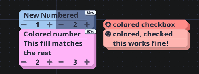
While I was busy testing out some of the new features (primarily, the new coloring function for tasks), I did notice that the fill ends up matching the color of the box, thus making them completely invisible when deselected. Somehow, this works perfectly fine with checkboxes.
Here is an image describing the situation:

I also want to state that it also looks fine with the fill progression with timers, too.

