Just an FYI: If you reset and select save your programs it makes a windows.old folder where the app data is.
mikenet707
Recent community posts
One suggestion I have from the game is when the Skylar slap scene UI is hidden and the scene loops. You have "Lyle" slap her then it zooms in then jarringly goes back to the beginning of the loop. Maybe, if possible, make it zoom in, then out, then start loop again. So that it looks seamless. The jerk back is not good on the eyes. The picture is below. Thanks.
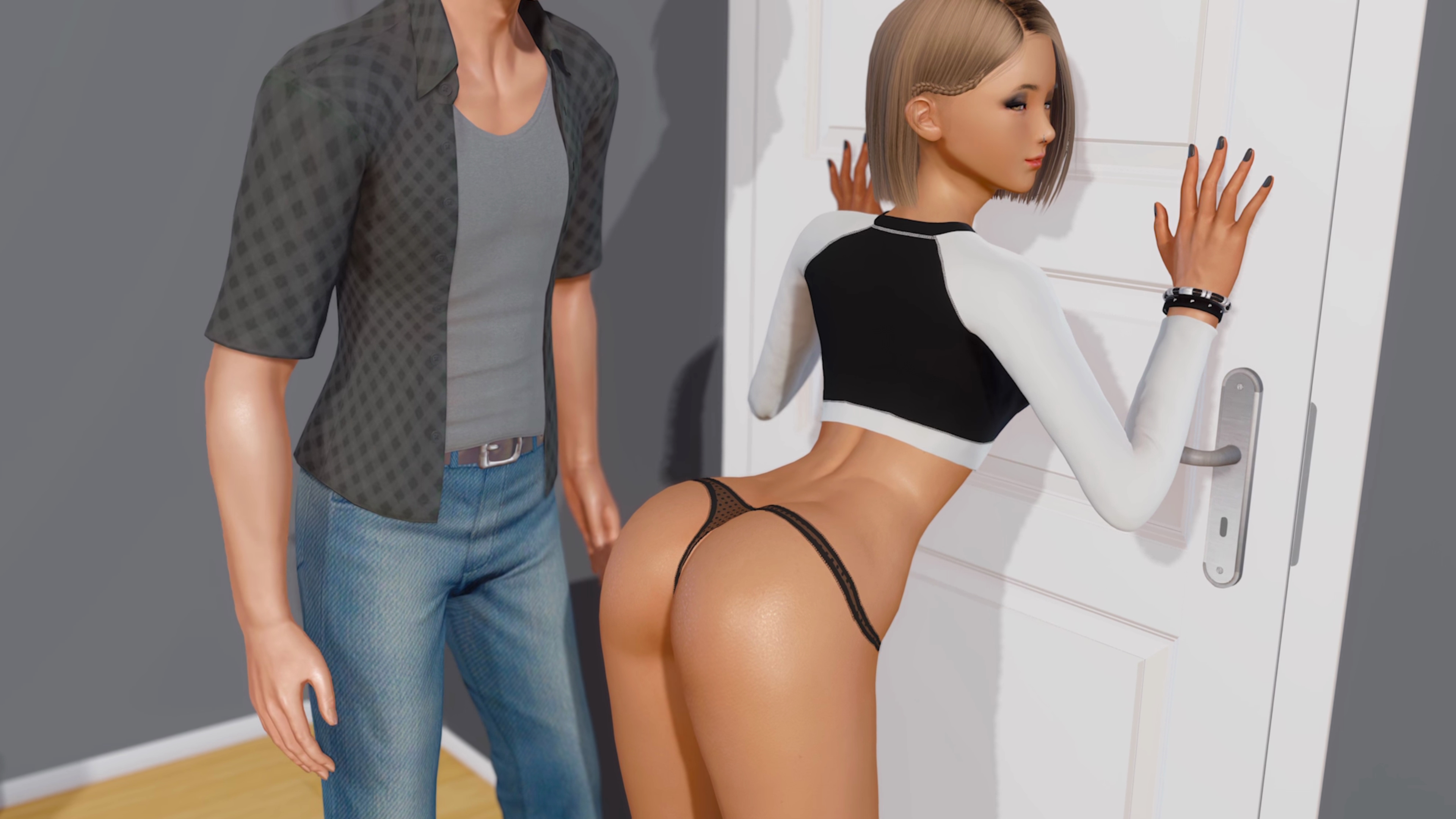
So far everything has been fine with the game in general, but more angles would be cool in each scene. Some end so fast too. That's a lot of work I know. But I had to voice my opinion. Ass, crotch and vagina shots. :)
More Ezra scenes would be nice. Some roped up or hanging scenes.
Double team scenes are sweet also.
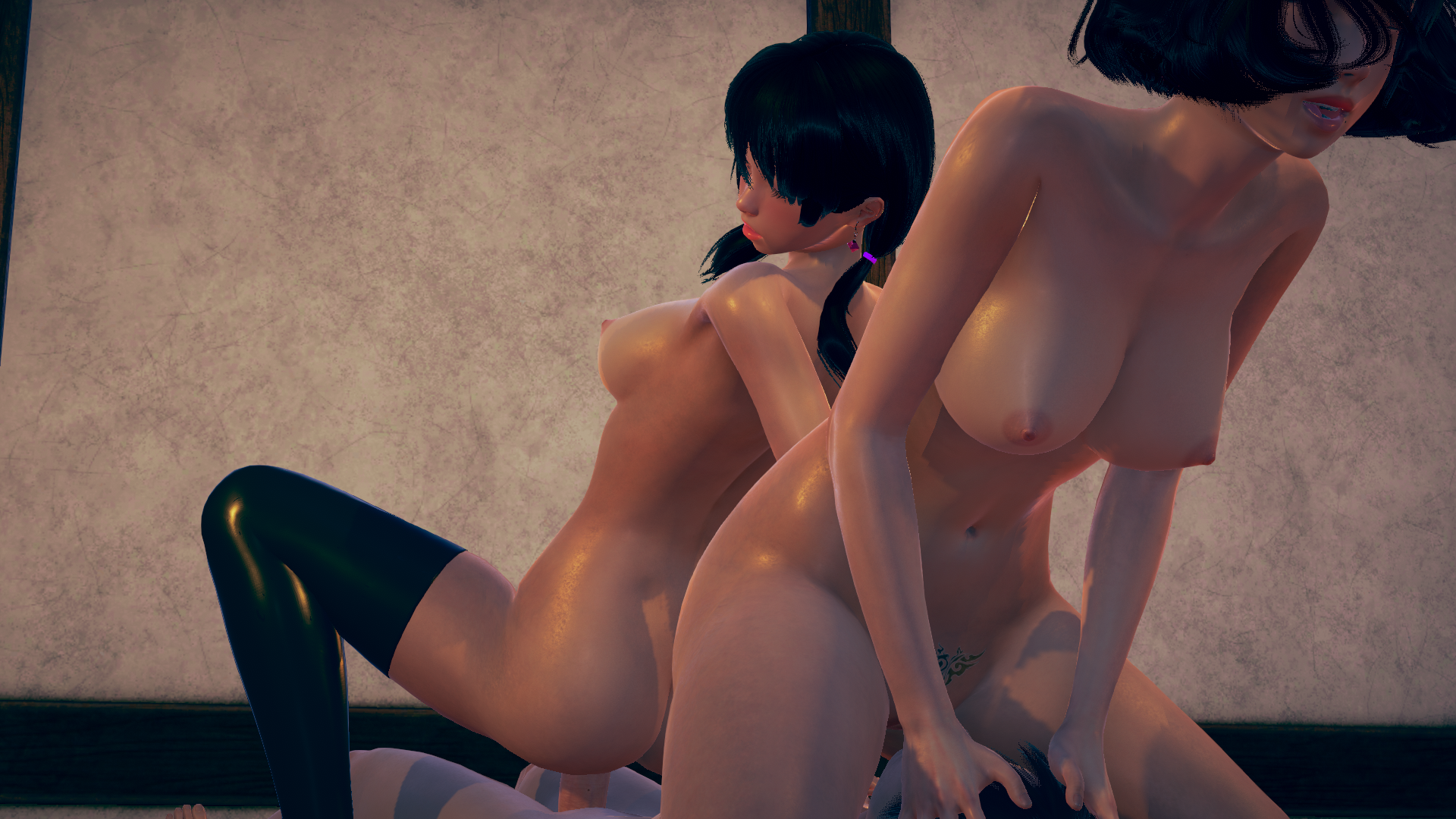
That's all I got for now. Ciao.
Nice work. Story is good too.
I hope you are not getting tired of me posting here. :)
I finished version 5 I think. It just ended suddenly.
Just my thoughts again. Only my opinion and suggestions.
Starting the game at the cave scene after the abduction things were fine but the action scenes wer not that exciting to be honest. Trog was sweet though.
After Trog turns around you decided to make her go fast. I think that was too soon. She should still go slow and then speed up a few more scenes.
Also, after the "R" scenes start it would have been nice to have some ass shots. Both side view shots. And when Trog turns around why no crotch shot? Vaginas man. Vaginas. I just think you missed some moments there. :)
I don't know if people say they like super-fast action or you just chose to do it but I personally don't like the super-fast speed up. It looks goofy. But that is my opinion.
I am new to these kinds of games so maybe I am just an oddball.
And lastly, Is there gonna be Wiki and Jinx action? I was hoping Wiki would do something in the cave since she seemed that devious. :)
That's all I got for now. Ciao.
I posted a screenshot of the error page. When scrolling through text it throws up the constant error and I have to select ignore to continue. It was happening a lot of Planet Zee and during Spin the Bottle and also a few times between those two areas. I assumed it was an error pertaining to the text that comes on screen (the dialog). Understand now? :) Look below.
Also, just some of my thoughts and questions. I'll try to make this short and to the point cause I know you are busy.
1. Is there a way to stay in the parallel world? I only had the option to go through the portal after getting all the gems. Each time I went back to a previous character in that realm I was not able to repeat being with them after their conversion. Unless I missed something.
1b. In the parallel world: The yellow chick after conversion looked nice. I think she was on the stairs. Some others as well but I forgot their names.
1c. In the parallel world: The two big daughters at the end were cool but more angles and positions would have been nice. Their conversion was good too.
1d. In the parallel world: The fairy scenes were nice but the part where the main was duplicated into a fairy, again, would have been nice to see more angles and positions.
That's all for now. Thanks. :)
Ok. Thanks for the tip.
I did get past that one part in Part 1 and finished the game but during the parallel world and after I was getting quite a few text errors. So much so it was annoying. I started seeing it here at this scene (below) and had more issues after but not badly again until spin the bottle. Cheers.
No problem. I know you have a lot on your plate right now. I just used Nvidia control panel to adjust color settings and got a happy medium. Still not as good as your screenshots but better. The game looks decent. I saw in part 2 how the models got better as the game went on. High fidelity models are great. And when you have nice shadowing going on it shows more depth (3D) not DOF. I hate DOF. :)
Also, I would like all the models to look as stunning as this pic below which might warrant a remaster obviously. Just saying. :)
And a longer sex scene with this hybrid:
And sorry if I posted the pics on wrong game. :) Part 2 was /thumbs up. Keep up the hard work.
I finished Part 2 and it's hard for me to comment on it since there was so much crammed into it.
I saw a comment down below about Futa. I don't think most people have a problem with it these days as this is strictly a fantasy game for sure. Totally out there.
I just don't like seeing a big dick. Seeing clearly the vagina from many angles is my desire. I wasn't interested in the tentacle sex either. Not really into monster sex or anything that looks similar.
Since I don't want to take up much of your time with reading, I will just say you hit a home run with the two hybrids I will post pics of here below. (orange and pink Orc).
I liked the two rear shots on orange-y (wish there were more) and wish that you had rear shots also in the void scenes. Rear shot of the futa and looking up from the bottom view, if you know what I mean, while they were having intercourse.
P.S. I would have liked to see more half elf pet action. The water scene was ok but wasn't my favorite.
The milking and peeing stuff were a surprise.
I won't spoil it but the fairy branch was creative also which branched well into later scenes. You got an imagination man.
Cool thanks for sharing. I know it is a lot of work. I bought Part 2.
On to my thoughts again:
The Dungeon /thumbs up for the 2 dominatrix scenes. The toys were fine too but I was getting an error at the chair saying can't find picture or something when I went in a certain viewing direction. I did get through the section through finally. The dildo machine and horse were the best. Anal and dildo on the chair was the best for viewing.
Zory was hot. It would have been cool to see more of her and her parts. Great job on her.
When I tried to name the merged character the game threw another error up and I could not name it. I am guessing that is the end of part 1 or it is broke there?
I really like how you have the characters look at the camera when they are solo. That is a great touch. They make eye contact with the player. Very immersive.
Another pole dance idea: Have a spotlight on the character with a strong shadow in the background so it looks like it is mimicking the movements of the character pole dancing. Which it is since it's a shadow. :)
Lastly, is this game related to Elseworld? Or is Elseworld a spinoff?
Highlights: Top and Bottom. Not sure why a pic when to the top. Sorry.
Lots of action in this one. /thumbs up
Just my thoughts...
1. I am convinced this game is made to play when you are on drugs. Like wowo. ;-)
2. Friendly criticism based on little experience with these games:
The penis is too big and very funky looking in both this game and Elseworld. Why does every visual novel have big penises?I would think people would want to see more female butt and vagina rather than penis or the man's face for that matter. The futa/unisex models are fine but even they have big penises in most VNs. But that is just my perspective.
Obviously, if sex is happening you can't hide everything. But definitely more focus on the girls would have been nice.
This game did have more better girl views than Elseworld but this game is lesser quality as far as the models go and cartoony look. But again that is my perspective.
3. How do you do the animations in your games? Is it build into the engine or do you have to create the animations from scratch?
Thanks for your time. Ciao. :)
I just made it to the Xenny scene. Nice angle.
Riley pole dance was nice. You could have possibly made that a high resolution 4:3 aspect ratio and made a higher quality video with closer zoom I think. There was a lot of wasted space on the left and right during the dance. Just an observation.
The gym part was interesting. Just a directing suggestion: You could have zoomed in on some of the girl's vaginas during the scenes as it played out. Some close ups. The few that you had were meh. :)
Ok thanks for the tips. My gaming monitor is a 1440p/4k - 260hz/144hz display. It even supports above that natively. I am playing at 4176 x 2349.
Your screenshots appear to have much more fidelity than what I see on my screen. I am not sure what is going on. It's no problem. I'll just try to keep playing with my color setting or something. I don't think scaling is the issue as I am only on a 32" monitor.
Peace. Ciao. :)
I left a message on the Haremz page also.
Here is a couple screenshots from EW for you to see. I had to convert from png to jpg.
Ok. I'll keep that in mind. Little Haremz
One last thing I forgot to ask:
During the intercourse scenes is there supposed to be sound from the characters? I only hear music but no sounds from the characters like moaning and dirty talk and stuff like that.
Ok I bought Little Haremz Part 1 but can't buy part two yet. I should have just got the whole bundle since I spent that much already. Haha.
Fidelity is the main thing with visual novels. "Realistic" looking characters are best. Some of your scenes the characters look very nice. Others kind of chalky. I saw the screenshots on Steam and my game looks nothing like those. Not sure why. I am still trying to fine tune my color settings. But to no avail. Oh well. :)
The opening scene and scenes after entering the portal are well done except for suggestions below.
I can't wait for the next part after getting captured. I played through again and no issues except the high contrast in some areas of the game mainly after going through the teleport to meet Izi's sister.
One friendly suggestion I have or request would be to see more of the mother's vagina in the opening intercourse scene. Also Luna when she first mounts my character. More vagina showing during sex in general. :-) .
I would support your patreon if possible but my wife who is chaste (which is fine by me) can monitor my purchases. She controls the money mainly. I was able to make the two purchases here because she does not know what this site is. Small one time purchases are no issue. Steam I have to be careful as well as she can see my profile but rarely ever looks. My kids can see my Steam as well. I have blockers on theirs but still.
Talk about walking on egg shells.
Anyway, looking forward to the next part. Ciao.
Being far right or far left is wrong. The middle is where it is at. We lost that in this generation for sure. Government overreach and religious overreach are both wrong. There are universal rights and wrongs though. That is a fact whether people want to believe it or not. Just saying. I'm out now. Peace. :)
OK thanks for looking into my question which mainly was focused on the models mainly.
It's just some of the characters seem like they could use a little more love in the fidelity department. Some characters look crisp and nice and others just meh. Washed out a little.
It could be the coloring or something of certain characters that is making things look "odd". Consistency in appearance might be what I am trying to refer to. I tried changing my color settings in Windows and my monitor but that didn't help much. I was able to darken things a little which toned some of that high contrast looking color down.
I know it's a lot of hard work making games so don't think I am bashing your work. What is there is fine and gets better over time.
I think I played all the present content through and then it abruptly ended just after the campfire scene.
I am new to visual novels because I am just not that patient to go through walls of text and some are just boring or too complex for being a visual novel.
I'll continue my ventures after I start the newer version. The game seems to run fine overall. I think I had a couple freezes but that was it. That could be because I am running the games off my extra spindle hard drive. It sleeps after a certain time if not used. None-the-less I'll report any issues I might have.
Thanks again for your time. Ciao.
My hardware is 13700k and 4090.
I'll give another donation also as soon as I can.